Search
From a shed in England to a wine brand built on connection

How One Another Wine turns collaboration and creativity into design
Designer: George Loat
Illustrator: Finn Orr
Typeface: Giulia Boggio
Label materials: Fasson® Noble Blanc FSC®
It started in a shed. Not a metaphorical one, but an actual small outbuilding where a young designer began turning his hands to wine. With a ton of English grapes and the most basic equipment, George Loat created the first vintage of One Another Wine — a project that combines winemaking, design and a belief in kinship.
His journey started while studying graphic design at Central Saint Martins, but didn’t go as swimmingly as planned. “The Covid pandemic had ruined my university experience, so I searched for new experiences,” he says. That search took him first to Le Mazelet, a family-run vineyard in the south of France, and later to Zorzal in Argentina. “It was on the weekends, helping a local Argentine make wine in his small shed on a shoestring, that I began to conceive the idea of making wine (in my own shed) in England.”
After returning home, George launched a kickstarter campaign that exceeded expectations. The support allowed him to begin his debut vintage, using his design background to build a brand that would express his travel experiences. And as the winemaking took shape, so did the identity behind it. The process of conceptualizing the label became an extension of the same spirit that had inspired the wine itself — collaboration, learning and connection.
“Approaching the design was straightforward,” he explains. “My brand would communicate the most valuable lesson I learned during my winemaking travels: that wine has a unique power to unify and connect.” That belief became the foundation for One Another, a name chosen for its sense of reciprocity — people working together in harmony. “In France, producers freely shared information, forming a critical mass to help build recognition for their region. It felt like a fairer way to do business,” George says. “In Argentina, I worked and lived alongside people from around the world, united by a love for wine. We shared stories, knowledge and bottles and formed life-long friendships.”
The visual identity needed to reflect that openness and warmth. George collaborated with illustrator Finn Orr, who created a series of lively drawings showing people sharing wine. “They embody the spirit of the project — togetherness through simple, human moments,” George says. He paired them with the font Bastardo Grotesk, a typeface by Giulia Boggio, chosen for its offbeat charm and modern edge. The combination gives the label a character that feels spontaneous, personal and distinctly handmade.
To complement this, George selected our Fasson® Noble Blanc FSC® paper. “I hoped to find a paper with a good texture to mirror the hands-on, tactile approach to my project,” he explains. “It was a pleasure working with Avery Dennison. The broad range of papers presented me with options, and I was able to test my printing process on multiple sample sheets they promptly sent.”

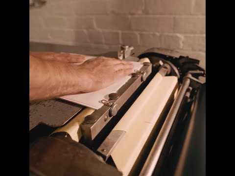
Because the letterpress required sheets rather than rolls, the Avery Dennison team adapted their supply to make the process work. “I needed my paper in A4 sheets for the letterpress machine, so they worked out the equivalent length and sent me a large roll of the correct width, which I cut down using a guillotine,” George says. That practical support helped him keep the scale intimate while achieving professional quality.
The finished result feels true to the story behind it — textured, humble and full of character. The soft grain of the paper carries the handmade quality of the print, while the artwork and typography tell a story of people, process and unity. Every bottle feels slightly different, yet unmistakably part of a whole.
One Another Wine may have begun in a shed, but its story speaks to something larger — how design and material, when handled with care and purpose, can connect people as naturally as sharing a bottle of wine.
