Search
Build Your Brand: Addressing Global Challenges with Label Design
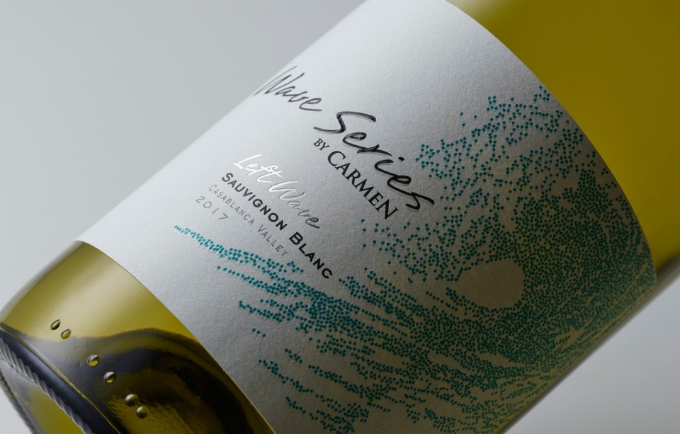
Over the course of the last 15 years, the Pentawards have brought together some of the world's most sophisticated packaging designs. It serves as a source of inspiration and provides a forum for the packaging community to connect, along with awarding some prizes to the leaders in the field. Often likened to the Oscar’s equivalent in this industry, they have received 20,000 entries from 64 countries worldwide over the years, which is a testament that winning one of their prizes is an award of honour that will carry much esteem and credibility in the world of packaging labels.
This year's competition truly attracted a diverse range of talented and inspirational entrants with impressive label design portfolios. For this reason, we are delighted to say that Avery Dennison, in collaboration with the design agency Supperstudio, received the silver award in the branding and consumer category for the ‘Build Your Brand’ project. We sincerely congratulate all our competitors and are humbled to have been recognised for our efforts and innovative partnership with Supperstudio.

What makes receiving this award so special is the fact that it recognises the importance of some key social and conservational issues that we face in today’s world. As consumers become more conscious of the global impact that product packaging can have, brands are being challenged to step up and showcase these values. Labels can play a pivotal role in helping to communicate these.
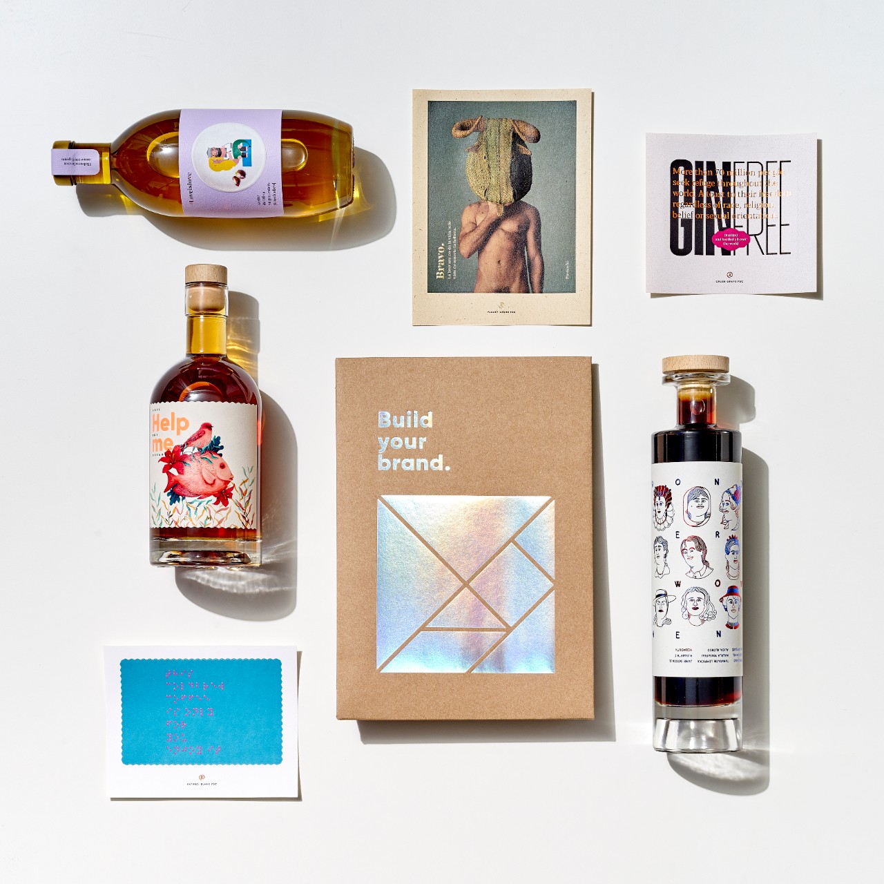
‘Build Your Brand’ features eight individual projects designed to raise awareness of these major global issues and take small steps toward resolution.
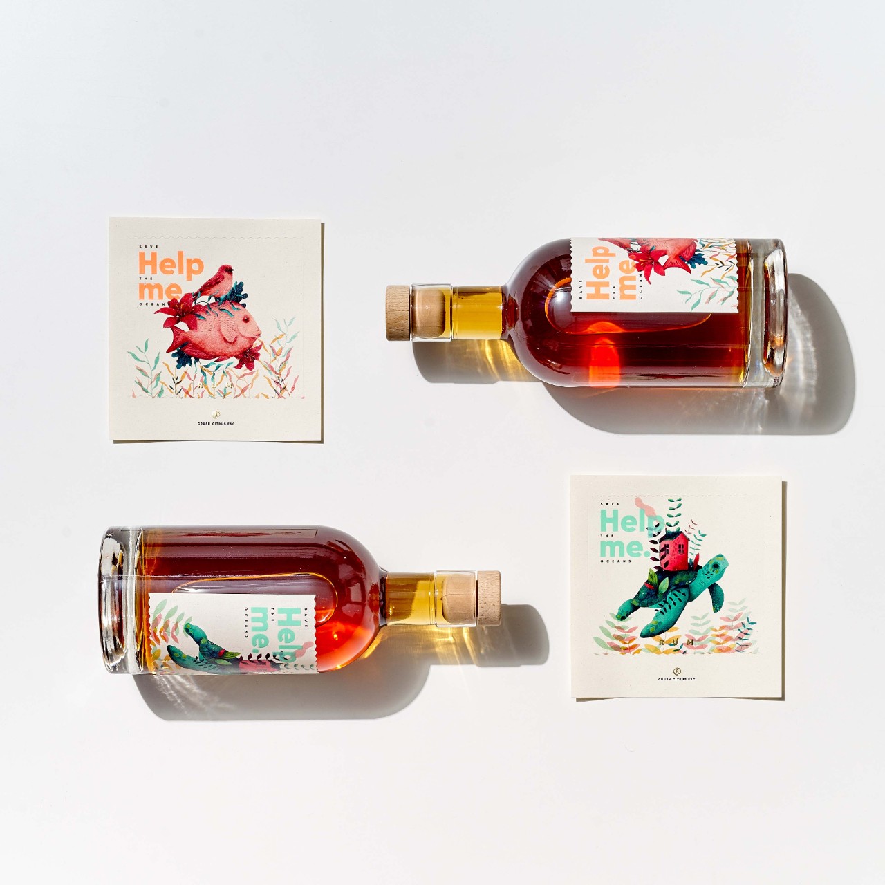
The first design, 'Help me (Save the Oceans)', emphasises the importance of preserving our oceans while highlighting our ability to effect change. This message is conveyed by the label, which is printed on rCrush Citrus FSC paper (made with 100 percent green energy) and therefore represents a 20 percent reduction in carbon footprint. With the help of serigraphic varnish and hot foil stamping, the label boasts stunning images of vibrant ocean creatures to further reinforce the message of conservation.
Bullfights are one of many animal rights debates in which arguments are made between historical customs and animal cruelty. While some argue that it is a tradition and part of long-standing cultures, others say it’s just torture. ‘Build your Brand’ wanted to highlight this discussion in the second design called ‘Bravo’, by exploring the different sides. The design, which blends a human male body and the head of a bull, invites a person to reflect on these subjects and consider both sides of the debate. Printed on rFleury Chêne FSC paper with hot foil stamping and micro embossing, the label has a natural feeling that gives a sense of authentic artisanship which truly mirrors the subject matter.
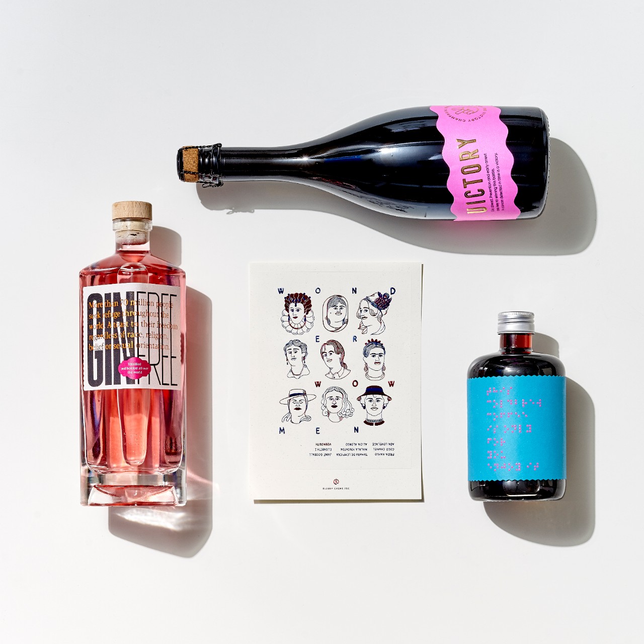
The third design in the brochure draws attention to the worldwide refugee crisis, educating the consumer that more than 70 million individuals globally seek refuge. With its pink tone and sustainable label, the 'Ginfree' bottle incorporates a sandy screen-printing varnish and hot foil stamping, dedicating a toast to the freedom of refugees while also making a powerful point about diversity and inclusion. The label is printed on rCrush Grape FSC which is made with 15% grape waste and 40% recycled fibres, giving it a grounded look and feel.
Continuing the narrative of inclusion, the fourth design in the brochure, 'Wonderwoman,' pays tribute to the women throughout history who have been courageous enough to fight for their rights in a male-dominated society. The label depicts a variety of women throughout history with beautiful blue and red tones and is printed on rFleury Crème FSC paper with embellishments, which has an elegant and natural feel. From Elizabeth I and Frida Kahlo to Alicia Alonso and Malala Yousafzai, the bottle yearns to inspire girls to have pride and courage in becoming the next generation of women without limits.
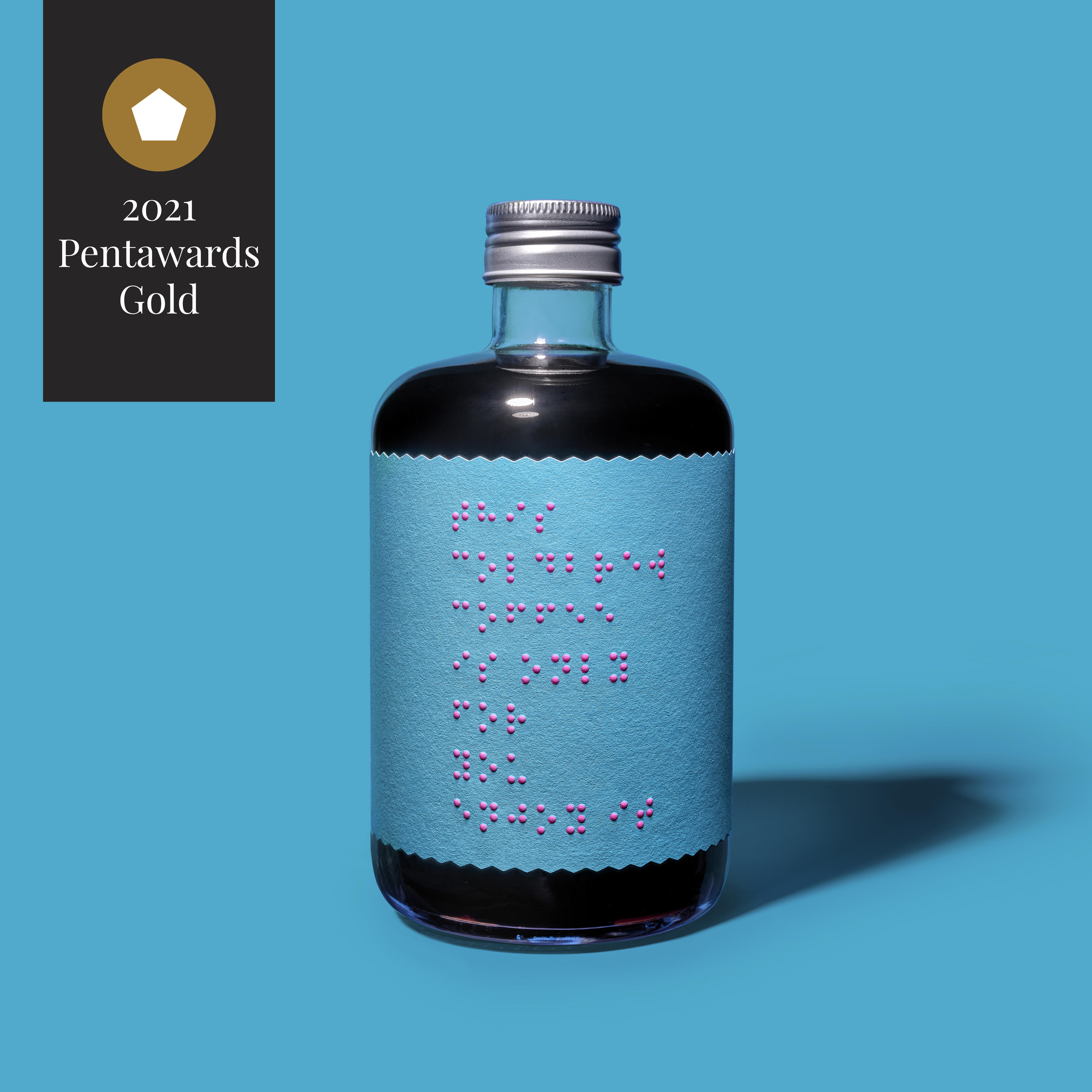
'Only for your eyes’ received a Gold Award as the fifth design in the brochure. This label, which is printed on rNaturel Blanc FSC, is embossed, hot foil stamped, and silkscreen varnished to include braille with the aim to show its support and raise awareness about the experiences of blind people. Making the label accessible to the visually impaired is just one step toward respecting the 285 million people who are affected, while also encouraging other brands to be more conscious in their design. A beautiful and necessary dedication to the visually impaired community, which is often overlooked by brands.
Breast cancer continues to claim many lives, even though it is a tumour that, when treated early, can significantly reduce mortality rates. Increasing awareness of this disease remains a critical mission, and the sixth design in the brochure, 'Victory,' aims to add to this. The sustainable rFrozen Pearl FSC paper label features the universally recognised pink colour, which is often associated with breast cancer awareness campaigns. In addition to gold notes that represent the feeling of victory, it also includes an anecdote about prevention, further contributing to the task.
The penultimate design in the ‘Build your Brand’ brochure also received a Gold Award from the Pentawards. 'Love is love' provides a platform to challenge nations where same-sex relationships are still illegal, while also encouraging people to understand the importance of equality and respect for those individuals. The label design celebrates love with illustrations portraying affection in various forms, and the textured extra white embossed rGranite Blanc FSC paper lends the design an endearing personality while remaining soft and creating a 3D effect. As a means of demonstrating love's simplicity, the design is minimalistic and is printed in offset without any embellishments.
As we near the end of this impressive array of label designs, we consider the implications of bullying and the impact it can have on the development of children and young adults. The ‘Stop Bullying’ label, which is printed on rCrush Barley FSC paper, is made from recycled fibres using 100 percent green energy. In contrast to what beer is often associated with, the label features some minor pink touches that bring the golden ‘love’ fist to the forefront. With this soft and subtle, yet striking design, it delivers a strong message to individuals with the simple message 'Stop bullying.'
While reflecting on this journey, we want to acknowledge that the success and organic nature of this collaboration can be attributed to the shared values of both organisations, which have undoubtedly come to life throughout these designs. Sharing common goals and values strengthens bonds among partners and increases the productivity of projects. This results in the most meaningful and impactful outcomes, which we are proud to have experienced and accomplished through this collaboration.
As we celebrate this wonderful achievement, we are eager to keep the momentum going and continue the hard work, while also looking forward to next year's Pentawards. Over the course of this time, we hope brands continue to push boundaries and tell the stories of underrepresented groups and highlight global issues that need more attention.
Related Articles