Search
Champion creations from the 2023 Vinitaly Packaging Awards
CREDITS
Vinitaly
Vinitaly Awards
Veronafiere
Design Studios:
ADVISION
Andrea Castelletti Studio
BasileADV
Dario Frattaruolo Design
Kiboko
Lettergram
Luca Di Francescantonio
Spazio di Paolo
Tailor Brand
Brands:
Agricola Bendazzoli Federico e Michele
Ama Aquilone Social Cooperative
#beredifferente Di Rocco Michelli
Brand Breeder
Cantina Roeno
Cantina Sociale Bergamasca
Citra
Collefrisio
Distilleria Antonellis
Frantoio Rapino
Guido Berlucchi & C
Maestà della Formica
Nosio Mezzacorona Castel Firmian
Tenute Tozzi
Terre Bentivoglio
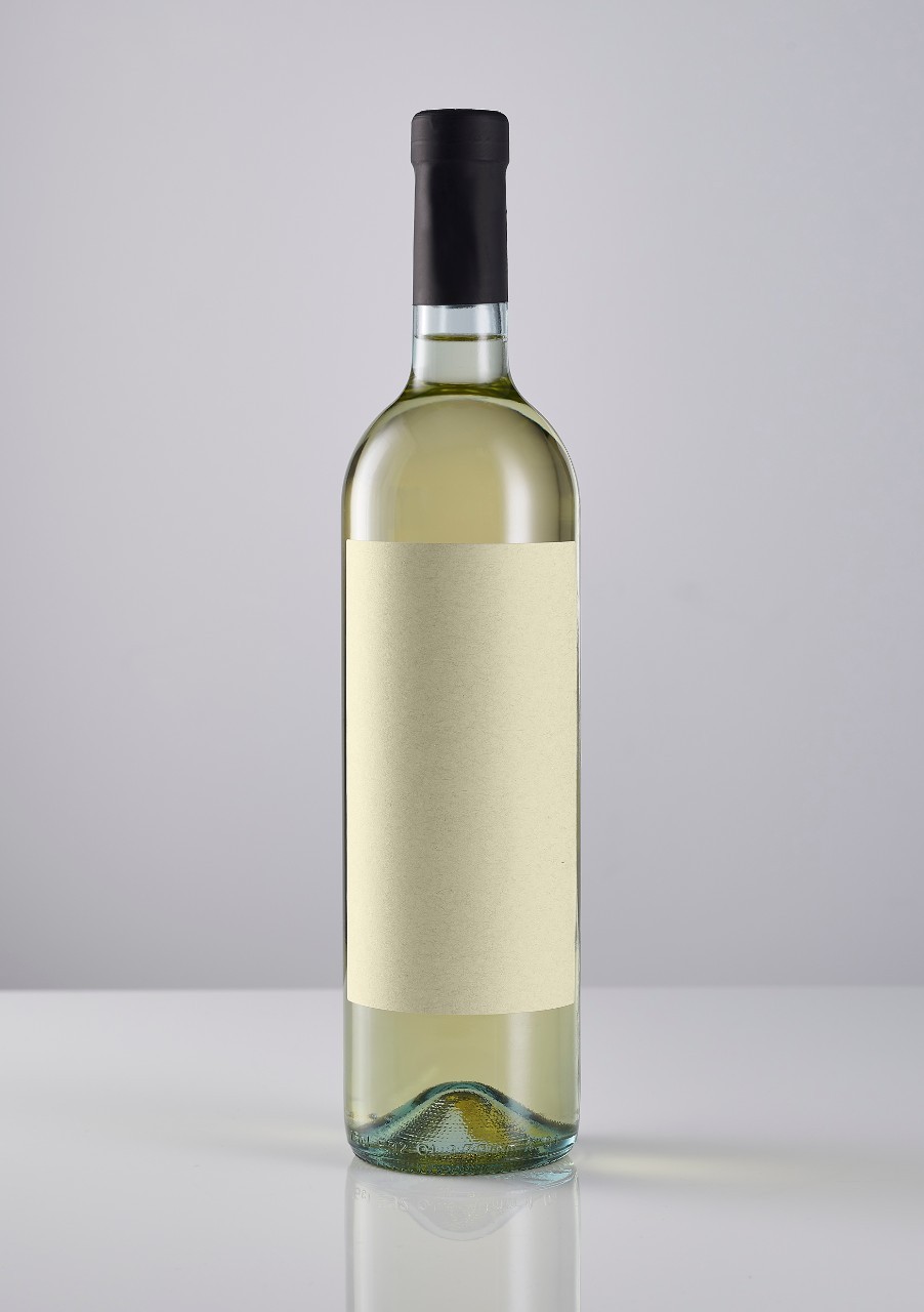
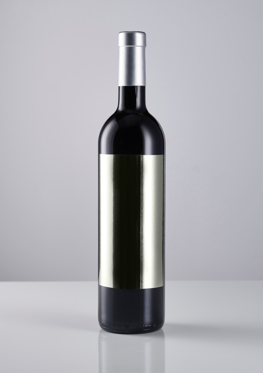
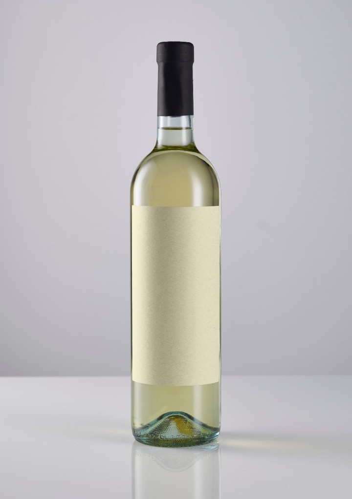
In an increasingly demanding marketplace, the art of packaging goes beyond mere aesthetics; it's the first touchpoint, the initial handshake between a luxury beverage and the consumer. This union of design and storytelling forms a unique blend that can define whether a bottle is simply glanced at or captured by curiosity. With the rise of consumer consciousness, packaging has transitioned from purely visual appeal to an indispensable element in the consumer decision-making process. Recent statistics highlight that approximately 70% of purchasing decisions are made at the shelf, reaffirming the fundamental role that creative packaging plays in this equation.
A beverage's design is no longer merely a visual symphony, but is rather an echoing narrative that resonates with consumers, elevating it from a simple drink to a sensory experience. With every pour, the consumer takes in not just the liquid but also the story it carries, epitomized by the canvas of its container.
Cue the 27th Vinitaly Design International Packaging Competition, an esteemed platform organized by Veronafiere-Vinitaly that echoes this sentiment, spotlighting the exemplary union of design and storytelling in the packaging of wines, spirits, liqueurs, beers, and extra virgin olive oils. A record-breaking 315 entries from Italy, Spain, Slovenia, and California poured their narratives into this year's competition, all vying for recognition and reward for their investment in visual excellence and artistic distinction. In a bid to maintain a high standard, the competition prizes are not guaranteed and extend across 11 categories, each offering Gold, Silver, and Bronze labels. Judging the myriad tales told by these bottles was an esteemed panel led by Paco Adin, Creative Director of Supperstudio, along with marketing and design experts Alessandra Corsi, Chiara Tomasi, Papi Frigerio, and Luca Fois.
We are thrilled to share that fifteen of the esteemed award recipients at the competition crafted their winning pieces with Avery Dennison's label materials. Every participant in the competition deserves a round of applause for their remarkable efforts, and we feel profoundly privileged to have been part of such creative collaborations with an array of distinguished brands and designers. Every project showcased a unique flair of innovation and distinctiveness, skillfully conveying narratives that left a lasting impression. These awards testify to the unwavering commitment each brand has demonstrated toward investing in creativity and, by extension, their customers.
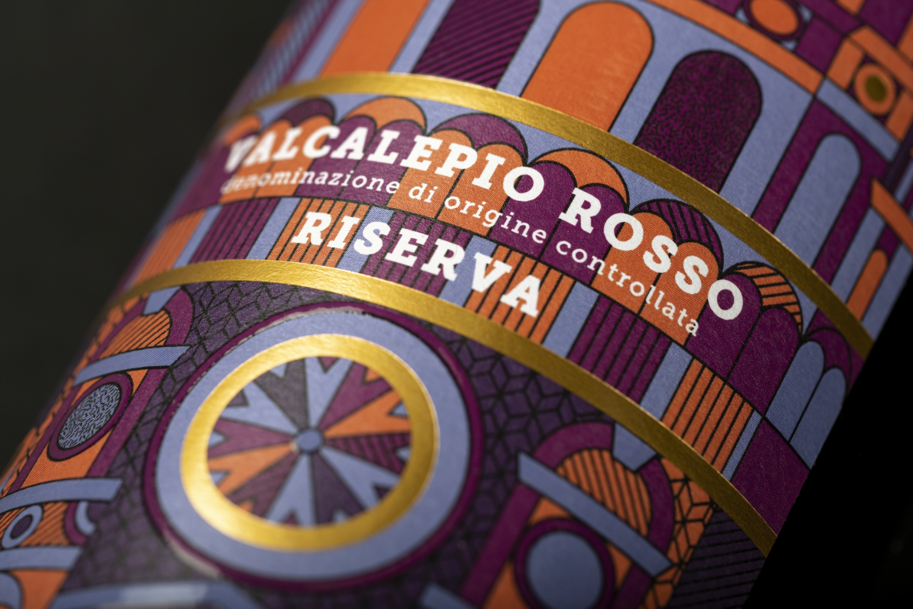
This year's’ Special "GDO" Award’ (retail market) winner is DUOMO, a brilliant collaboration between Cantina Sociale Bergamasca and the creative minds at ADVISION. This visually striking label uses our Fasson® Rustique Blanc FSC® paper to seamlessly blend geometries and colors to narrate the rich history of Bergamo and its iconic monuments. The label tells the story of Valcalepio Doc, the quintessential wine produced exclusively within the province of Bergamo. In the center of the design is an artistic rendering of the cathedral of Sant'Alessandro, a cherished place of worship nestled in the heart of the city in Piazza Duomo. The various elements converge to create a label of unparalleled character, its roots firmly planted in its unique territoriality. Rustique Blanc's brilliance allows for a stunning rendering of colors, making the label stand out and effortlessly catching the eye of the consumer. The result is a harmonious blend of visual storytelling and regional pride, echoing the essence of Bergamo in every bottle.
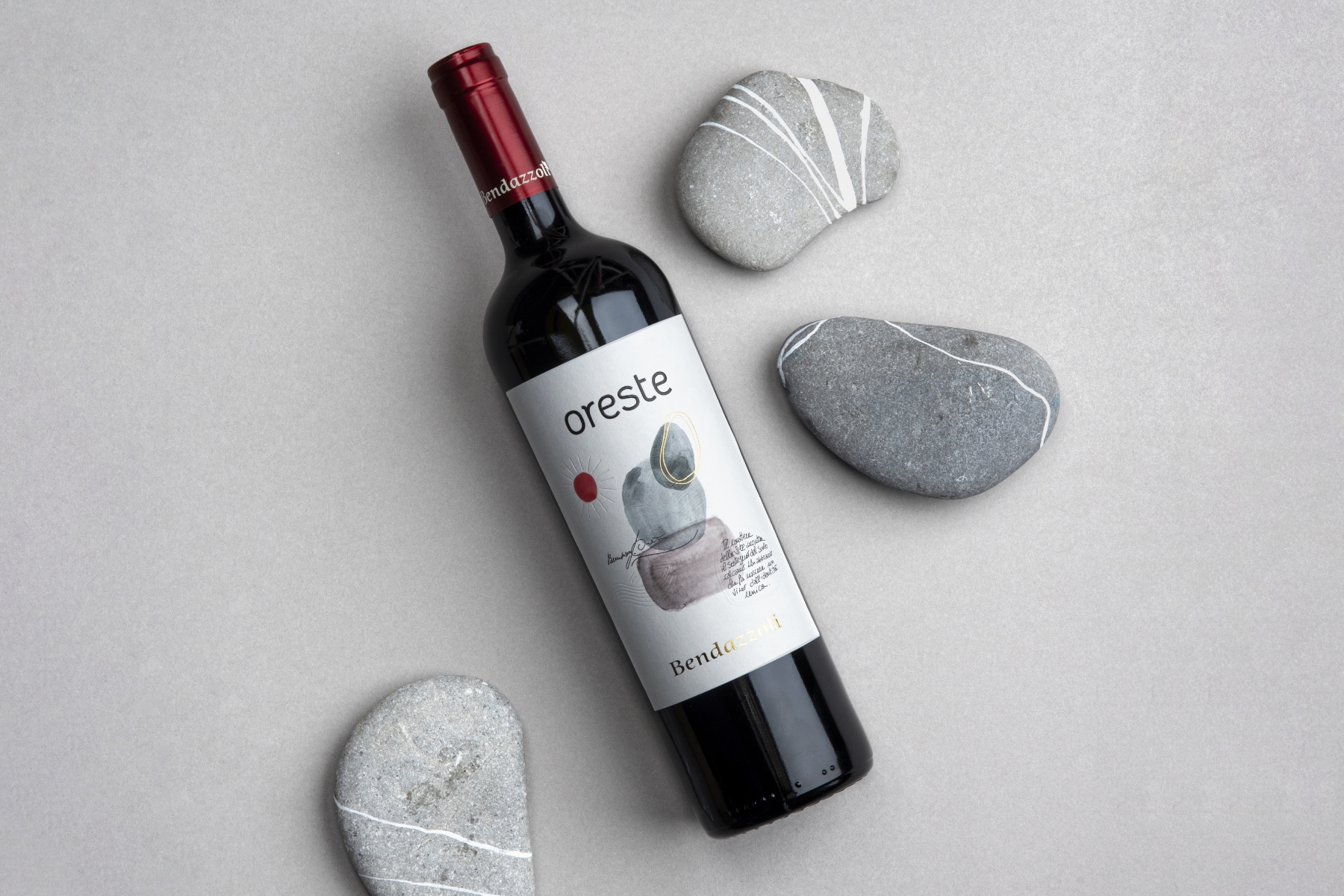
ADVISION continued its winning streak, receiving the Silver Label for Category 5 - ‘Still Red Wines with Denomination of Origin and Geographical Indication - vintages 2020 and earlier’, with the distinctive project L'ORESTE. Drawing inspiration from the very veins of nature – stones – the design embodies the spirit of Agricola Bendazzoli Federico e Michele's vineyard, which rests on particularly stony ground. This unique terrain impacts the growth and flavor profile of the grapes, an element captured exquisitely in the label design. Created with watercolor illustrations, it reflects the simplicity and uniqueness of the cellar, encapsulating the story in a visual memento. Our Fasson® Rustique Blanc FSC® paper elevates the label design, enhancing the chromatic representation and adding a tangible depth with the debossing technique. The attention to detail paid dividends as the winery saw significant appreciation for the new label, leading to an expansion in production.
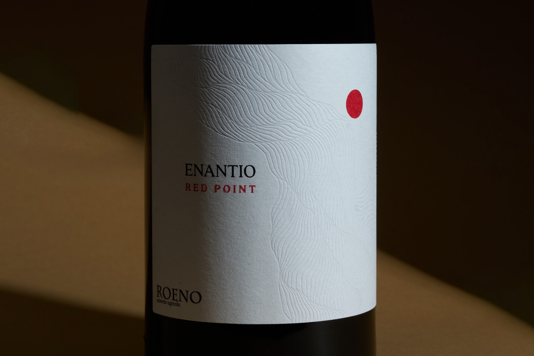
Enantio Red Point, a project by Cantina Roeno and the creative agency Kiboko, was awarded the Bronze Label in Category 5 - ‘Still red wines with Denomination of Origin and Geographical Indication - vintages 2020 and earlier’. This prestigious honor is a testament to the project's blend of tradition and modernity, strength and lightness, represented on the label of Valdadige Terradeiforti Doc Enantio 2020 "Red Point." The design, characterized by its simplicity and evocativeness, features two key elements. A red stamp, as intense and decisive as the wine it contains, stems from its name, "Red Point." The second element, the stem, pays homage to the ancient native vine's tradition. To convey this powerful imagery, our Fasson® Paper Watermark was used. Its tactile appeal, combined with the debossing technique, delivered an elegant and engaging effect, while the red stamp applied with hot foil created a contrast to captivate even the most distant observer. The unique choice of materials and techniques made Enantio Red Point a project that was truly reflective of the wine it represents.
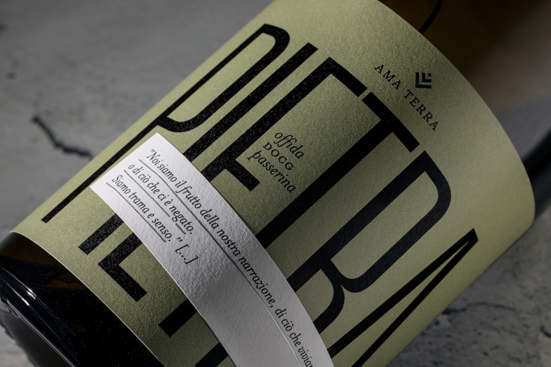
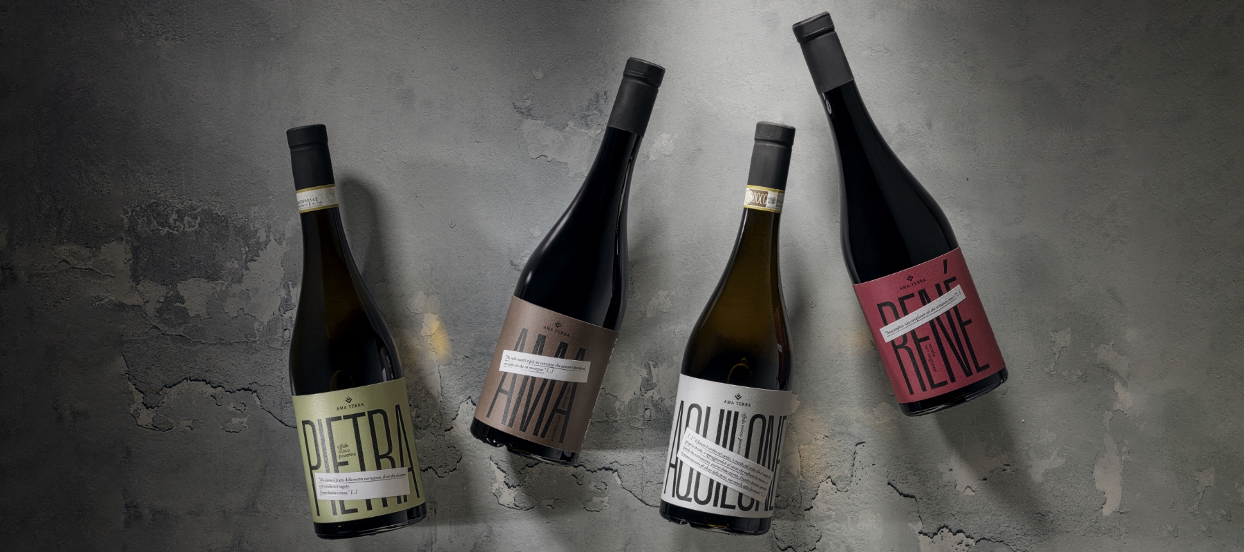
The ‘Special "Coordinated Image 2023" Award’ was bestowed upon the project AMA TERRA, a collaborative endeavor between Ama Aquilone Social Cooperative and Andrea Castelletti Studio. The story behind AMA TERRA is deeply human and inspirational, stemming from a social cooperative established to aid vulnerable individuals, a mission that now extends to producing high-quality organic products as a means of social and professional reintegration. The project centered around designing a label for a limited-edition Marche IGT Syrah wine dedicated to Gabriele Novi or "Il Topo" (The Mouse), a vital part of the cooperative's history. Using our Fasson® Cotton White paper, the label reflects Gabriele's vibrant personality and the premium quality of the wine, ingeniously hiding the last letter in "TOPO" to reveal "TOP," symbolic of excellence. The label further incorporates an iridescent effect akin to a hyper-dimensional portal connecting to Gabriele's present existence, encapsulating the spirit of hope and positivity. Post this project, the brand commissioned a redesign of its existing wine collection, taking inspiration from Francesco Cicchi's book "Pietra, l'anima e l'infinito da abitare." Each wine label carries a fragment of a story from the book, interweaving human resilience, light, and shadow, manifesting in a series of elegant and poignant designs.
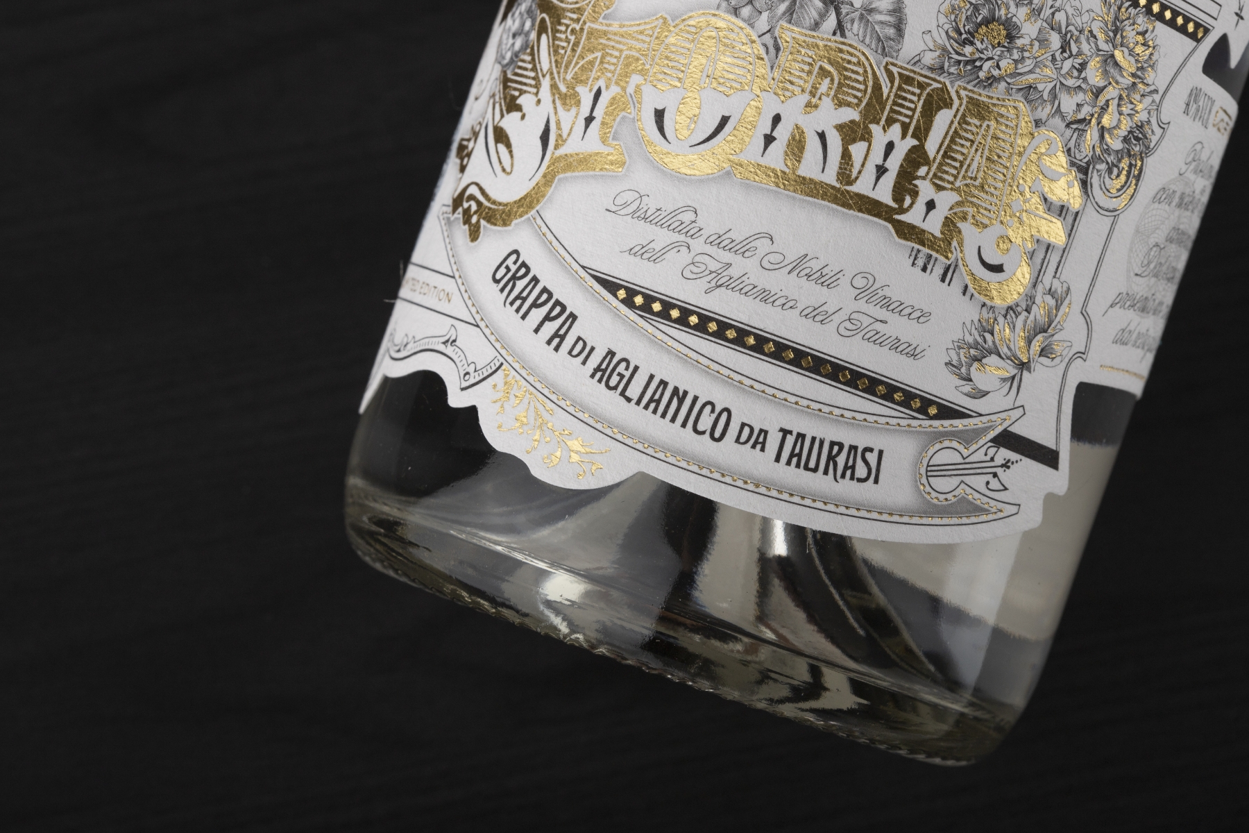
Garnering the Gold Label for Category 8 - ‘Spirits made from grapes, marcs, must or wine’, STORIA stands as a testament to the power of a well-told narrative. The project is a collaborative achievement between Distilleria Antonellis and BasileADV, paying tribute to Agostino Cobuccio, who dedicated his life to his work and built a compelling story to return proudly to his cherished land. The brainchild of the innovative vision of designer Andrea Basile and the typographical inspiration of Giuseppe Salerno, STORIA is a homage contained in an Aglianico grappa of Taurasi – a tale steeped in freedom and legend. This limited edition portrays the gems of Irpinia, journeying from the tale of the Roman archaeological site in Mirabella Eclano, portrayed in the beautiful, illustrated columns on the label, to the pure essence of the untouched Irpinia landscape, depicted through vineyards and floral elements. The design's journey, originating from the Aglianico vine leaves and culminating in the depiction of a small bird – a symbol of bucolic authenticity and serene peace, captures the region's incredible spirit. STORIA's design and lettering reflect a bygone Baroque era; the sinuous natural shapes decorating the label are a nod to this past. The label was brought to life on our Fasson® Fibers Look FSC®, an uncoated non-woven paper that adds a unique debossed felt finish and visible fibers.
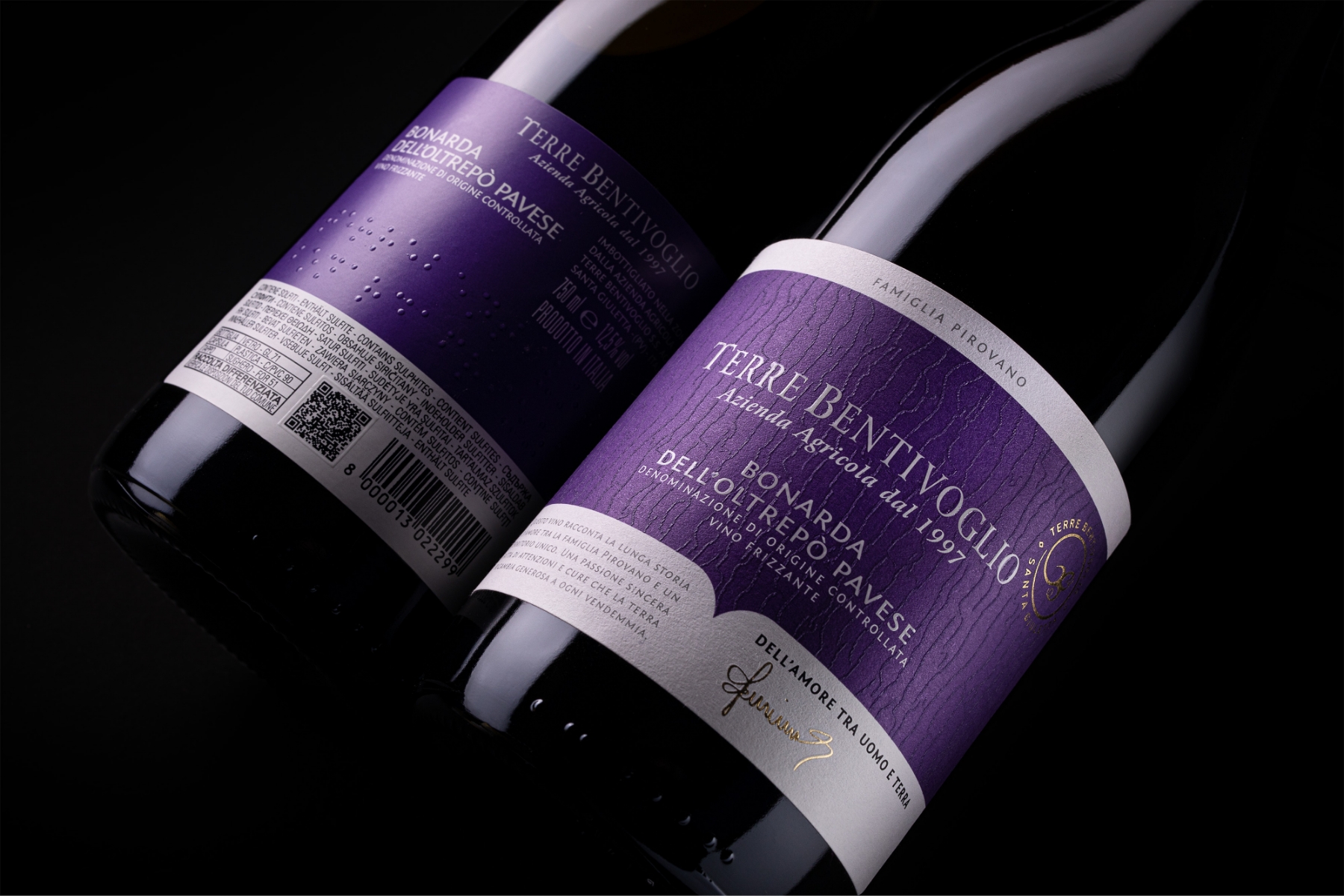
Bringing home the Bronze Label for Category 6 - ‘Sparkling wines with Denomination of Origin and Geographical Indication’, the Terre Bentivoglio project embodies a true love story between man and earth. Tailor Brand, working closely with the Pirovano family, who own Terre Bentivoglio, conceived a label that represents the principles of sustainability and inclusivity. The label became a meeting point for various senses and stood out at this year's Vinitaly Packaging Competition. Through the tactile interaction with the label, a powerful connection is established between our natural Fasson® rNoble Blanc FSC® paper and the material texture suggestive of vine bark fiber, signaling a powerful identity. Remarkably, the rear side of the label includes Braille, extending a warm invitation to those who are blind or visually impaired. It transcends barriers, creating a multisensory encounter with the wine and winery through different languages, all converging in shared toasts. This illustrates that true inclusivity, facilitated by concrete actions, is at the heart of conviviality. In this bottle, we discover an ever more immersive experience, underscoring the profound essence of fellowship.
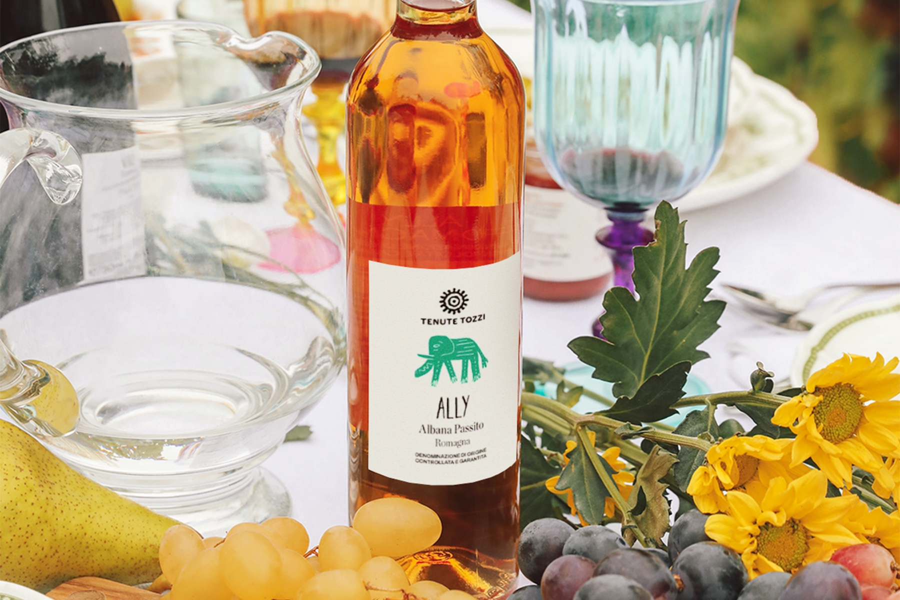
ALLY was awarded the Silver Label in Category 2 - ‘Naturally sweet wines and still liqueur wines with Denomination of Origin and Geographical Indication’. Lettergram developed this project with Tenute Tozzi, and it's an excellent example of how you can bring vibrant stories to life. Through their collective vision, they sought to reflect the powerful family culture of the Tozzi family. The label is as unique as it is bright, showcasing original childhood drawings that connect consumers directly to the family's deep heritage. Our Fasson® Cotton White paper used in this label further enhances the design, reinforcing the essence of family and tradition that is at the heart of the ALLY project. This combination of compelling storytelling and engaging visual aesthetics truly embodies the spirit of innovation and design excellence. As a result of the collaboration between Lettergram and Tenute Tozzi, the team also received a Gold Label for Category 6 - ‘Sparkling wines with Denomination of Origin and Geographical Indication’, with the project BIDIBIDÌ. The label depicts original childhood drawings and follows a theme similar to ALLY, which honors the winery's heritage.
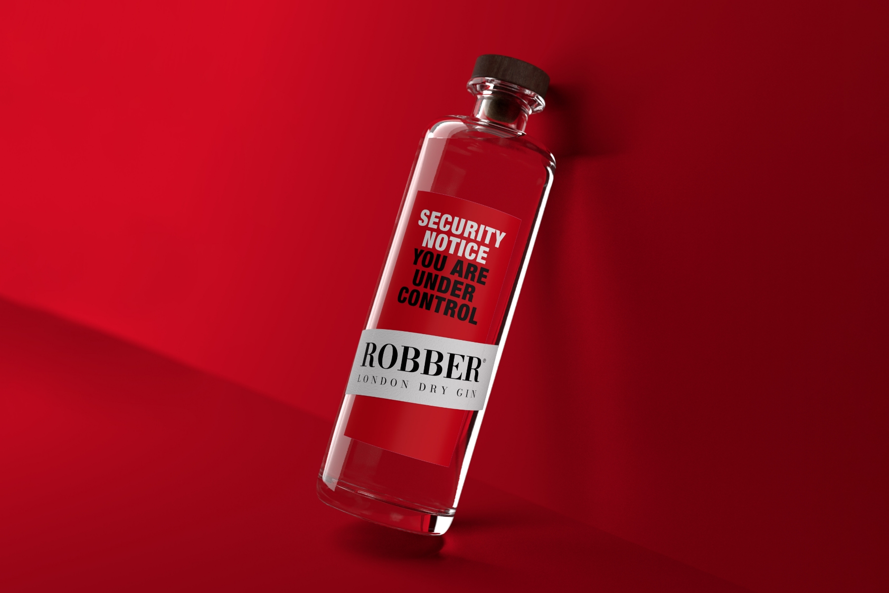
Spazio di Paolo, a creative powerhouse, garnered an impressive six awards at this year's Vinitaly packaging competition. The first project, ROBBER GIN, won the Bronze Label in Category 9 - ‘Spirits not made with grapes: packaging for liqueurs, Vermouth, and other aromatic wines’. The project strikingly represents the innovative collaboration with #beredifferente by Rocco Michelli, and the inspiration for the concept stems from the Italian municipality of Rapino, the home of the manufacturing company. This association led to a pun since, in Italian, 'Rapino' can also be associated with 'robbery' (rapina) and thus with 'robber.' Breaking away from traditional gin aesthetics, the team opted for a daring red shade that exudes danger and alertness. Our Fasson® Cotton White paper, used for the overlapping label, adds a tactile intrigue to this narrative. The label presents a provocative transformation. First, we see a surveillance message, "YOU ARE UNDER CONTROL”. But when illuminated with UV light, it reveals an invisible paint that boldly declares, "YOU ARE OUT OF CONTROL." This shift from control to liberation dramatizes the narrative of breaking free. ROBBER GIN is just one example of how Spazio di Paolo has harnessed Avery Dennison's label materials to craft award-winning narratives. Let's take a look at the rest.
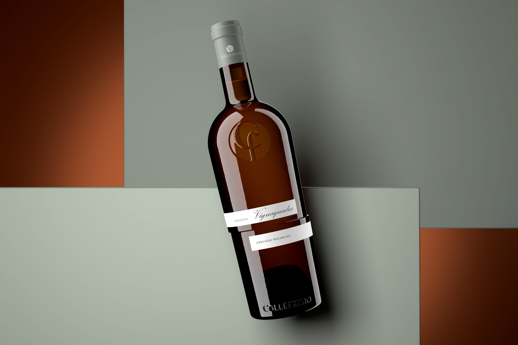
The agency's collaboration with Collefrisio on PRESTIGE VIGNAQUADRA earned them the Silver Label in Category 1 - ‘Still White Wines with Denomination of Origin and Geographical Indication’, which exhibits a stunning synergy of design and narrative. Spazio di Paolo brought a fresh perspective to wine presentation by focusing on the uniqueness of the glass bottle design. Composed of two staggered halves, the bottle maintains perfect balance during automated filling and capping processes while exuding an elegant and original aesthetic. The inspiration behind the project lies in the geometry of the vineyard 'squadro' (square), a technique that defines the layout of the rows and the square design used to select these wines. Our Fasson® Cotton White Plus paper adds a complementary touch to the striking design and elevates the entire packaging experience, reinforcing the unique qualities of the project.
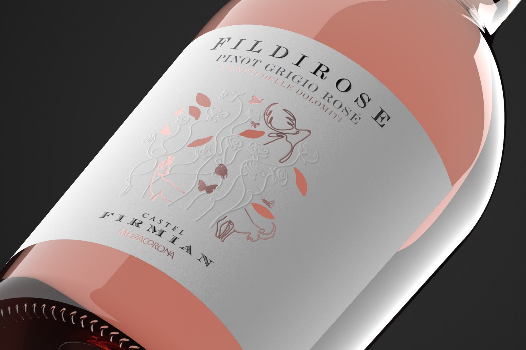
Moving on, the FILDIROSE project, a collaboration with Nosio Mezzacorona Castel Firmian, won the Bronze Label in Category 3 - ‘Sill Rose Wines with Denomination of Origin and Geographical Indication’. FILDIROSE stands as a testament to the diverse life that thrives in the heart of the mountains. The name evokes the fragrances and sensations of a mountain rosé, firmly rooted in its terroir, cultivated in a renowned, protected micro-system. The label's narrative celebrates our harmonious coexistence with nature, encompassing mountains, native plants, and wildlife. It encapsulates the spirit of Trentino in an exceptional rosé wine. Spazio di Paolo chose our Fasson® Cotton White Plus paper for the label material in line with the design's core identity. It aligns seamlessly with the project's narrative, enhancing the story's depth and making each bottle a tangible representation of the FILDIROSE vision.
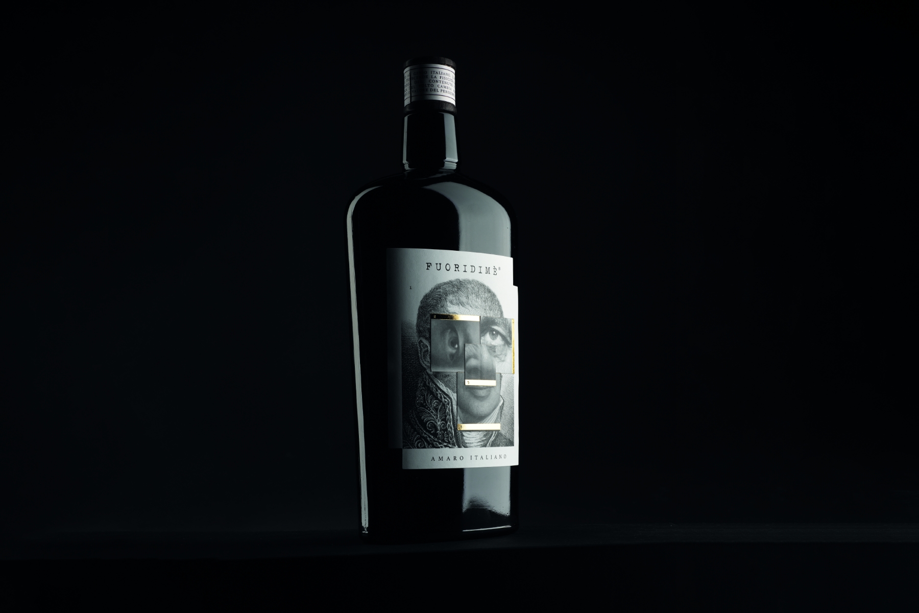
Continuing with our series on Spazio di Paolo's award-winning collaborations, let's look at the FUORIDIMÈ project, which was created with Brand Breeder and honored with the Silver Label in Category 9 - ‘Spirits not made with grapes, packaging for liqueurs, Vermouth, and other aromatic wines’. FUORIDIMÈ, which translates to 'outside the body,' is an artistic project celebrating Italian genius that interweaves the aesthetics of the body and the value of thought. It takes us beyond ordinary, typical thoughts and common experiences. The project pays tribute to some of the most influential Italian scientists and thinkers of the 20th century, and the design approach is aimed at inciting curiosity and engagement. Using our Fasson® PP 120 Matt Wine material, the label comprises multiple removable layers. These layers can be repositioned according to individual aesthetic preference, inviting the consumer to interact and connect with the packaging and ultimately encouraging the notion that intellect transcends physical form.
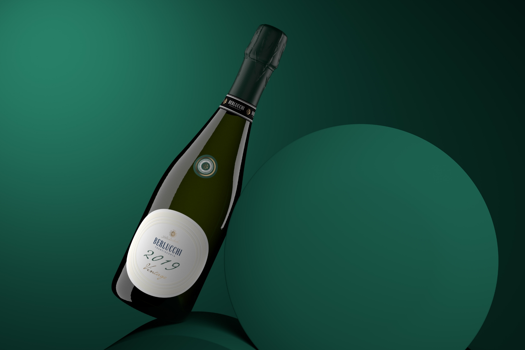
Spazio di Paolo's next project, which won another award, is the Franciacorta Vintage Collection. In partnership with Guido Berlucchi & C, it was recognized with the Silver label in Category 7 - ‘Sparkling wines produced with fermentation in autoclaves (Charmat method) and fermentation in the bottle (classic method)’. This design represents a classic of the highest quality with a new restyling. It aims for a minimalist and tactile effect of profound elegance, with reliefs, workmanship, and our very own Fasson® Cotton White Plus material. The Franciacorta Vintage Collection is a testament to the level of absolute excellence that can be achieved when combining vintage tradition with innovative design.
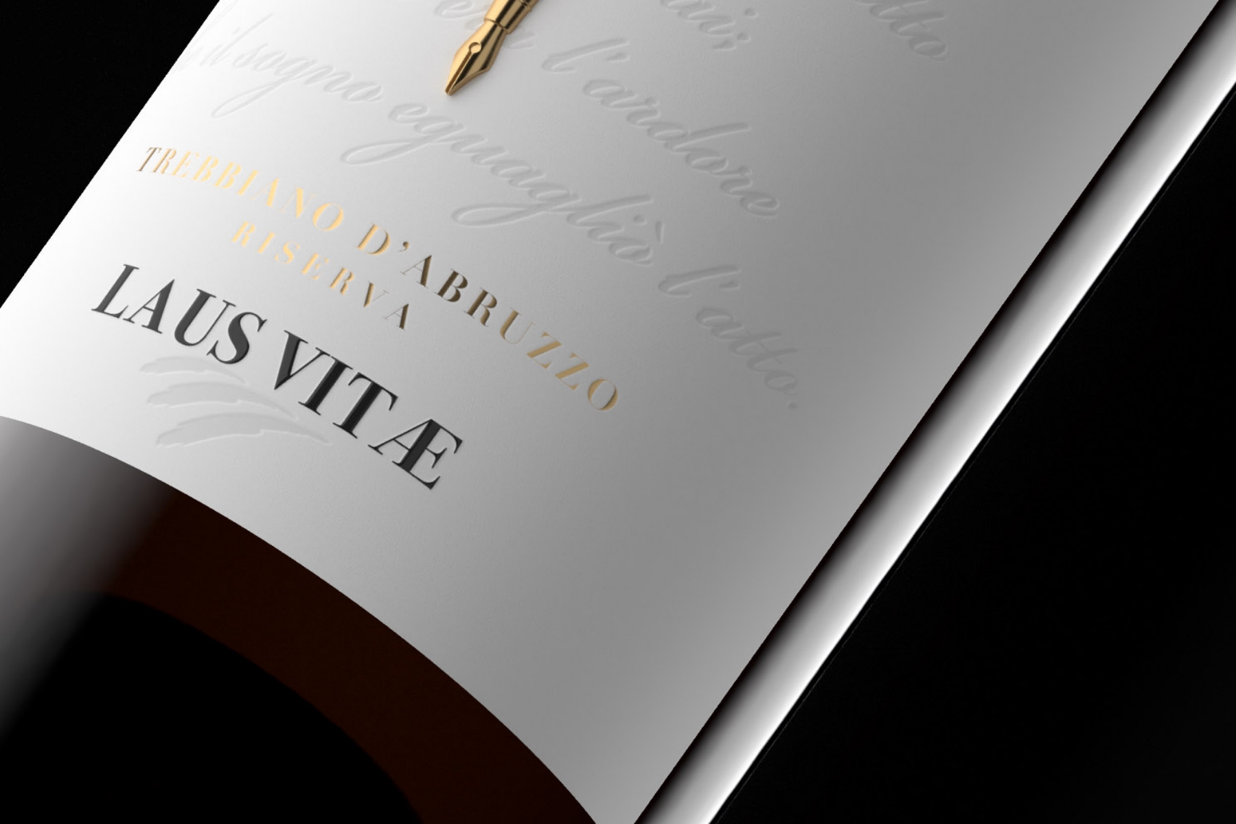
Approaching the end of the agency's impressive accolade list, let’s look at Spazio di Paolo and Citra’s project: LAUS VITAE. This design was awarded the Bronze Label in Category 1 - ‘Still white wines with denomination of origin and geographical indication’, an extraordinary fusion of wine, narrative, and materials. Dedicated to the esteemed poet, novelist, and war hero Gabriele D'Annunzio and his native territory of Abruzzo, LAUS VITAE weaves together culture, wine, and the unique heritage of one of Italy's great regions. The label, a three-dimensional story, unfolds the thoughts of the poet, forging deeper connections with the heritage it embodies. Our Fasson® Cotton White and Fasson® Cotton Black, the papers chosen for this project, lend the label an engaging tactile and visual appeal, thus amplifying its storytelling power. They imbue depth and texture to the label, vivifying D'Annunzio's musings and encapsulating the spirit of Abruzzo's enchanting landscape.
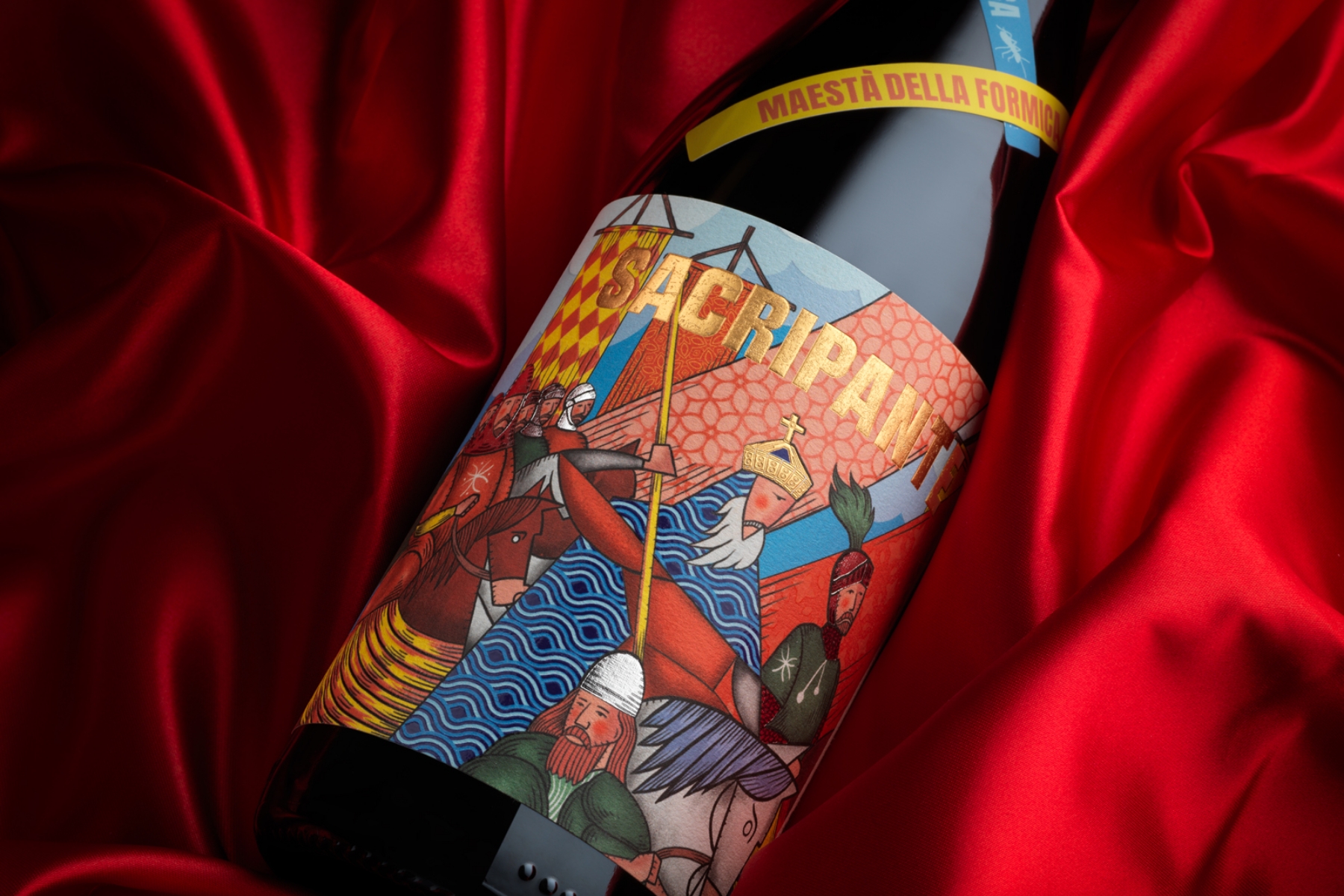
Moving on, Dario Frattaruolo Design, in collaboration with Maestà della Formica, won the Silver Label in Category 4 - ‘Still red wines with Denomination of Origin and Geographical Indication - vintages 2022 and 2021’. The project, SACRIPANTE, showcases the biodynamic farming of the brands' farm, which is beautifully nestled in the Apuan Alps. Named after a chivalrous character from Ludovico Ariosto's poem, ‘Orlando Furioso,’ SACRIPANTE is a tale of love and heroism, mirrored in the austere and elegant nature of blaufrankisch grapes from Hungary. The label concept ingeniously takes us back to the battlefields of the poem. A leader draped in a blue cloak—echoing the literal translation of blaufrankisch—commands a warrior army. This image, rendered in the style of 15th and 16th-century manuscript illustrations, fuses with abstract modern geometries to create a solemn mood, enhancing the tasting experience of this sincere and refined wine. This winning label has been printed on our Fasson® Martele Blanc FSC® paper, known for its high-quality texture and appearance. The debossed and embossed laminations add a play of solids and voids that align with the label's mood, while the choice of the four-color print imparts a rich visual depth.
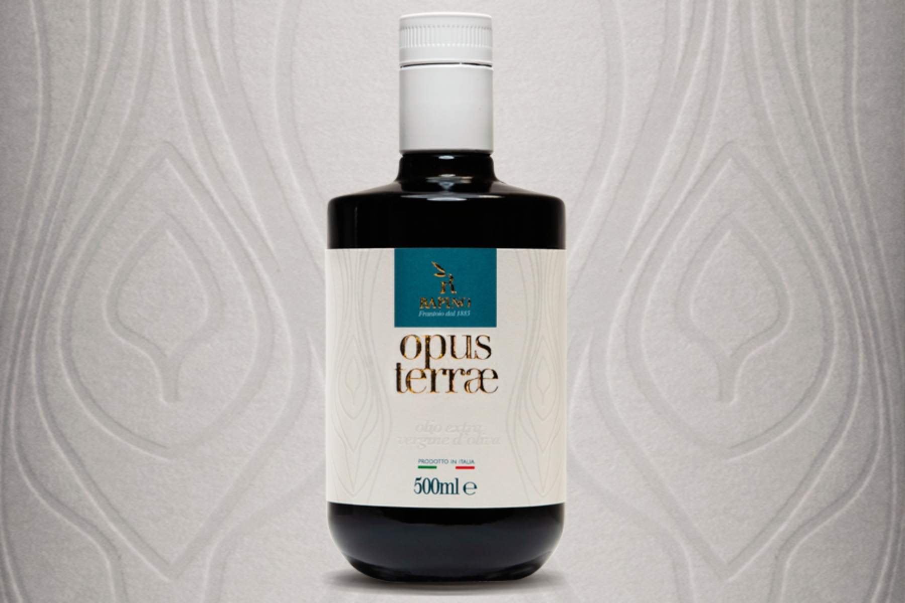
To conclude this remarkable line-up, the spotlight now turns to OPUS TERRAE, which received the Bronze Label for Category 10 - ‘Packaging of extra virgin olive oil’. Frantoio Rapino, the brand behind this notable creation, collaborated with Luca Di Francescantonio to conceptualize and manifest an elegant and contemporary design. The uniqueness of OPUS TERRAE's design is evoked by the imprint of an olive tree bark on our Fasson® Paper Watermark 120 FSC®, creating a blend of minimalism and modernity. It captures a sensation in just a few embossed strokes, resonating with the refined beauty of the product itself. Luca firmly believes that an oil label must communicate the product's sophistication, suggesting that the pursuit of sensation relies on the choice of refinement and the distillation of beauty. Therefore, the unique mark on the paper, carved out, seeks to impart an emotion that mirrors the experience contained within the bottle. The label material was chosen for its ability to endure the pressure of the embossing while still retaining its tactile quality, and the outcome was remarkable, echoing the ultimate elegance the product intended to convey - a result that surpassed expectations.
As we conclude this journey through the rich tapestry of design, narrative, and innovation presented at the 27th Vinitaly Design International Packaging Competition, we are left with an even deeper appreciation for the importance of design and storytelling in transforming packaging from a simple container to a sensory experience. These award-winning creations are a testament to the power of design in the dance of choice and decision-making that takes place on the shelf. Each of the eight award recipients that crafted their winning pieces with our label materials has shown us the potential for packaging to transcend its functional role and become a medium for storytelling, a physical embodiment of a brand's identity, and a connection between the product and the consumer.

Related Articles