Search
How to apply the “design playlist for generations” way of thinking
Agency
tridimage®
Client
Avery Dennison
Material
N/A
Market
Argentina, Latin America
In How an eye on generational behavior and design trends can set a brand apart, M_use Contributor Marit Meelis talked with Partner and Executive Design Director Hernán Braberman and Project Manager Guillermo Dufranc—from design agency tridimage—on the way they use their “design playlist for the generations” to create award-winning branding and packaging design.
Here, the conversation continues.
By dividing wine and spirits consumers into four generations, tridimage is able to find unique ways to connect brands with consumers, and to showcase how different design trends and styles resonate with each generation of consumers.
In their view, “Labels tell a story. Everyone loves a story. But everyone loves a different kind of story. We wanted to know: What kind of stories are best for each generation?”
M_use: To start, we’d love to give our readers a quick recap on your playlist concept.
tridimage: Sure thing. In the same way music is an emotional expression of human culture, design is also a visual expression of human culture. Music can act as a time capsule into the behaviors and interests of a generation; so too can design. The “design playlist” takes the idea of a music playlist for the generations and translates it for a design application.
M: How do you approach design for baby boomers? What’s on their playlist?
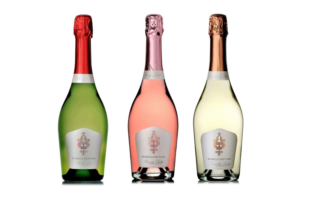
t: When we talk about “baby boomers”—consumers born between 1945 and 1965— we’re talking about a generation that is loyal to brands. They like known and trusted quality and they will search for it. They value tradition and like being marketed to in traditional ways. They’re the wealthiest generation in the world, with more free time, and they tend to be drawn to premium brands.
A way to connect with baby boomers is to keep to tradition by using familiar serif typography. In terms of layout, we might focus on symmetry, balance, and an overall look of tidiness. Classic brands appeal to this consumer when they keep to their traditional look. They mustn’t lose their DNA, but should subtly evolve their brand.
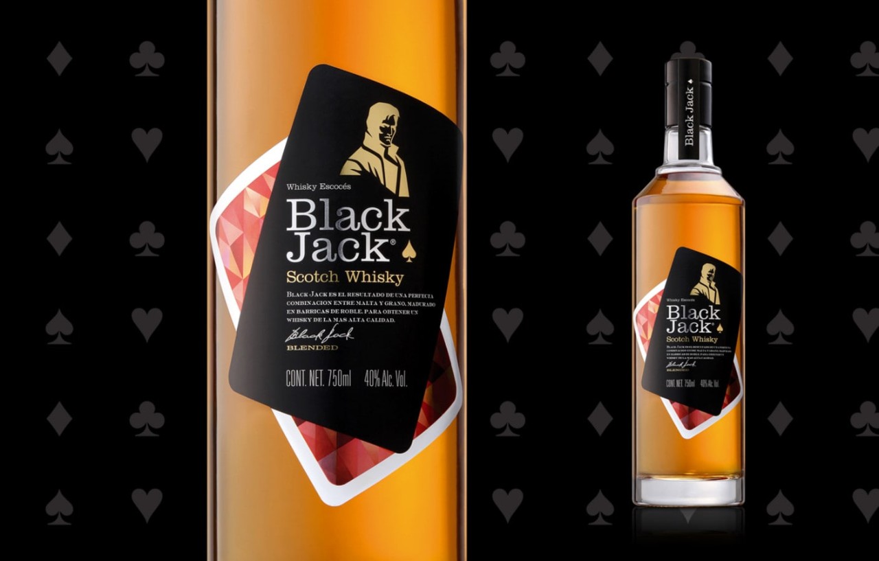
In terms of label materials, we will often use facestocks that are textured and high quality, then also use finishings like foil applications, because they are a cue to a certain type of quality. In terms of bottles, brands appealing to baby boomers typically use engraving on the bottle itself, like a molded glass bottle or innovative labeling that creates a engraved glass look.
As this generation advances, natural changes in eyesight make it advisable to make labels easier to recognize and legible by using typography and logo designs that are larger and easy to read from a distance. Boomers are attracted to the tactility of embossing. This added element can add familiarity to the brand story through the label.
We’ve found these consumers connect with some very interesting stories. Baby boomers tend to be interested in limited editions, as well as exclusive and vintage wines. The idea of a special, unique, or rare vintage is very compelling to them. They buy less but will invest more. When looking at design trends in high-end spirits, we see that many brands are still working with traditional design trends because they want to seduce baby boomer consumers.
M: Next up is Generation X. What design features speak to this group?
t: Generation X is how we describe consumers born between 1965 and 1980. We know this one the best because it is ours! This generation knows the analog past and lived through the shift to digital. As a generation, we feel we are a “guest of technology.” As we enter the middle of our working years, our generation tends to be a bit more skeptical of brands and companies we’re not familiar with.
In this skepticism, Gen X consumers look for brands offering the right mix of quality and value. They don’t spend a lot on super premium brands, but they don’t want to spend less and get less quality. They seek balance.
In terms of culture, these consumers tend to harken back to the good old days of the 80s and 90s, their childhood and adolescence. They like true, fact-based storytelling. They also tend to look for a minimalist version of the past—a clear reminder, without a lot of ornamentation. There’s a necessity for brands targeting Gen X to balance the vintage feel with more modern elements that keep consumers feeling young.
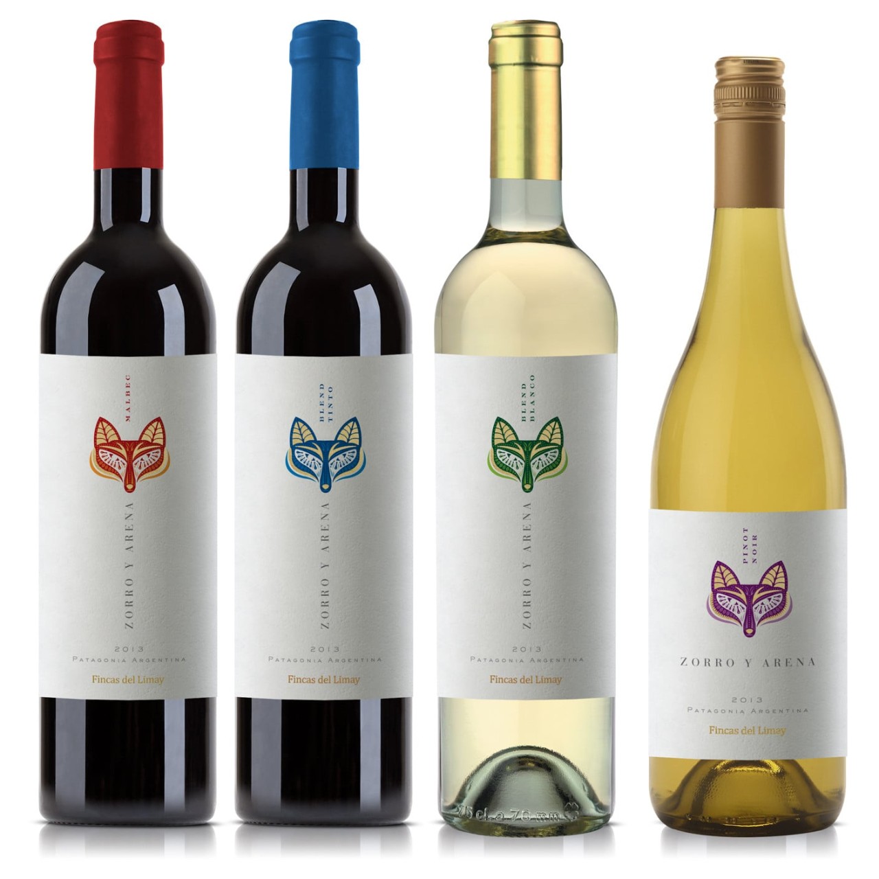
These consumers tend to connect strongly with craft stories, but not in the same way as millennials. For these consumers, it’s more about discovering something exclusive or special, whereas younger generations might look for something new or innovative. Gen X consumers are looking for products that reflect their status in life, but without being too “in your face.”
These consumers like bespoke designs that question the status quo. They’re not necessarily looking for a classic wine bottle. Some smaller wine packaging may suit their lifestyle best. They want sophistication and minimalism—with lots of white space on the label, with the facestock being the main feature. Because of this, it’s important to have an interesting label material that allows brightness, unique finishes, varnishes, and foils. Natural textures are very suitable when branding for Gen Xs, with watermark and embossing being popular design elements.
M: How do you design for millennials?
t: We categorize millennials as those consumers born between the 1980s and 2000. Millennials like brands with a purpose. It’s important for these consumers that they the brands they support have a social impact. They are energetic, tend to be dreamers, and want to change the world. To a millennial, money is not everything. They prefer brands that strive to make a positive impact.
In terms of design, millennials want a fresh, new look that reinvents the past. They find in it an escape from today’s frantic lifestyle, an antidote to a world of continuous change. They want to go back to the “old ways” of their ancestors. They see the past as a kind of reminder of a quieter era, when things were done with a passion and not yet so industrialized. For millennial consumers, it’s important to convey a sense of days past, but with a refreshed, modern feel.
Brands targeting millennials can be recognized by labels with neo-baroque style, large labels, labels completely covered by graphics, those with lots of ornaments, hand drawn labels, and any of these combined with engravings.
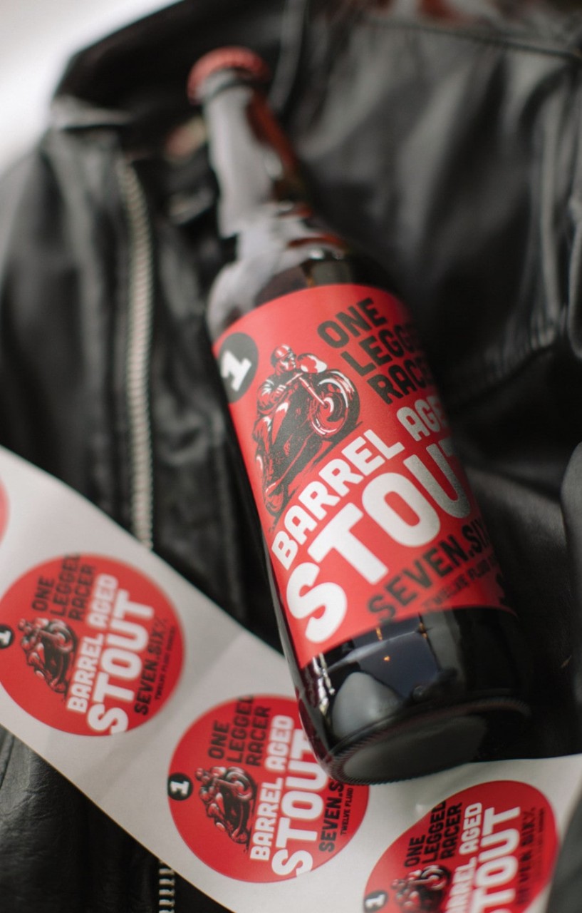
If you pay attention, you will notice it’s not the same past as with baby boomers—there’s a little twist to the past. These labels try to tell a story, so they are very large, sometimes covering the whole front of the bottle. It might be an engraving of the founder’s signature for example, or a label with some humor. You might find an atypical portrait, a funny person making faces. It’s all a reference of a historic graphic style, but with something new and interesting to grab the eye. They have to look retro, but not old-fashioned.
As a generation, millennials embraced technology at an early age, and they like to interact with brands through technology in a meaningful way. They can connect with the brand through the wine packaging with their mobile phone—as it’s always in their hands. Brands can use intelligent labeling to tell their story, so consumers can listen and experience the brand right from the shelf.
M: As Generation Z enters their late teens and 20s, what informs how you design for their wants and needs?
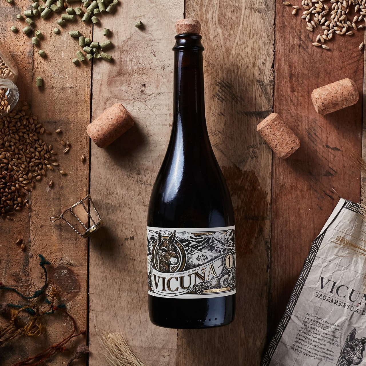
t: Gen Z consumers are very aware of sustainable solutions because they feel responsible for the environment and the future of the planet. They tend to be interested in organic wines, and are comfortable asking about the environmental footprint of packaging and labels. For this reason, brands that choose organic prints or sustainable packaging can add value to their product offering.
As the youngest generation of consumers, we categorize Gen Z as consumers born between 2000 and 2010. They are digital natives born with smartphones without buttons. They’re learning to rule the world with just one finger. As consumers, they’re multi-taskers with a low attention span.
For Gen Z consumers, everything has to be fun and informal. They like to be surprised. In some ways, they’re a bit like a millennial, except they’re a bit more conscious of their purchasing habits. The Gen Z consumer is at the beginning of the drinking age, so they’re open to new possibilities and for us they represent where the future is heading.
Traditionally, typical spirits and wines are manufactured and packaged differently—sparkling red wine, mix wine and beer, wine in cans, etc. Other generations won’t accept these packaging changes easily, but this generation will find alternative packaging interesting.
Brands should use their brand story and be completely transparent. Gen Z wants to see how the product is made. Being fun and visually interesting will allow brands to connect more effectively, instead of through traditional advertising means. They feel they can decide for themselves if they want to interact with brands on social media. They want to speak with brands in first person, not third person. They also want to see the work in progress.
Gen Z consumers like limited edition items from brands they already like. They don’t like it because it’s rare, they like it because it’s unique and their experience will be new. This generation is attracted to labels that evolve over time. In terms of converting, digital print technologies match their desires. Unlike millennials who enjoy the uniqueness of a personal label, Gen Z looks for brands that change and grow along with them.
M: Thank you for taking us through your process! We look forward to continuing to follow your design theories in practice.
For the first part of this interview, check out our article, How an eye on generational behavior and design trends can set a brand apart.
tridimage future-proofs Latin American brands through packaging design. The award-winning company’s creative headquarters are in Buenos Aires and it has account managers in Mexico, Ecuador, and Guatemala. Combining 3D branding, graphic design, and structural packaging, tridimage creates, revitalises, and extends CPG brands to positively impact consumers, the market, and society.
tridimage's reputation attracts the attention of both established and emerging companies operating in Latin America, the U.S. and Europe. Since 1995, tridimage has worked with clients in more than 30 countries. Their designs have been awarded with numerous Pentawards (known as the “Oscar award” for packaging design), Vertex awards, A'Design, Ameristar, Good Design Seal, POPAI, Estrella del Sur, and Pack Andina.


Hernán Braberman is Partner and Executive Design Director of tridimage. He co-founded the company in 1995 and has since spent his time building and renewing brands throughout Latin America and Europe, contributing with his knowledge in brand strategy and packaging design. His work as a designer continues to take him around the world, where he shares his experience and knowledge with all those who recognize the limitless power of design.
Guillermo Dufranc works as Project Manager at tridimage. He writes articles about packaging design for international magazines and design, and has also published several ebooks. He is an International speaker who speaks at conferences and workshops related to packaging design and design thinking in companies, universities, and exhibitions. He has been invited as a jury member for several packaging design competitions.
Related Articles