Minimalism in design—insights from Design Shanghai
At Design Shanghai, a leading international design event, Avery Dennison designer Sunny Lee got an in-depth look at top design trends. Between the five halls at the show—Contemporary, Classic and Luxury, Collectibles, Kitchen and Bathroom, and Workplace—she saw a few common threads.
One was natural elements—a theme we explored in Nature in design—insights from Design Shanghai. Another was minimalism.
To a consumer, minimalist design may look simple. But for a designer, it’s anything but. The question of aesthetic quickly becomes blended with consumer / brand interaction. What information does the consumer need to know? How can you convey that in the simplest way possible?
The idea of minimalism in label and packaging design isn’t new. But with a renewed industry focus on sustainability and innovation, the minimalist trend was a popular one at Design Shanghai—and one that we’ll continue to see front and center for a while, according to Sunny.
“Minimalism in packaging and label design may sound cliché, but it allows the expression of core information without the unnecessary embellishments that can distract consumers. Minimalism has gained popularity in Asia among designers and consumers in recent years. I think it’s something we’ll continue to see continue to grow in relevance and importance in the near future,” she says.
Minimalist design elements keeps things simple
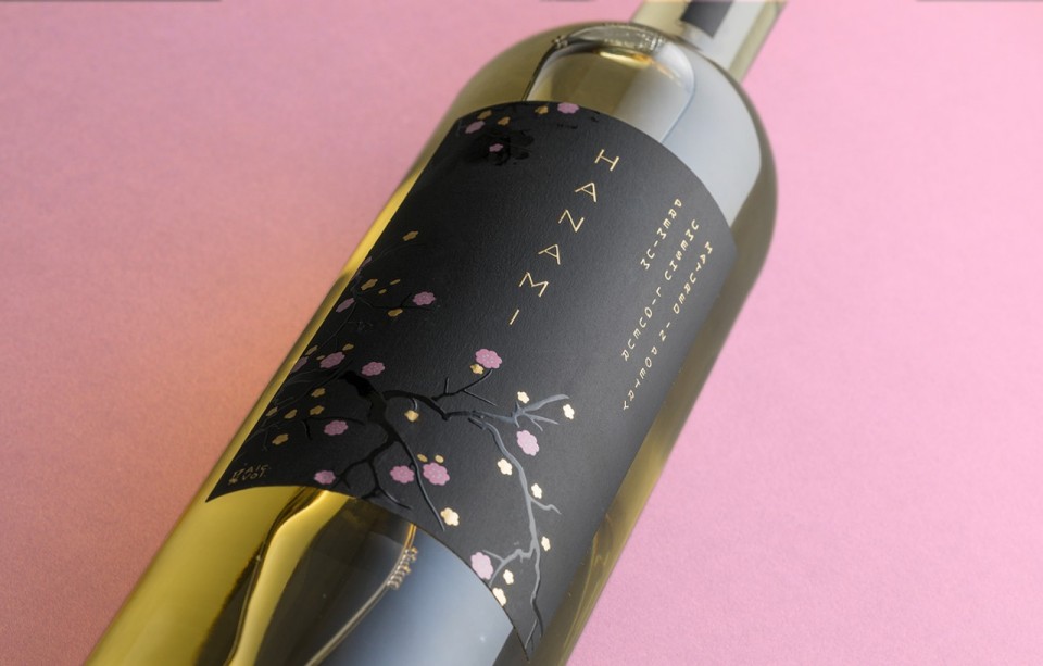
“The idea of minimalism is often illustrated with basic design elements such as line, shape, color, typography, and simple graphics, rather than complicated or cluttered ones—which can distract consumers from the true brand message,” says Sunny. The minimalist approach doesn’t mean the absence of design, according to her. Instead, minimalist design allows for a concise brand message and a clear and straightforward delivery, like we see in the Lokales Vasser design.
“Minimalist design also does not mean boring,” she says. It actually allows a label to be eye-catching, and stand out on the shelf. But how does minimalist design win when it competes with other leading design trends? ”Premium label material, bold typography, a color palette full of contrast, and minimal label copy were popular at Design Shanghai,” she says.
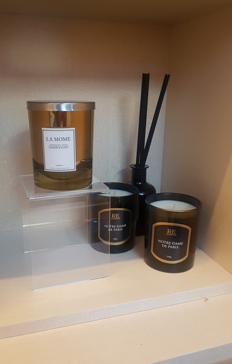
Minimalist labels and packaging require premium materials
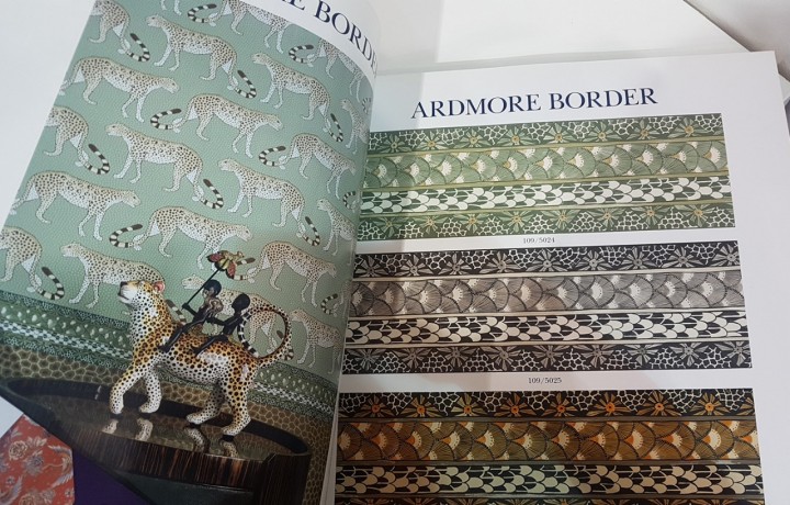
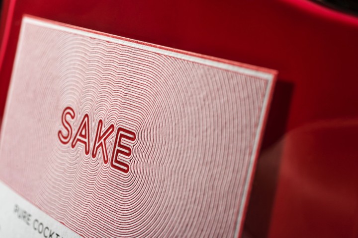
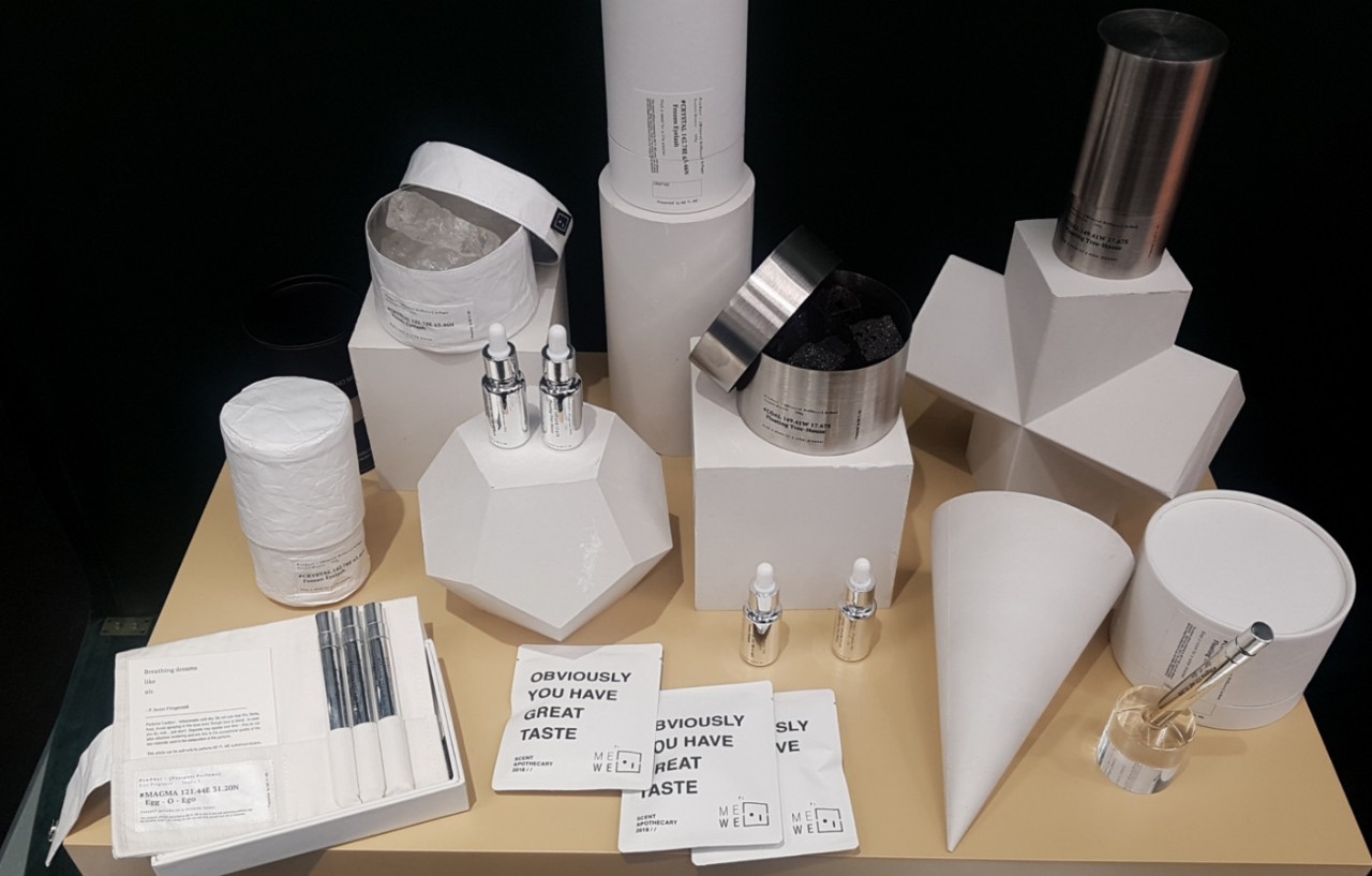
Achieving a minimalist look with a high-end shelf appeal, depends on the materials chosen by the designer. The premium materials not only served as a backdrop, but acted as an important part of the consumer experience. Using both tactility and texture, facestock aesthetics elevated the look and feel of both the brand and the consumer experience.
“When people consider buying a product, they instinctively pick it up and touch it. The texture of the label and packaging materials create a unique impression and experience. Using a wood label, for example, can convey ‘nature’ and ‘handmade’ value propositions, while a velvet label might convey a ‘luxurious’ or ‘romantic’ value proposition,” says Sunny.
The minimalist label design and premium materials use at Design Shanghai gave her plenty of inspiration. But the one concept she’s still thinking about is the power of materials in minimalist design.
“Selecting the right material can showcase a brand’s personality and value proposition to consumers and set them apart from others. Allowing the material to do the talking is the ultimate minimalist design application.”


