Search
Back to the essence of design with Diego Giaccone
Agency
Diego Giaccone
Client
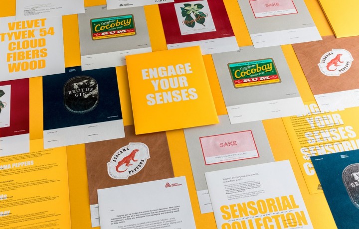
Avery Dennison
For more than 20 years, Diego Giaccone has been working with Latin America’s leading brands. In 2005, he founded Sure Brandesign, where his team of seven develop unique branding and packaging design for brands throughout Latin America, the US, and Europe.
The award-winning designer speaks at lectures and conferences throughout Latin America and is the author of Quebranding!. To learn more about the inspiration behind his designs, we asked Diego about his favorite projects, where he finds inspiration, and the origins of his love of typography.
M_use: In your online portfolio, you have a lot of interesting projects in the food and beverage segment. Can you explain what you like so much about labels and packaging design for food and beverage products?
Diego: Before founding my agency, Sure Brandesign, 15 years ago, I worked for 10 years in international branding consultancies. That's where I began to combine my love for design and branding. I started thinking about creative ways for brands, enhanced with the versatility of design, to create their own language and unique style.
I like labels that are easily recognized, and are easy to verbally describe when someone asks for a brand or product recommendation. I also love working with different product categories. The differences, I feel, nourish us as an agency.
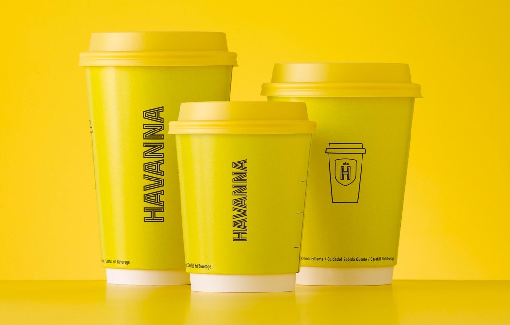
For example, working in consumer goods, I love the immediacy of the point-of-sale, and the eight-second purchasing decision. It requires you to design powerful brands with strong identifiers that stand out and are easily recognizable.
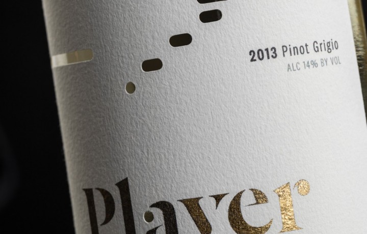
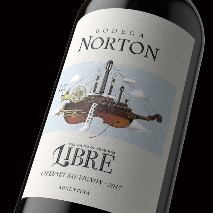
And on the other side, I love the world of wine. It’s a world of its own—complex and fun at the same time—in which you have to be a specialist, yet you can’t be so specialized that you don’t continue searching for unexpected, new solutions the ever-changing category requires.
M: What type of product is your favorite? And why?
D: I love to face problems and solve them creatively, first with a creative strategy that generates brand opportunity, and then to reflect that strategy with good design that embodies the values of the brand. Every product category is different and provides different challenges, which I love.
In the world of consumer goods, you have to work hard to detect, prioritize, and enhance the brand identity that makes people recognize those brands and remember them for repurchase in the future. I am very excited to redesign classic brands, in which we have to evolve their image without losing the essence of the brand or the consumer recognition. It’s a super strategic job of knowing what to change and what to keep.
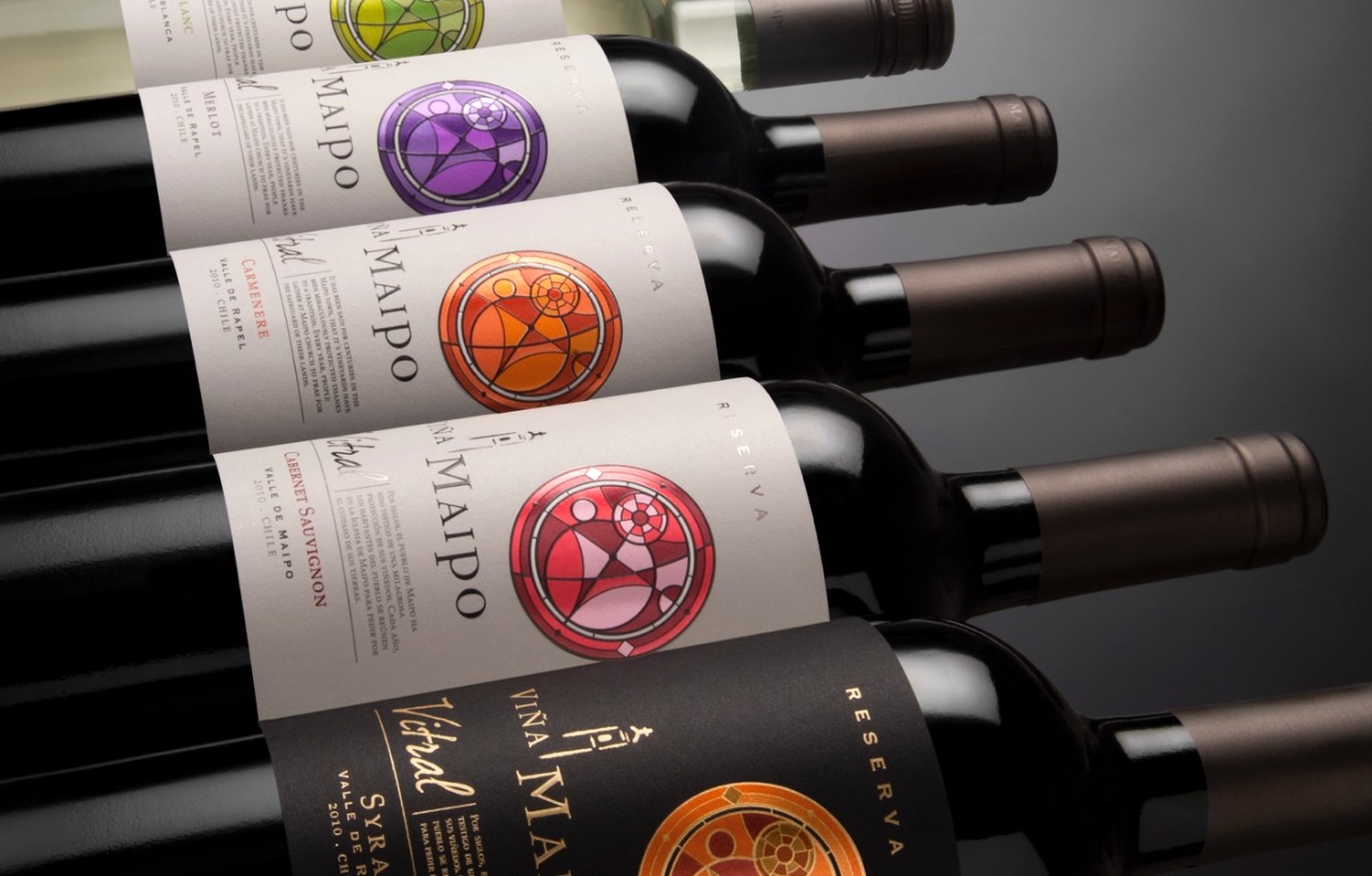
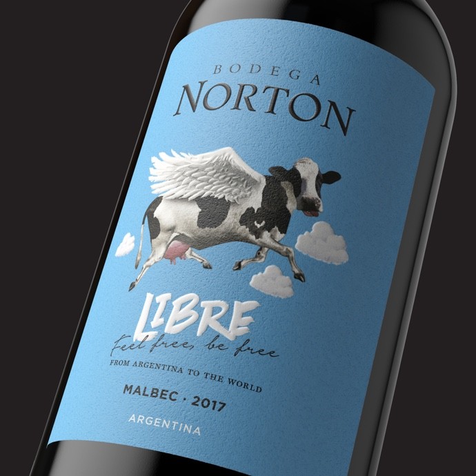
In the world of wine, brands communicate concepts and are looking for freshness and artistic versatility. The origin and the winemaker are no longer important for the typical buyer, but more so for the connoisseur, which changes our design process.
In designing wine labels for millennials, a lot of work is done on the concept phase. Here, we find a short story to tell, and then we use disruptive designs that attract attention at the point of sale. To be successful in creating a unique style, it’s necessary not to set aside preconceived ideas of the industry and to take a fresh look at every product. For me, I want to make a connection with these non-knowledgeable consumers.
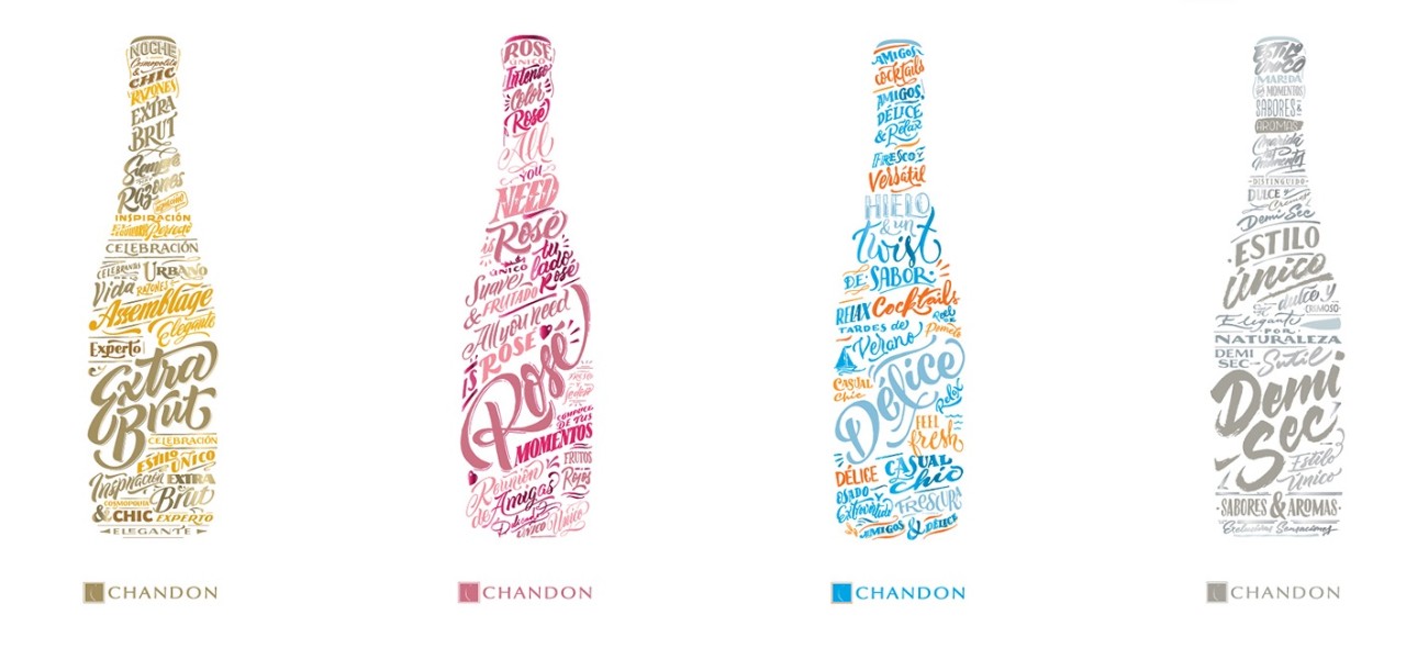
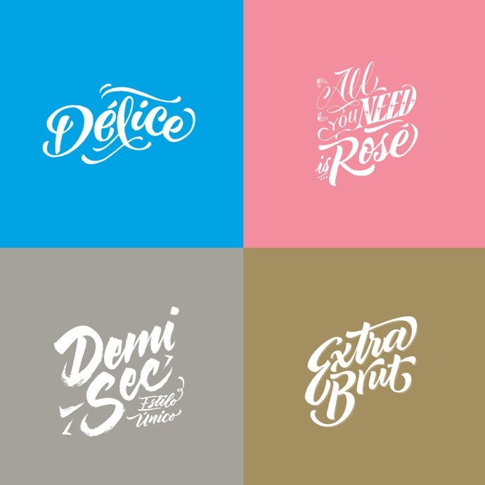
My experience in consumer goods and my love for design makes these design projects go well. I enjoy working on illustrations, handwriting, and creating my own artistic interpretation.
M: Can you tell us more about your design style and where you go for inspiration?
D: I always say that our inspiration is the client's brief, which is where creative opportunities begin. Then we have a “Brand Safari” process to see the current design trends in the world of wine. For example, I have gone to Prowein for several years now, and it is the place where I see all the trends in the world of wine together.
About seven years ago, something clicked, and I changed the focus of my agency. I always liked design, calligraphy, typography, and illustration, but I felt that my agency was becoming "very professional." That’s not bad and we were doing very well, but I didn’t enjoy it.
I created a concept called “Back to the Essence”, which focuses on returning to the essence of design: illustration, lettering, typography, handwritten font, photos, digital renderings or those by hand. The idea being so that the brands we work with can create a unique visual language that helps them stand out at the point of sale.
That is why my goal has been to build teams with talented people who have their own aesthetics and art. I have never emphasized the experience a person has, but quite the opposite. I like people to come free, without prejudice and with a fresh head. And I'm guiding them and getting the best of them.
M: How do you approach a design summary for a label and packaging design?
D: From my point of view, wine label design is 50 percent creativity and 50 percent how you implement. The printing and finishing methods are especially important. When you take that product into a meeting or just in your hand, those details are key. Often, the choice of paper determines the printing system and inks, and whether we use stamping, screen printing, embossing, metallic inks, to achieve the desired look and feel.
When you design a product such as wine, you have to think about all the details to achieve brand consistency, from the bottle to the capsule and to the back label, which is also very important for providing relevant information like what food best accompanies the wine.
But the most important step in the design process is to taste the wine—to stimulate the senses.
M: I see that you design your own fonts as well, which is very interesting. How did you get into that?
D: As a kid, I drew magazines to entertain myself in the pre-tech era. And in those magazines, what I enjoyed most was making announcements and logos, that is, handwriting. I think my taste for hand lettering was born (and didn’t stop) there.
I really enjoy doing calligraphy or lettering in my spare time, but I don't show anyone. Years ago, I had an interest in joining calligraphy with typography, and I spent four years designing a calligraphic type, where my goal was to challenge technology and line so that it doesn't look mechanical and does look calligraphic. That typeface led me to form a typography company with three friends that we still have. It is called Sudtipos.
Since then, I’ve made four more typographic families: one using a brush, another with the style of the Buenos Aires fillet of La Boca, a sans serif that took two years, and another simply with my handwriting that took two days.
I am passionate about combining art with technology, and the idea that something handmade can be programmed into a computer and can be used to type a phrase. For me, it’s about bringing hand lettering to the computer. And something challenging is that there is no brief or client. It was just my own artistic expression and hobby.
M: What advice do you have for label and packaging designers?
D: Make your own way and enjoy the process. Don’t get caught up in structure, but continue enjoying what you do. And listen to the client. They’re the head of the branding process that you’re developing.
About Diego
Diego Giaccone is the founder and director of Sure Brandesign and a founding partner of Sudtipos. He has won awards at Sure Wave Festival in Brazil, Los Angeles International Extra Virgin Olive Oil Competition in the US. Diego studied graphic design at Buenos Aires University. Learn more about Diego and Sure Brandesign on his website.
Related Articles