Search
Interview Jordan Jelev
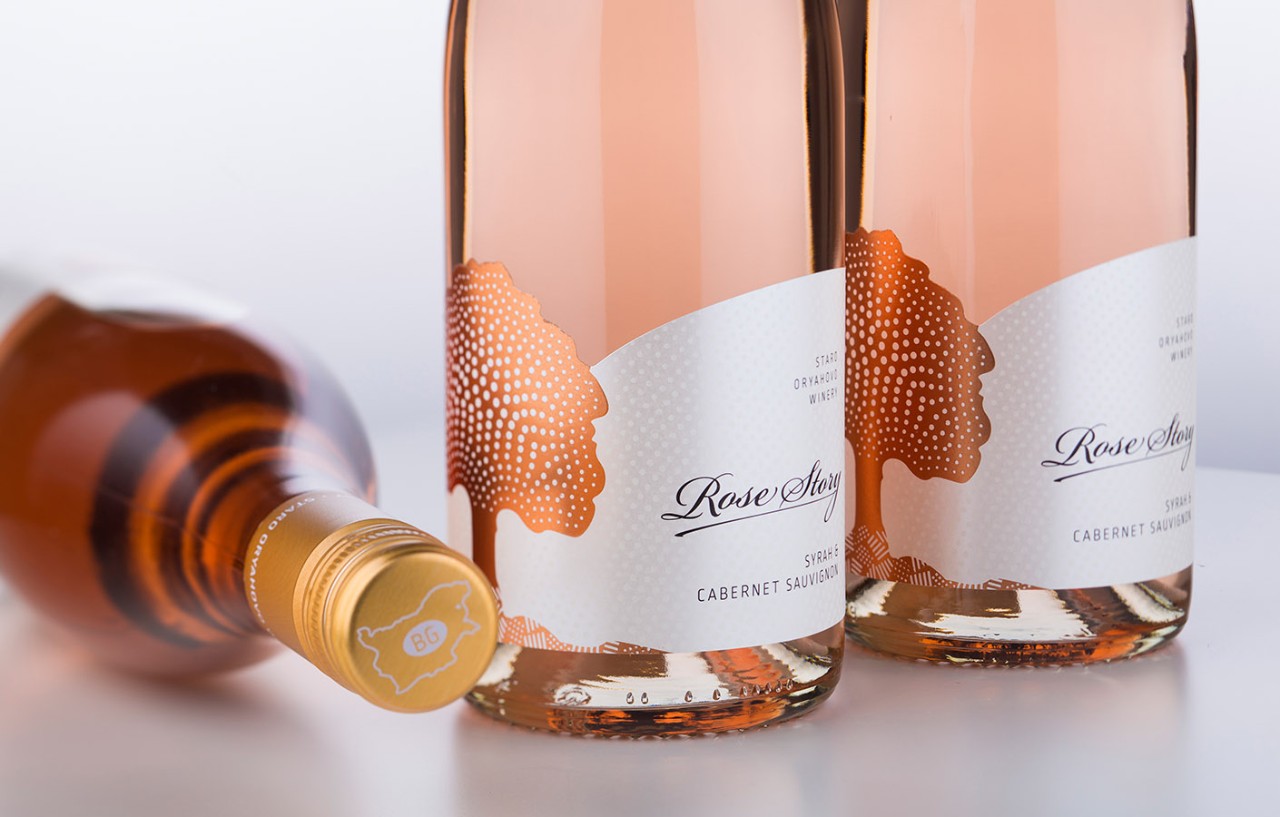
Jordan Jelev is a wine label designer and calligrapher based in Varna, Bulgaria. He’s the creative mind behind the Wolf’s Head Wines label design. His agency, the Labelmaker is focused exclusively on wine, spirits, and beer. Jordan has more than 15 years of experience creating memorable labels for premium brands and is an award-winning designer.
Recently, the M_use team had the opportunity to talk to Jordan about his creative process, his inspiration, and his favorite design projects.
M_use: What is your design creation process? Where do you begin and how do you find inspiration?
Jordan: I usually try to set the right mood for each new project. Before getting started, I do some sort of mental preparation with meditation. I also do a lot of research for each project I work on. This is an essential part of my preparation.
As for inspiration, I try to stay focused in my thoughts. I have lots of scenes, objects, images in my memory that awaken my fantasy and inspire me. Sometimes I do dedicated searches in books or on the internet--studying different processes, styles, etc. For example, I often study heraldry, different techniques and styles in painting, and calligraphy. This usually means seeing a lot of different images. I can’t store them all in detail in my mind, so I create some general ideas that I later use as inspiration in my new creative process.
M: You've said in the past, "materials go hand in hand with my creativity." Do you begin first with materials or design? How do they go together?
J: They definitely go together hand in hand. When I start something new, I usually have two creative flows that go parallel. One is for the idea and the story behind the project, while the other is mostly for the material and technical aspects of what is about to be done and how to transform the technical part into aesthetics.
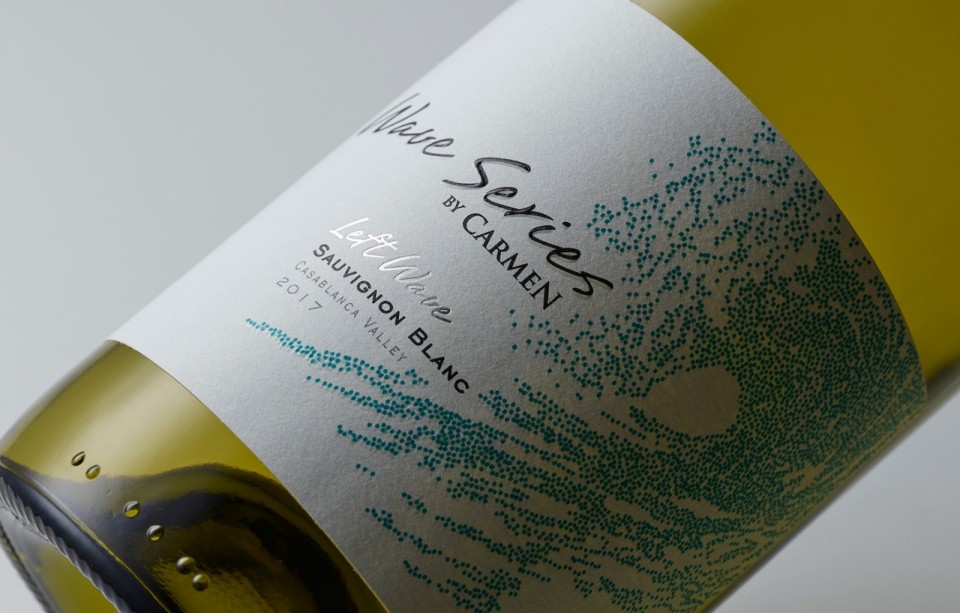
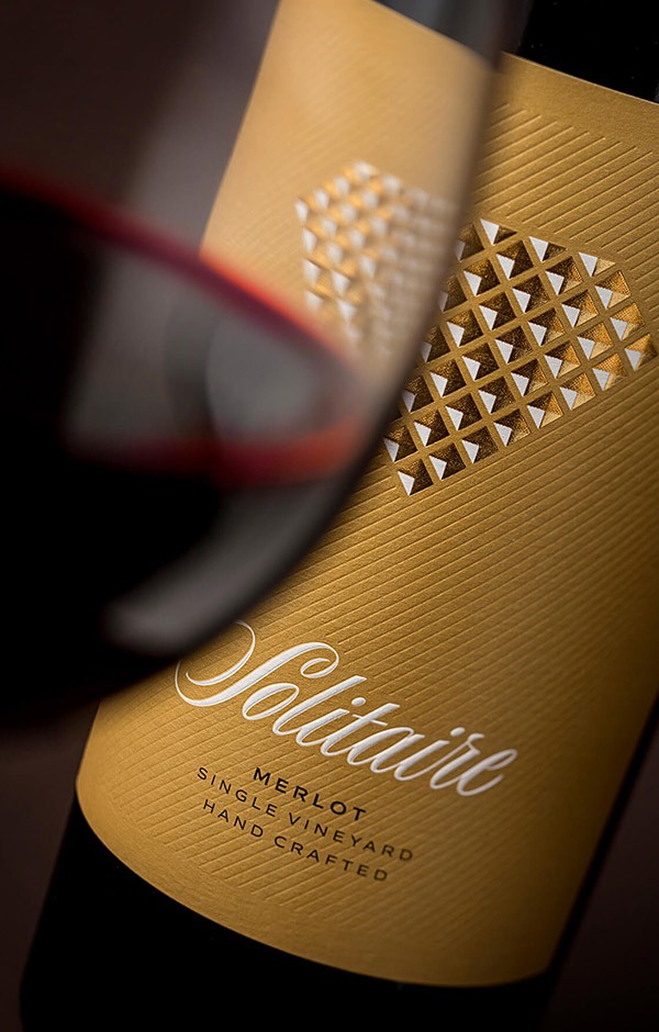
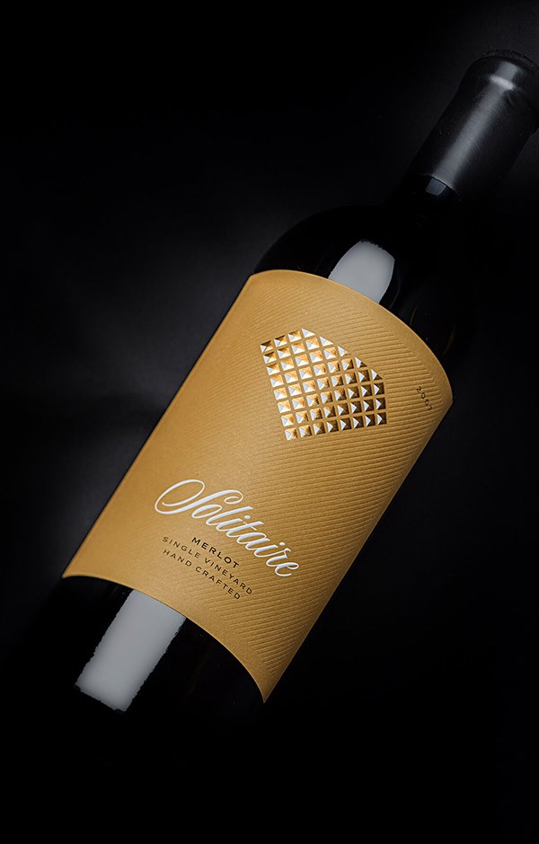
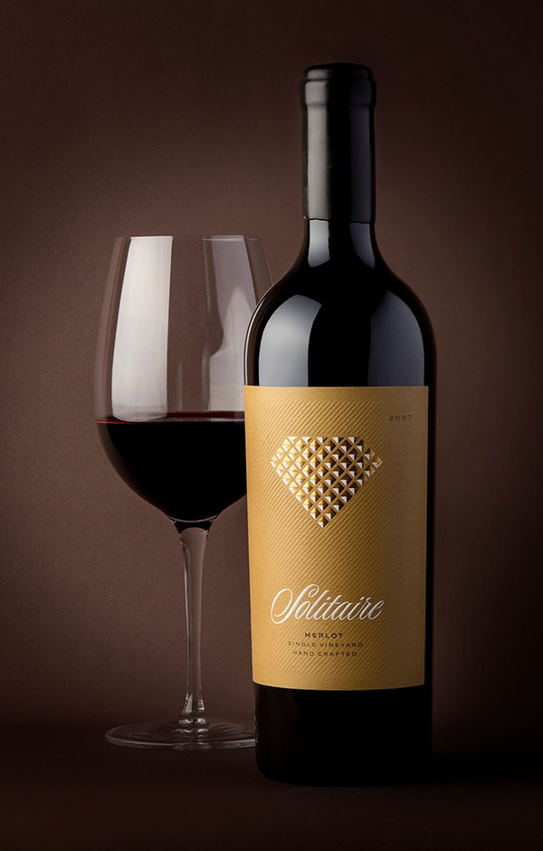
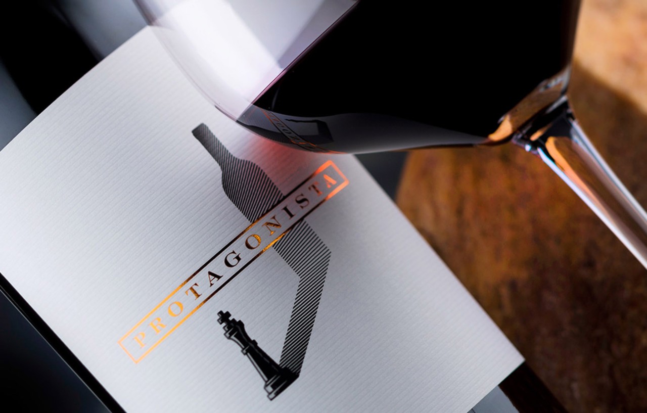
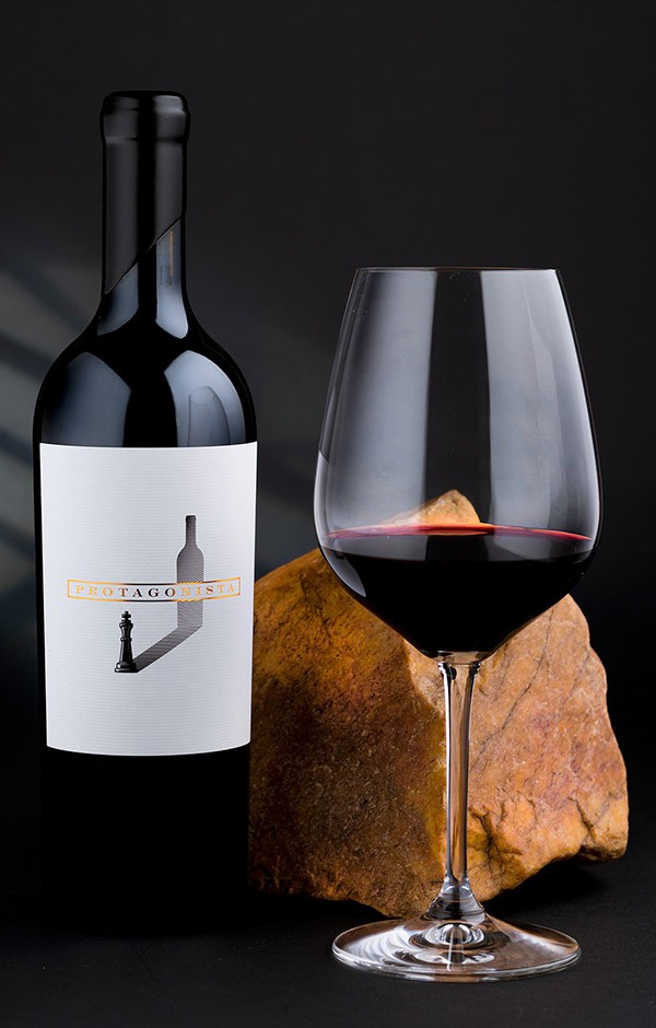
Those two creative flows live in balance, though, I have to say, sometimes one dominates the other. Speaking of papers, for example, I sometimes customize every part of the design to fit a specific paper I find inspirational--like in the Solitaire redesign I did in late 2019. The Fasson Cotton Touch paper was right in the center of my initial research and conversations before I even started the project. I was really lucky to discover for myself this paper as it became a foundation, and therefore an inspiration for the whole creative work.
M: We've seen a global trend and interest in sustainability for packaging and labels, have you also noticed this trend? How does it affect your design process?
J: The world is trying to get green, or at least greener than it is now. Sustainability is a word we started using more and more frequently in our daily speech. For me, as a wine branding professional, I believe that sustainability is not only just a word, a material, a trend, or a fact. It is something more regarding the whole creative process, as it is without any doubt a real theme, a motive, and an inspiring source for a new type of creativity. Sustainability is a new key that will unlock new concepts in my design work.
M: What would you say are the biggest innovations in terms of design for packaging and labels right now?
J: First I am very happy with the diversity we have in the paper world. Second, I really like what is happening in printing. Paper and print go always together, and nowadays we have the chance to do almost anything on paper.
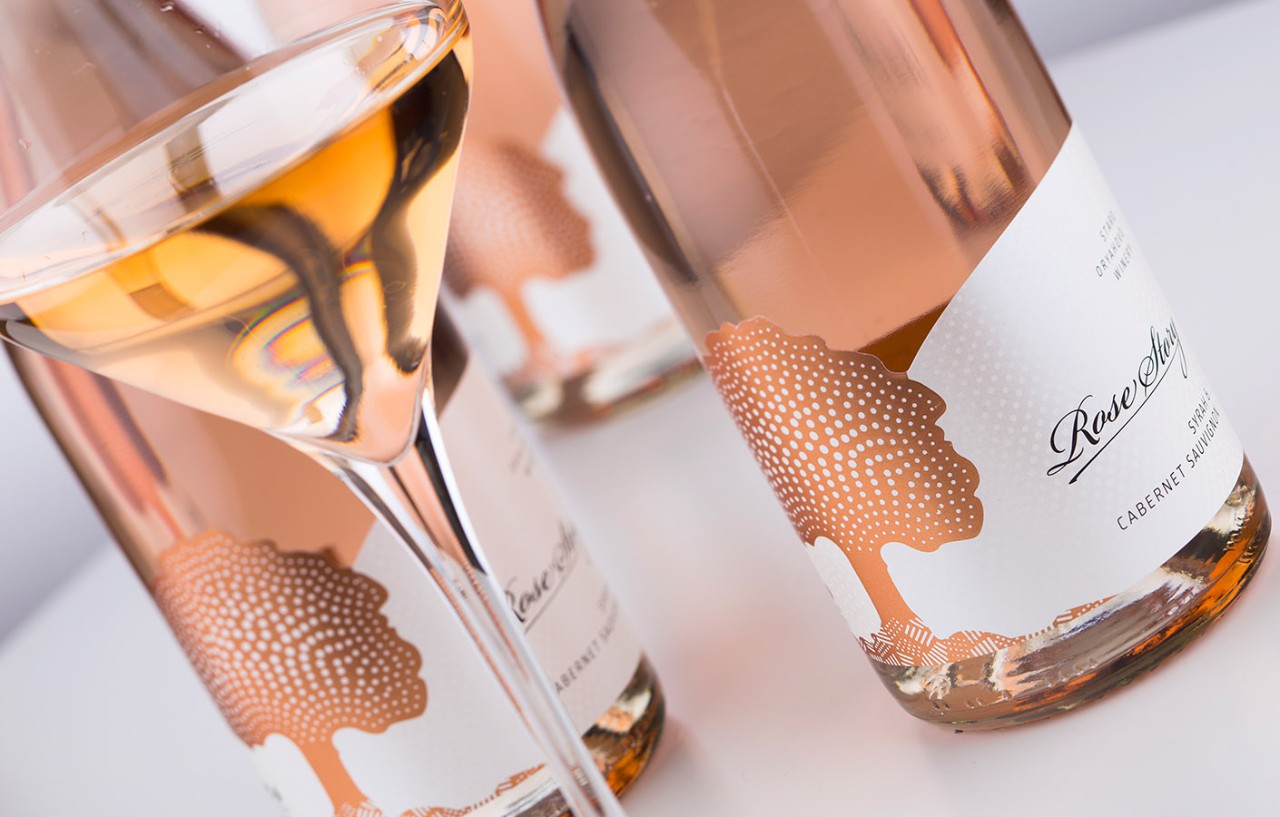
For me as a graphic designer, there are some particular effects I really like a lot. I like to design appealing labels that really make you want to touch them and feel the materials. I very much like different levels of embossing and debossing and the play with micro embossing. I also feel very confident when I use silk foil effect along with raised varnish and sand effect varnishes. And I am really excited about using several paper layers applied one over another in one label. All these processes are getting more and more sophisticated, and if you have a good reliable printer, then you could do miracles on paper.
M: What projects or design styles interest you the most and why?
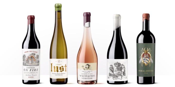
J: I am not focused or interested in any particular style or type in design. What I am really trying to do in my work is to get the best from every idea I am working on and transform it into memorable label design.
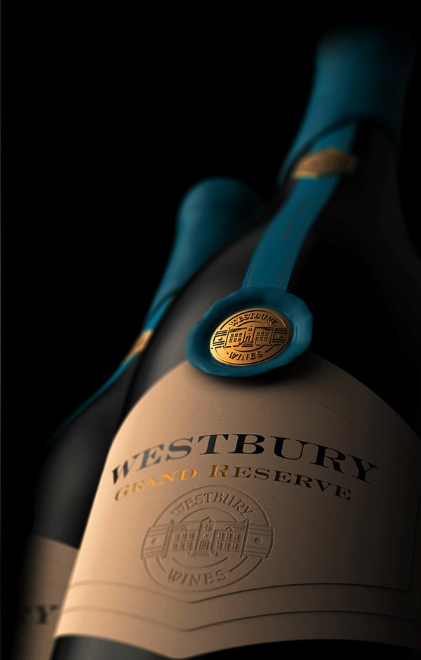
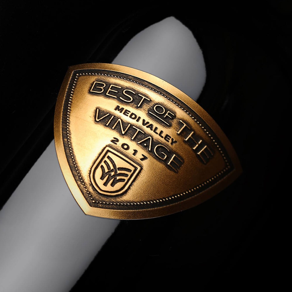
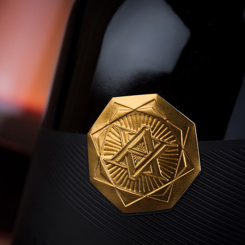
This often means that I work in many different styles, each reflecting a particular idea, and thus I get many different designs at the end. Of course I sometimes have certain periods in my career. For example, now I am very attracted to metal applications combined with paper labels. This is not something new for the industry, but for me it is a good way to create compelling wine label designs using this combination of technology.
M: How did you get interested in design? Was it always labels and packaging for you or did your interest begin elsewhere?
J: Visual arts played a serious role in my childhood. Drawing, embroidery, calligraphy, lettering were all things I’ve done since I was a little kid. I have always had a strong affiliation for the arts. Then one day I decided I should study economics, and after I earned my masters degree I became 1000% convinced I should continue with arts and become a graphic designer. This is how the Labelmaker was born.
M: Why is your focus on wine? Are you also doing food, beauty etc?
J:J: Initially I had no clear idea what wine really was to me--as a drink, culture, business, or lifestyle. Then, after I did my first labels, I tried to get deeper into wine in all its aspects. Meeting wine experts, drinking wine, studying wine, grapes, being at the vineyards, wineries--step by step I realized I fell in love with wine.
The other point of view is about wine as a subject of creativity and design--every wine is different, and each wine’s story is different. With my wine labels I have the unique chance to tell everyone a unique story. This is challenging, exhausting, and it is also an endless source of happiness and vital energy. So, really, for me, what else could it be but wine?
To see more of Jordan’s work, check out his portfolio at The Labelmaker.
Related Articles