Interview with Nano Alfonsín, Graphic Designer for Wine and Spirits
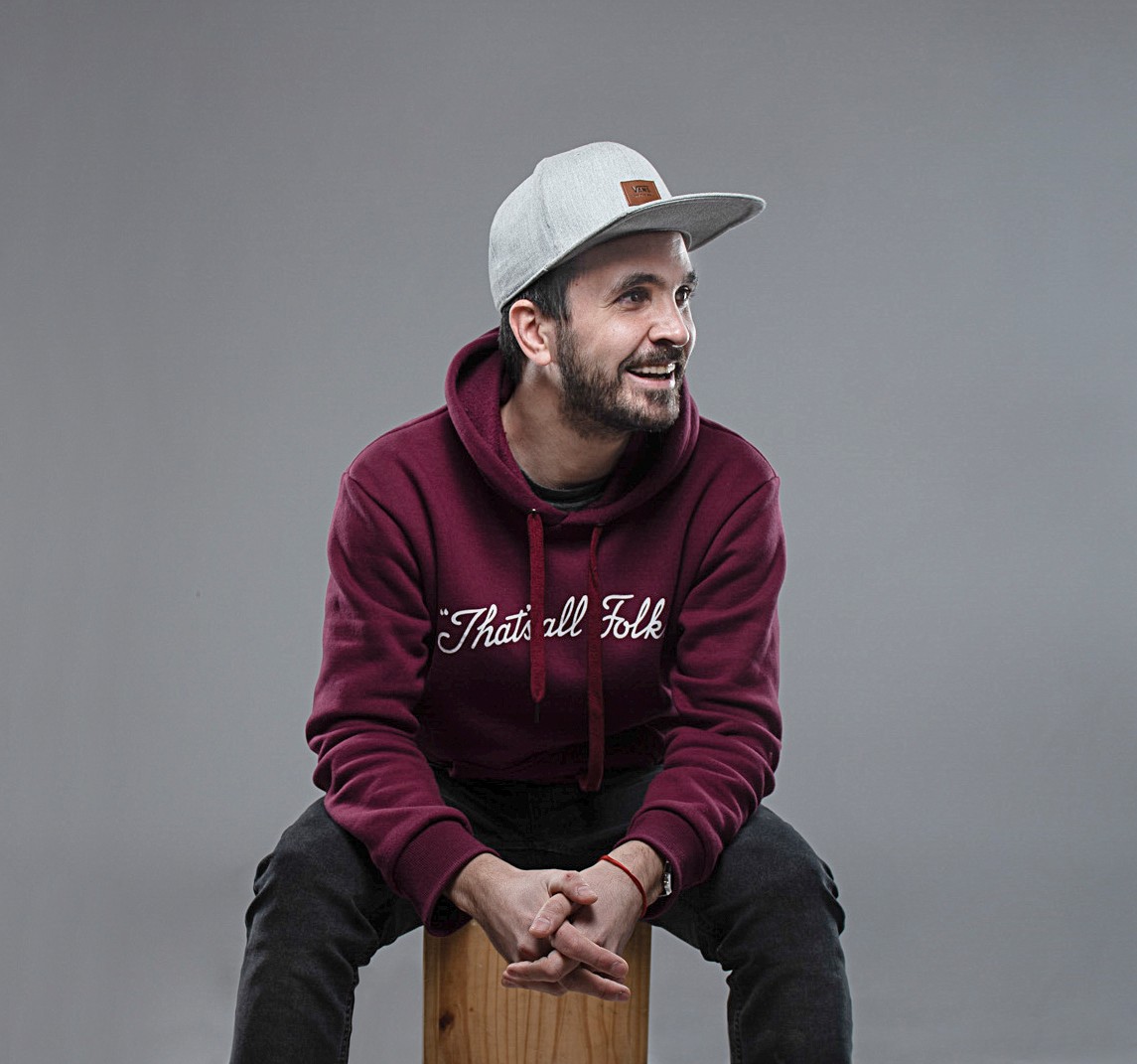
Passionate about design, Mariano “Nano” Alfonsín began his career in the Argentine province of Mendoza, recognized worldwide as the "land of sun and good wine." Having studied advertising, photography and drawing, Nano has become a Graphic Designer specialized in the design of labels for wines and spirits. Throughout his career he’s developed a portfolio of both national and international projects across Chile, Italy, Brazil, United Arab Emirates, USA, France, Canada, China, Mexico, and Great Britain which ultimately led him to create his own studio. With a team specialized in brand design and packaging for alcoholic beverages, Nano Alfonsín Studio manages to capture amazing designs for a wide range of products. Today, Nano works with a single approach: designing labels with their own identity that tell stories in an innovative way.
We recently spoke with Nano about his approach to design, the importance of high quality materials, and how he finds inspiration to create striking visual stories for his global clients.
M_use: What drew you to packaging design, and to specialize in alcoholic beverages?
Nano: As a child, I remember that I was always very curious about design and labels. I kept observing them and asked myself things like: Who makes them? How do they make them? Why do they make them? Before studying design, I didn’t have much of a notion of what designers do in their work, but from a very young age I was interested in the advertisements in magazines, on television, the packaging of toys, and I always kept thinking: What is the story behind all this?
On the other hand, being from Mendoza, in my house there was always a very present wine culture, so this is a category that touches me from a personal point of view. That is why when I had the opportunity to be part of the world of wine, I did not hesitate to accept. This was the beginning of a one-way journey.
M_use: You state on your website: "Being different from the rest is not accidental, it’s strategic." What is your process for discovering what that standout difference is for each brand and incorporating it into your design?
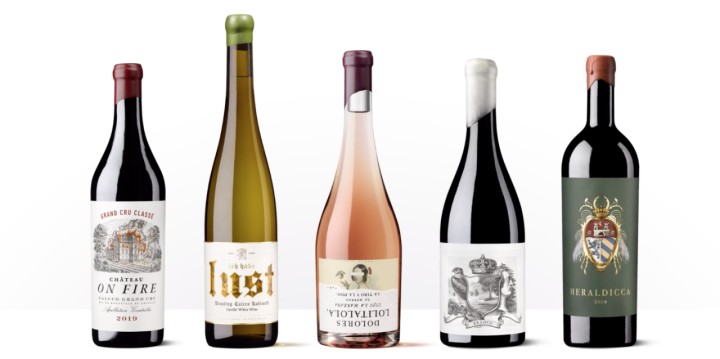
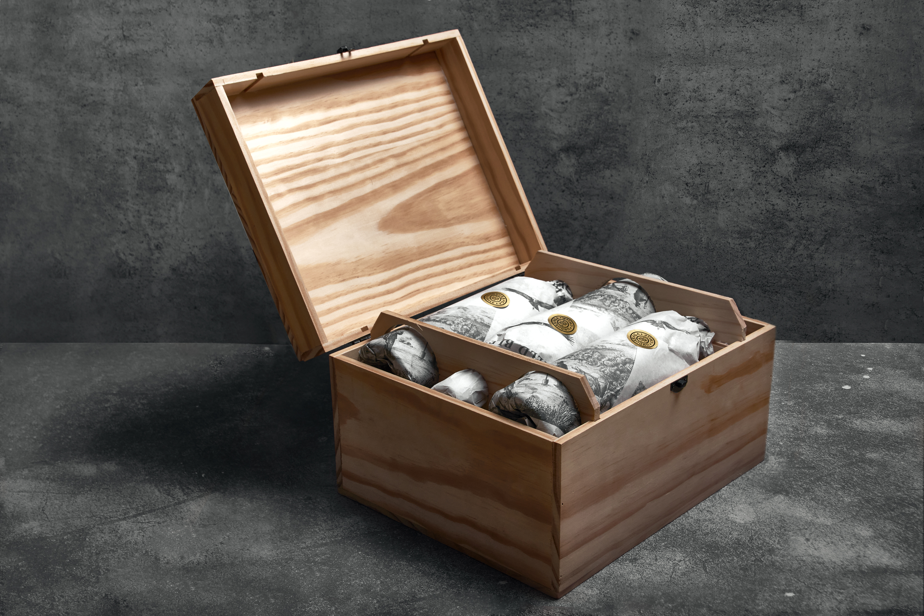
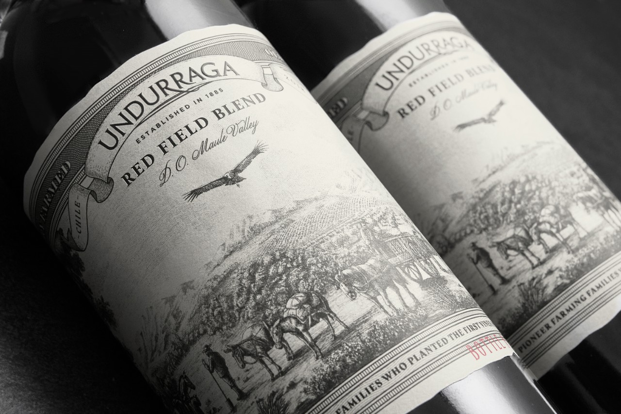
Nano: Behind every project there is a story that seeks to be told and in the studio we love to make that happen. We design labels with their own identity and, regardless of the nature of the product, we focus on its story which helps us consider the true identity of a brand and enrich the creative process. To do this, we really like to use illustrated designs since they give us the opportunity to express what we want to say in a lot of detail and convey messaging in a creative and eye-catching way. In short, a differentiating visual code.
Although illustration unites us and is part of our language within the agency, it does not define our design style. Our style has more to do with the opportunity to tell a story with the label. To be a storyteller.
M_use: Does that creative process change when working with brands across the globe? Are there key differences in how regions are using packaging design to stand out?
Nano: The creative process we use is usually similar since, for us, the importance is in telling stories in a striking way. Starting from that foundation, we begin a process of understanding the needs of each Brand Owner, their objectives, style and ideas, and we start to outline the first steps of what will be proposals that lead us to create the most disruptive, creative, and striking stories possible.
Having a good label is of the utmost importance to attract the attention of the consumer. Its design, image, and general quality will be factors that will decisively influence the purchase choice and it is vital to be able to get the customer to pay attention to the product. This is the challenge we have as designers and it is our starting point to work from.
M_use: Are there any disruptive design trends that you see flourishing in a certain region? Or ones that are quickly crossing borders?
Nano: The truth is that I don't tend to be very aware of trends. For me the key is to constantly seek differentiation. Although we know that there are certain classic products or wineries that are not going to change their image, we believe it’s more interesting to seek out and offer alternative paths and new visual codes that help reach other markets, other generations. The only trend that I follow with passion is, to the extent possible, to being different in every job I do.
M_use: How does material selection play a role in your creative process?
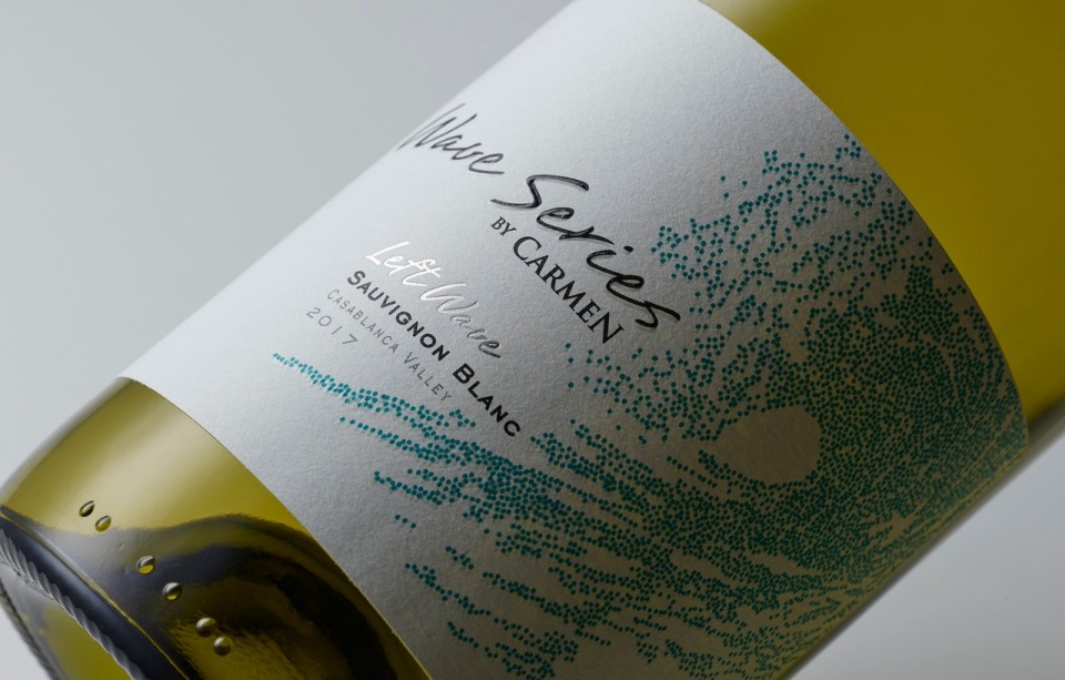
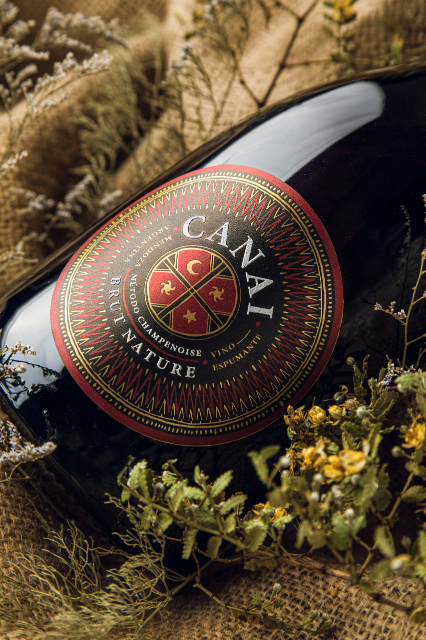
Nano: For me it is very important to portray the designs on materials that are up to the taak, so I consider selecting good materials to be a fundamental part of our work. Personally, if I have to name a material that seems really differentiating it would be Fasson Cuvée White Cotton by Avery Dennison. Its weight and texture, and the way it shows embellishments, can change a person’s perception when they hold the bottle. On the other hand, there are also classic materials I select such as Fasson Cuvee Martelé which, thanks to its subtle texture and great performance, is an excellent choice for a large number of label styles.
When choosing a material you have to think about how it achieves excellent performance, both visually and how the client we subsequently use the product, such as bottles that will go in ice buckets or be in contact with water. A wrong choice can bring down your design and a good choice can take the product to another level.
M_use: What design or packaging innovation is exciting you at the moment? How are you incorporating it into your work?
Nano: I like to explore other drinks because I can explore other codes, other mediums, other ideas. This diversity allows you to create other styles and other pieces. For me it is very interesting to be able to go out and encounter projects that do not have to do with the wine industry, as that allows me to continuously evolve in content and styles. In the long run, all that content ends up being part of a bigger picture which allows us to continue innovating in all future work.
To learn more and view the studio’s portfolio of work, visit nanoalfonsin.com


