Search
Bringing a concept to life
Agency
Thirst
Client
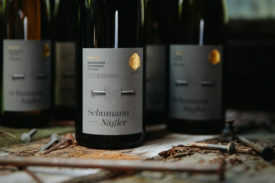
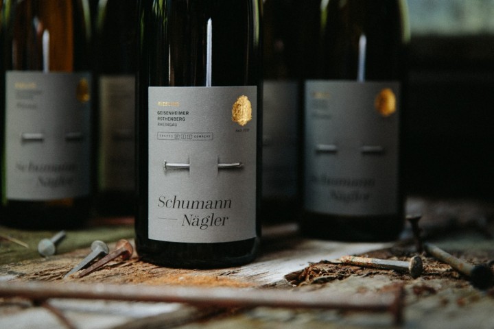
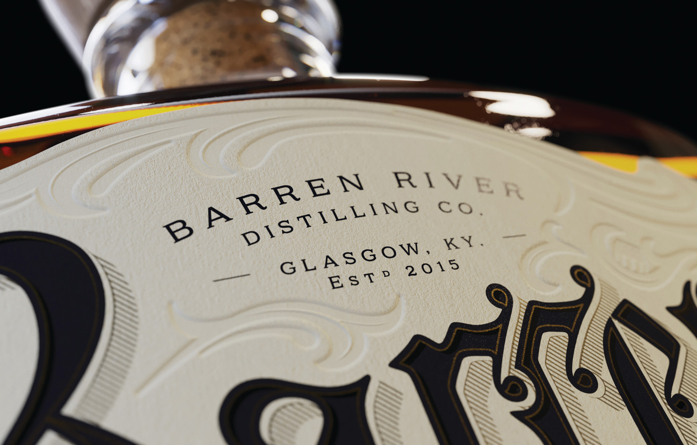
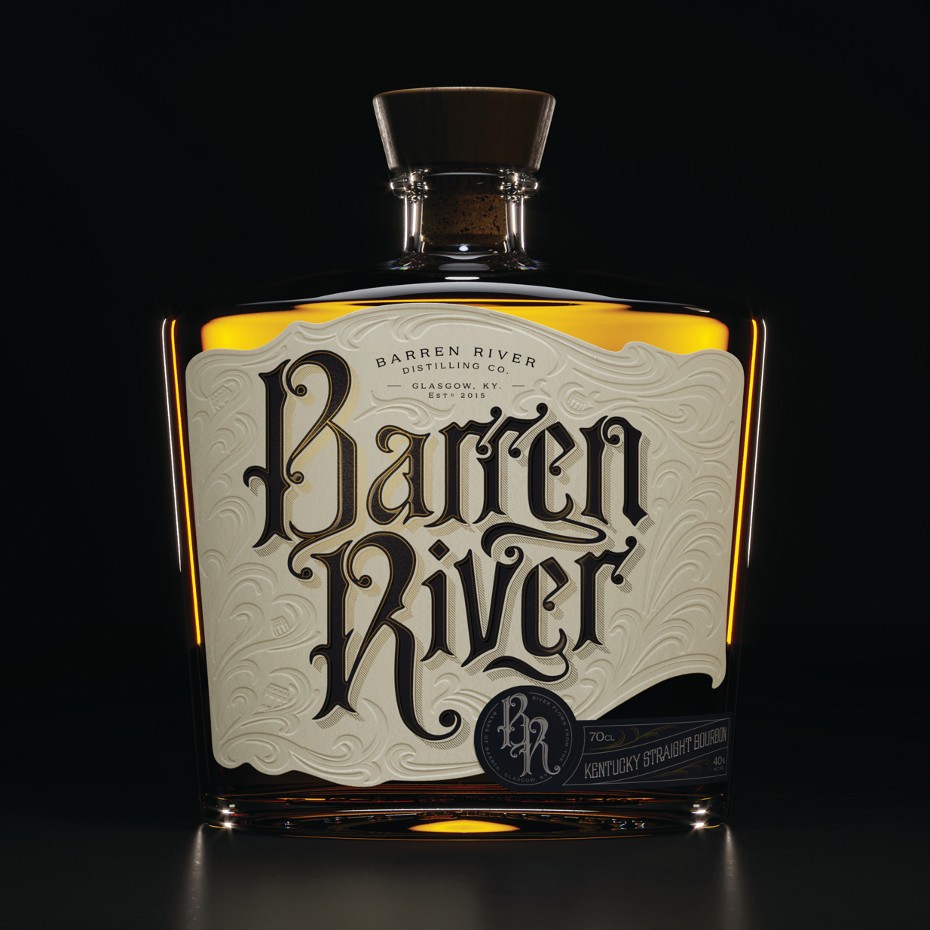
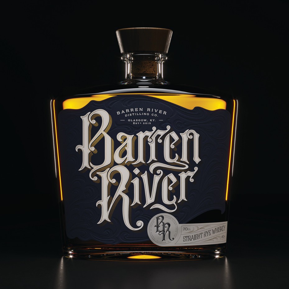
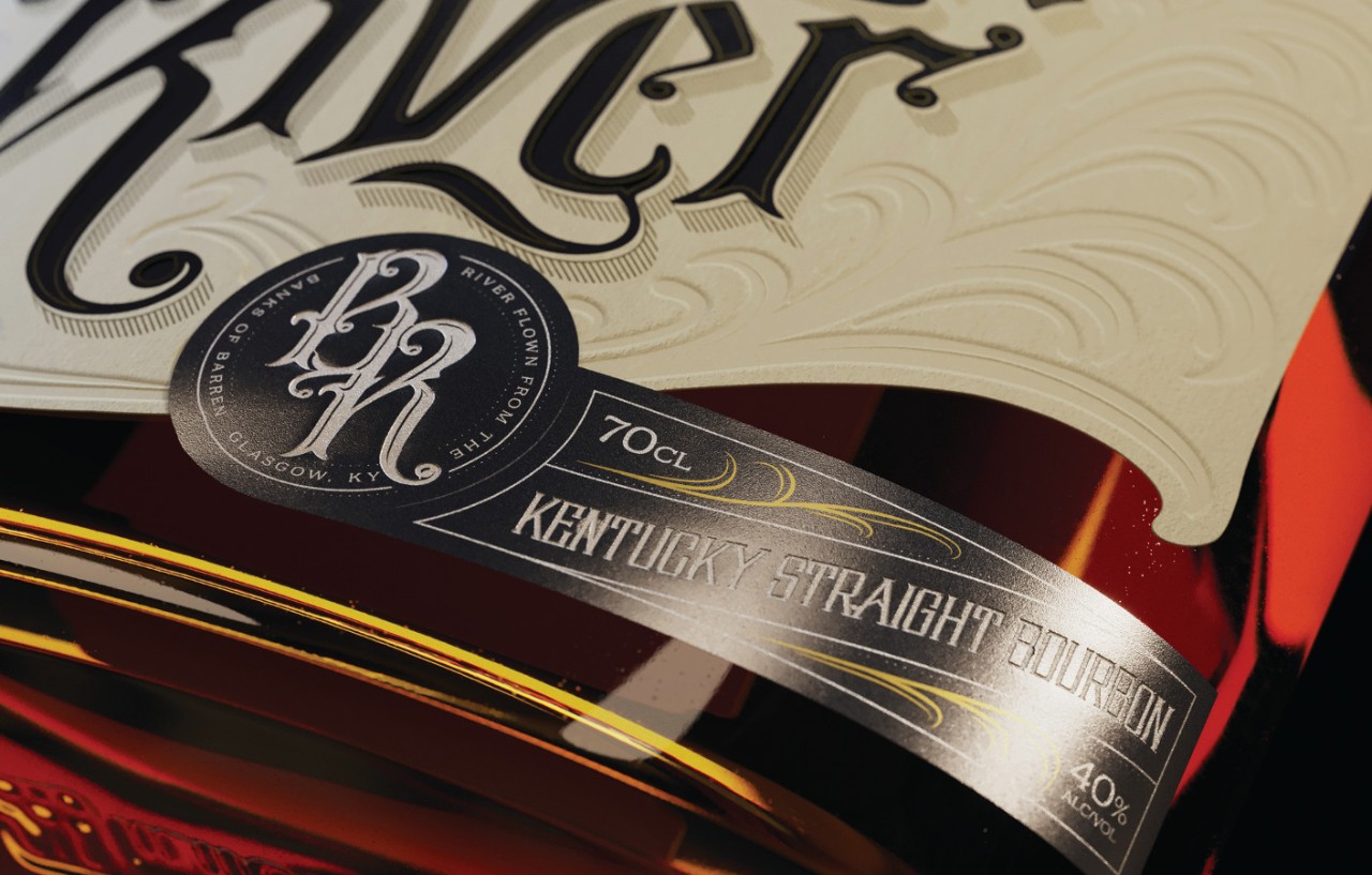
Barren River Distilling Company
Material
Fasson® Cotton White Tree Free
Market
Europe
How a creative agency leveraged the Avery Dennison Concept Lab to turn its vision to reality.
Glasgow, Scotland-based Thirst is a strategic packaging and design agency focusing on the craft beverage segment. To help bring to life a label design for its client, Barren River Distilling Company, the Thirst team reached out to the Avery Dennison Concept Lab for guidance on materials. We asked Eamon Cameron, Senior Designer for Thirst, a few questions about the project and process.
Q: Tell us a little about Thirst and what your agency specializes in?
We’re a strategic drinks packaging design agency that builds creatively rare, commercially right brands. We were born from a love of drink and design, working across all elements of brand strategy, design and execution – from powerful positionings right through to flawless finishes and anything in between!
Q: How did you hear about the Avery Dennison Concept Lab?
Heard about it straight from the source when we first met Alex at the ’17 Craft Brewers Convention in Washington DC.
Q: Tell us a little about the Barren River project
Our Barren River project is our first foray into the world of American whiskey. We set the brief internally to stretch and develop the skills of the team and provide an opportunity to execute a challenging print spec. It was also an exciting opportunity to develop a solid brand story with a voice to go with it.
Q: Can you explain the overall process of this project?
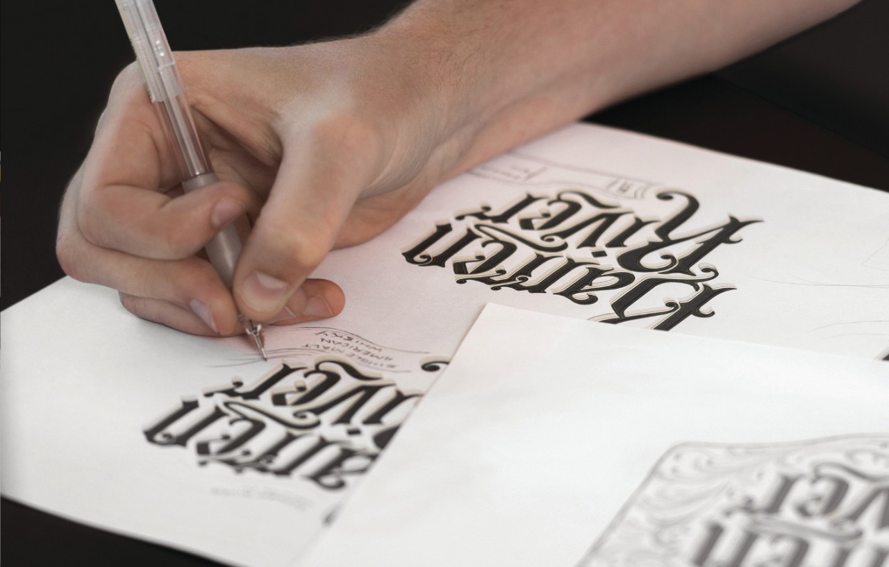
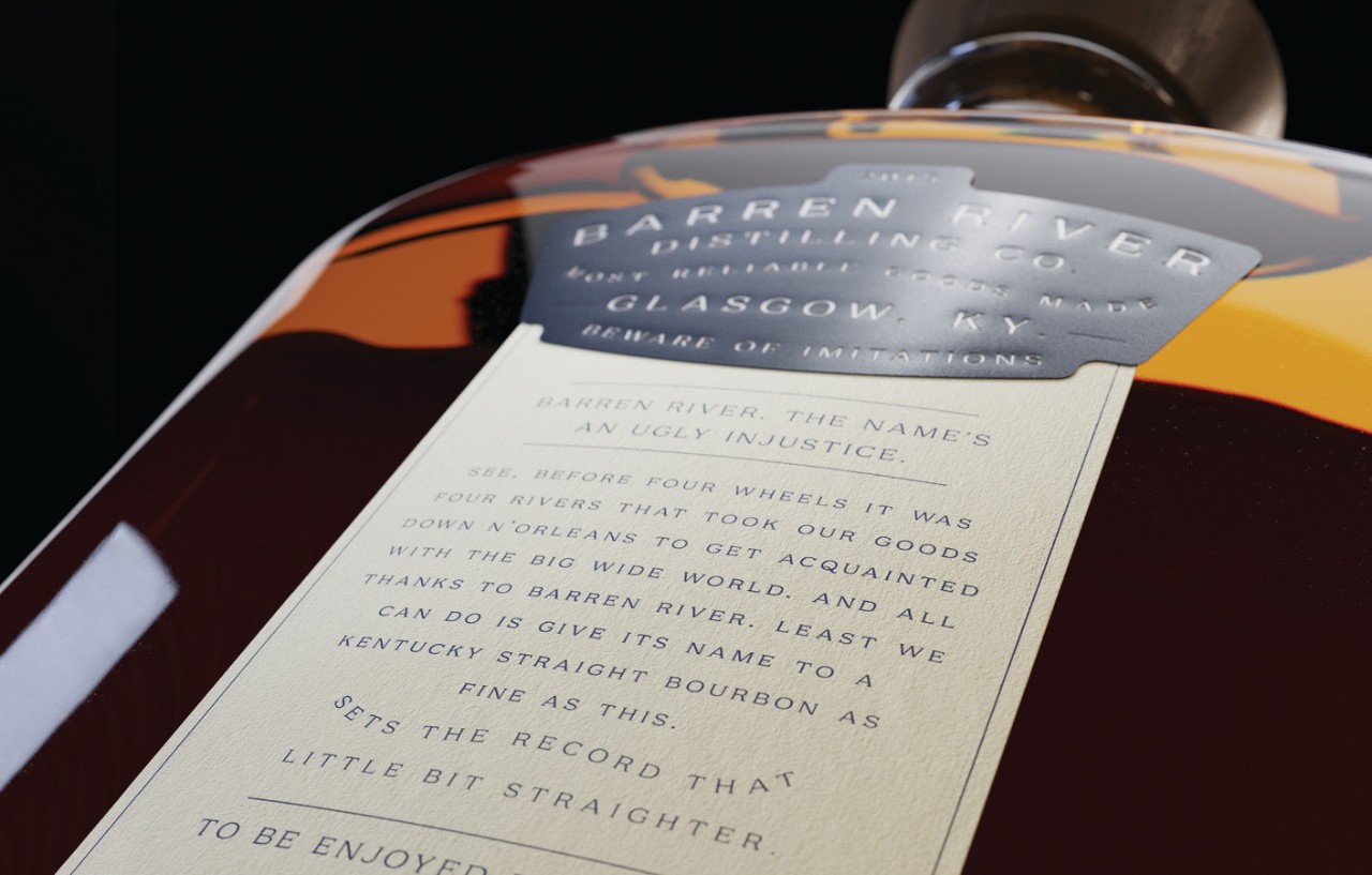
It all started with a typographic collaboration — working with our friend Craig Black who is an amazing lettering artist based here on the West coast of Scotland (@_craigblack). He developed a beautiful typographic style for the project with the main display typeface referencing the old American West. A labour of love internally was the overall execution of the typography. Originally we favoured a stippled style to add depth the type, but with test prints this style unfortunately wasn’t conducive with the type of finish we were hoping to achieve. At this point we decided to keep the bones of the type composition but develop the style toward a more clinical execution — making sure we could achieve the detailed print finishes we had in mind. We then created a branding suite to compliment the label and weaved river flown filigree around the typography which influenced the overall shape of the label. From there, the mission was to get this new work off of our screens and into our hands … up steps the Concept Lab!
Q: How did you collaborate with the Concept Lab to create this?
The Concept Lab were integral to the realisation of this project. We had all of these wild thoughts brewing around how we could realise the design on label and right off the bat they provided an excellent sounding board for these ideas.Through multiple video calls, we hashed out potential finishes on various substrates to experiment with. The team at the Concept Lab then tested these out and sent us physical samples which were always incredibly exciting for us to receive.
Q: How do you choose Avery Dennison materials?
We have a suite of the latest Avery Dennison material swatch books. These are a key resource in our conversations with the Concept Lab as we can get hands on with the materials we are discussing and really dig down into the details of each material — its pros, cons and potential alternatives.
Q: What value does the Concept Lab bring to your agency/brands when you work together?
Incredible value. The opportunity to work with a team so knowledgeable about their craft can only act to elevate the work we’re doing here at Thirst. Having the work we do supported with the Concept Lab’s expert resource of material/finishing knowledge is a powerful partnership to bring to any project we work on.
Related Articles