Search
Tinchitè: Rethinking how Sicily is displayed on the shelf
How Usopposto translates a single word into a layered label for Feudo Arancio’s Tinchitè range
There is a particular challenge that faces wine producers in established regions: how do you represent a place that has already been represented a thousand times? Sicily, Italy's largest wine region by vineyard area, with more than twenty DOC denominations, carries enormous visual weight. Sunsets, terracotta, olive branches. The temptation to lean on these shorthand images is understandable, but the results tend to blur together on a crowded shelf.
Feudo Arancio, the Sicilian estate owned by Mezzacorona Group, chose a different approach for its Tinchitè range. Rather than reaching for landscape, they reached for language — specifically, one word from the region’s dialect that carries an entire worldview inside it. That word is tinchitè, an expression that conveys a sense of fullness. It was the starting point for a label design brief handed to agency Usopposto, and it became the conceptual engine for everything that followed.
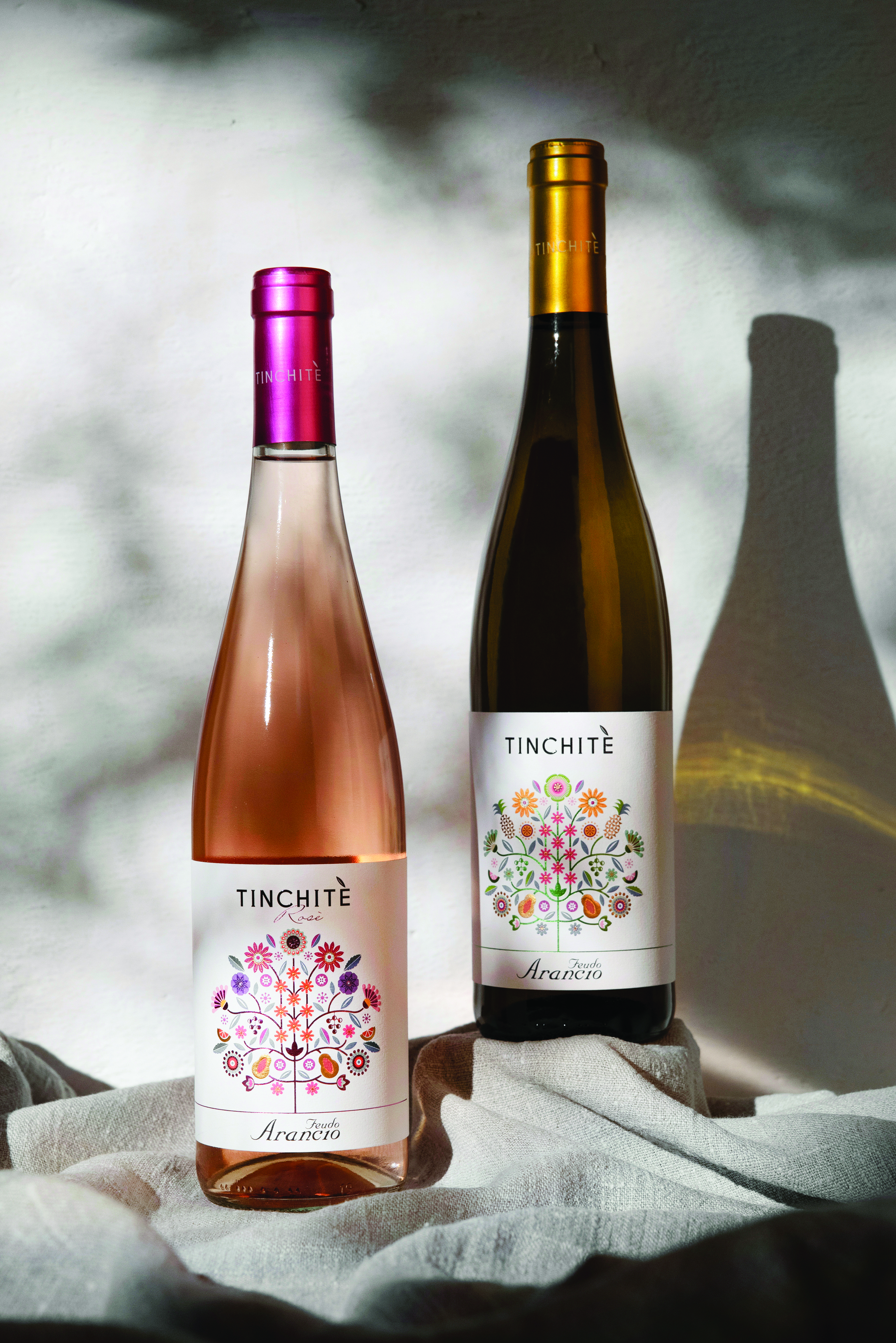
Designer Alessandro Santoro at Usopposto approached the project with clarity of intention. "Our approach to the brief was to respect the client's vision," he explains, "to reflect the essence of Sicily onto the label with its colours and its aromas, while at the same time illuminating the product." Central to achieving that was a decision to work with a wraparound label surface, giving the design room to expand and amplifying both its presence and visual impact on the bottle.
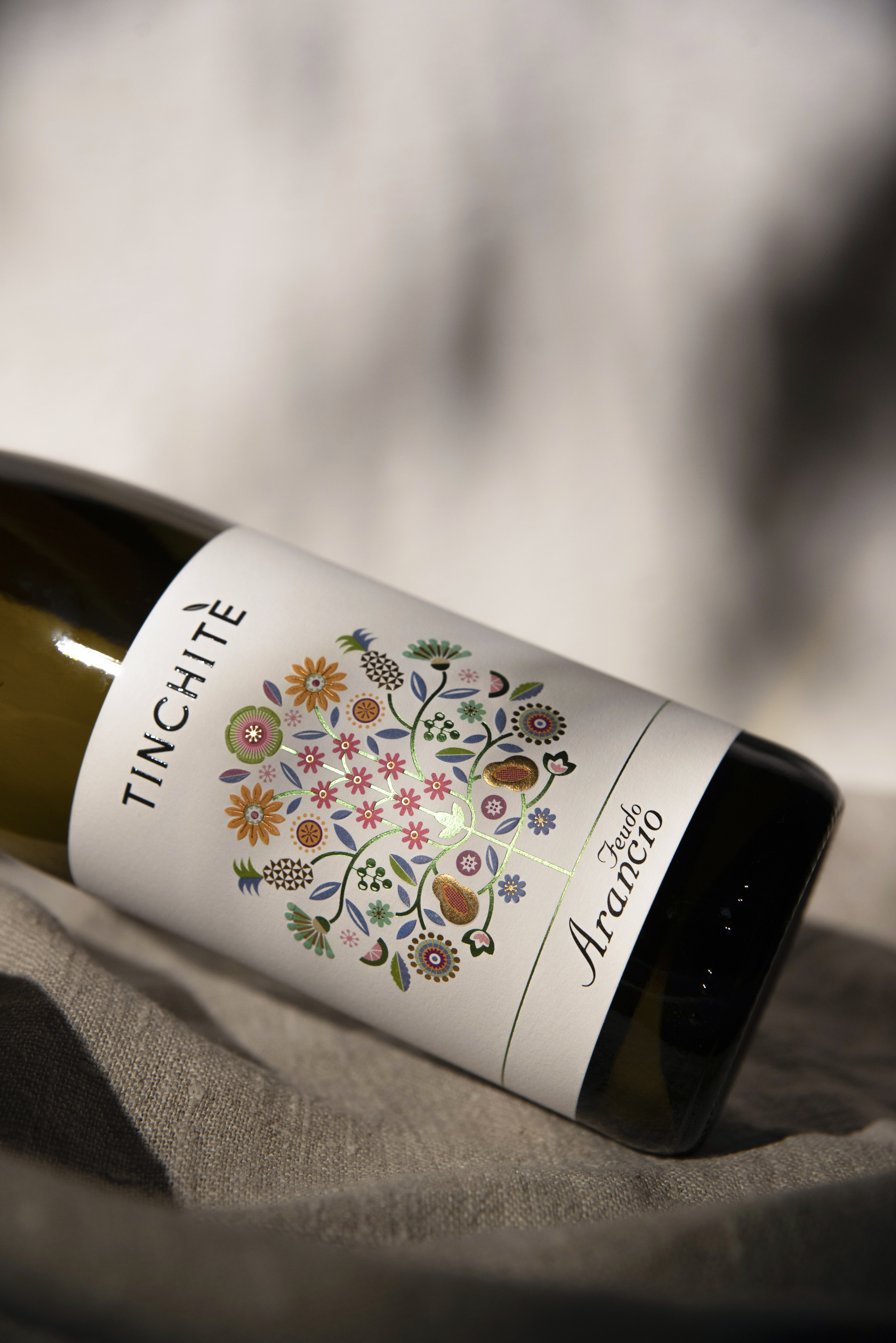
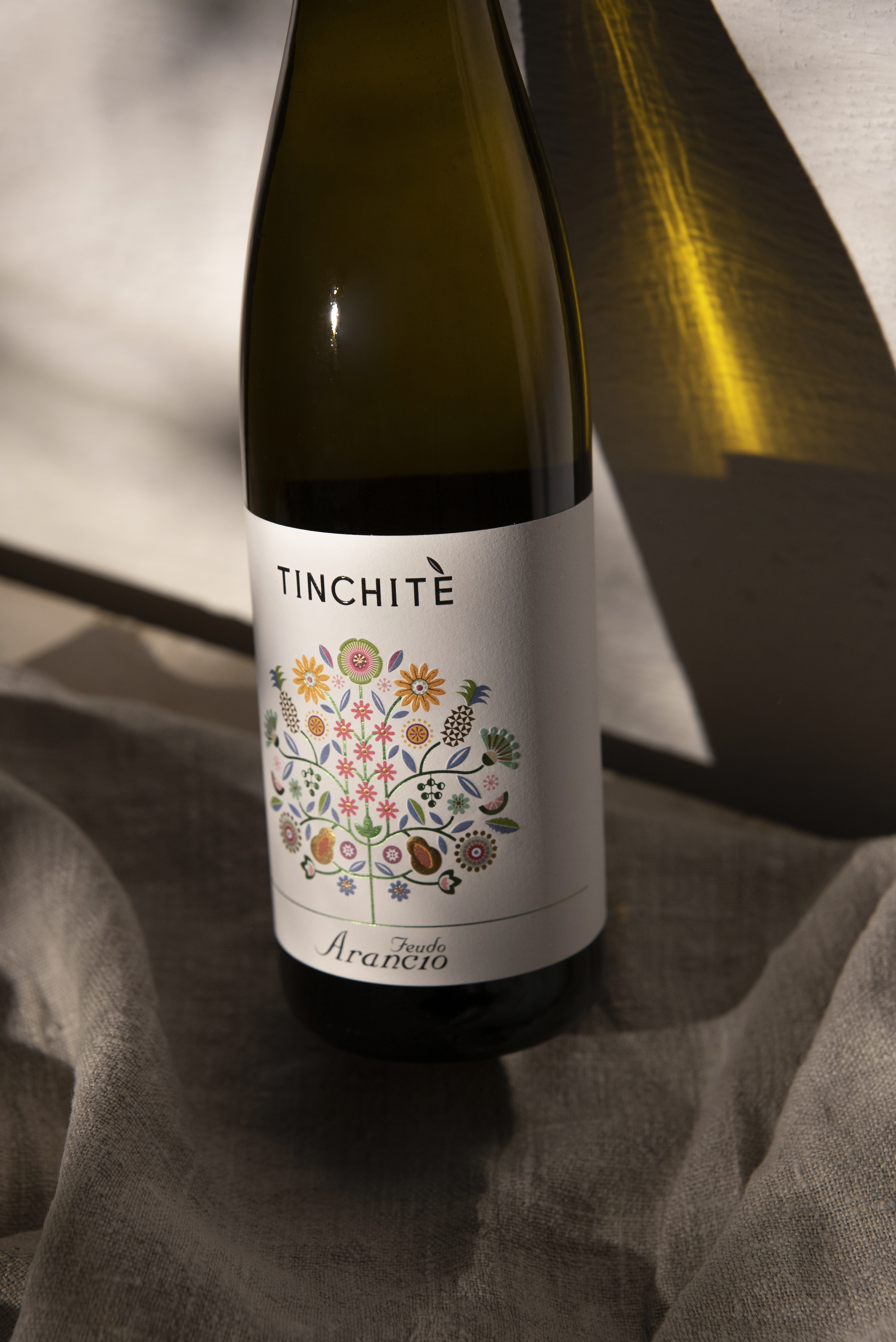
The solution took the form of a tree, but not a naturalistic one. Santoro built an illustration rooted in the idea of the manna tree, a regional symbol historically associated with nature's generosity, and expanded it into something closer to folk art: a branched form bursting with blossoms, leaves and fruit. Some of the botanical elements are native to Sicily; others were chosen to represent the profile of the wines themselves, making the artwork function simultaneously as origin story and palate map.
To print an illustration of this complexity, the label had to perform. Usopposto selected Fasson® Cotton Touch rPlus FSC from Avery Dennison — a tactile, textured material that introduces a handcrafted quality without compromising print precision. "This material allowed us to work with a textured substrate while maintaining great print definition," says Santoro. "It also delivered the brightness the product required, enhancing both the clarity and the overall perception of quality."
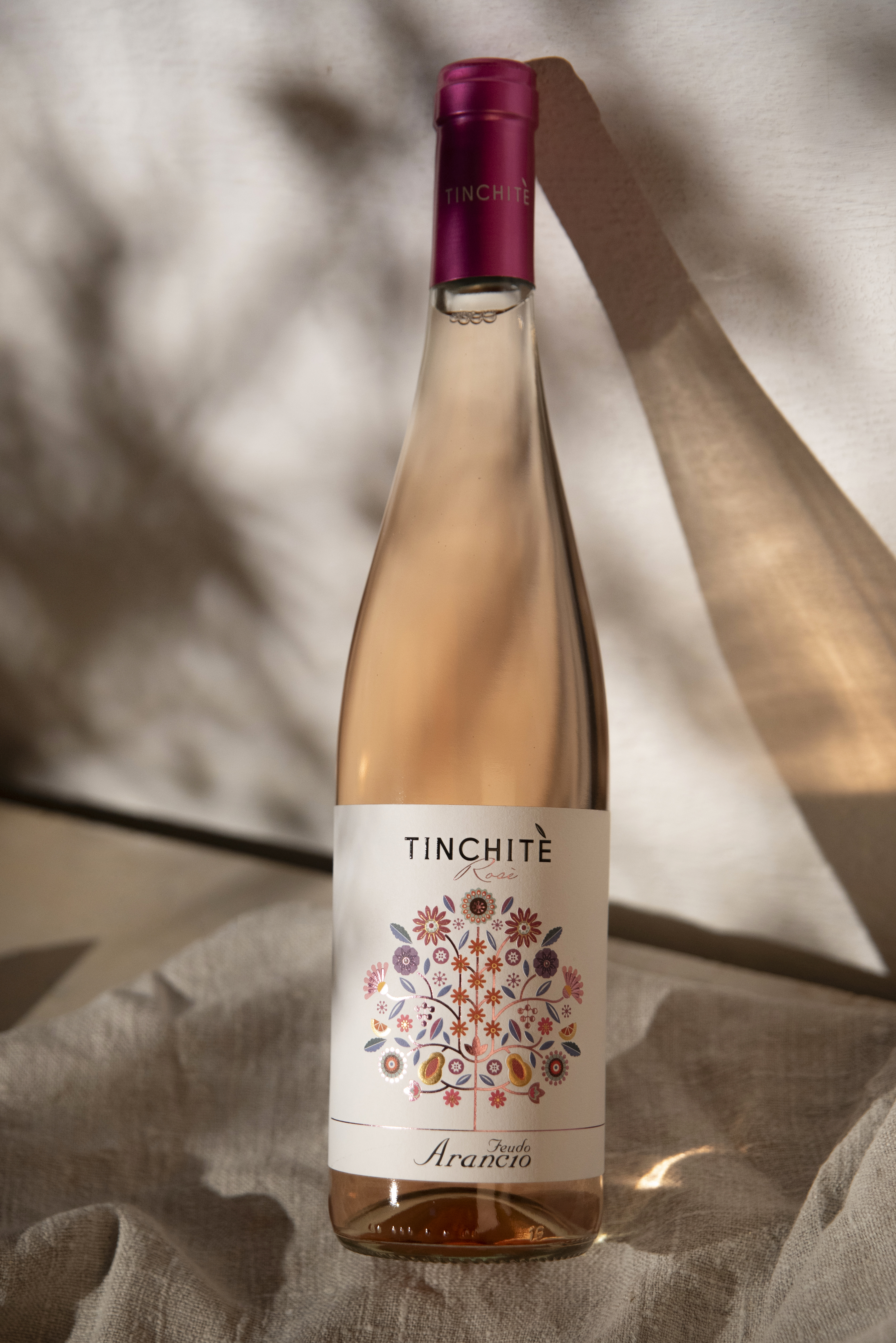
The same illustrative system adapts across the range. The rosé variant shifts the palette toward pinks and purples while maintaining the same style, giving the range a cohesive look while allowing each wine its own visual identity.
The outcome speaks for itself. "The final result precisely conveys the concept we had in mind," says Santoro: "a product with an elegant design that is capable of capturing the viewer's attention through a carefully balanced interplay of shapes and colours."
That balance is what elevates the project. It would have been easy for an illustration this vivid to tip into noise. Instead, the Tinchitè labels achieve something more considered — immediate visual impact that rewards closer inspection. "The overall impression is that of a product with strong communicative impact," Santoro adds, "one that draws you in at a first glance, and then reveals its depth through finely executed detailing."
Related Articles