Search
A quinta do Bill
Agency
Antonio Quintas
Client
Quinta do Bill
Material
Fasson® Paper Watermark 120 FSC®
Market
Europe, Portugal
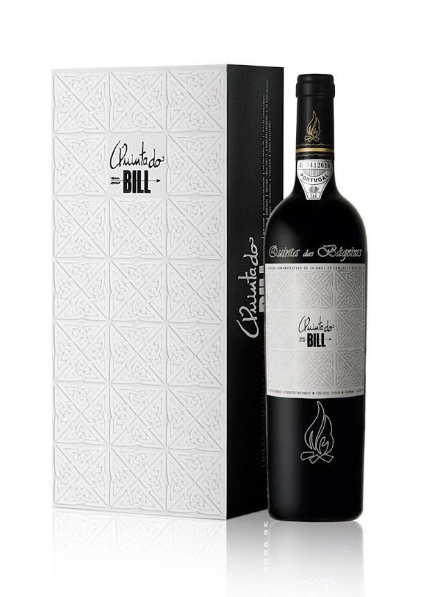
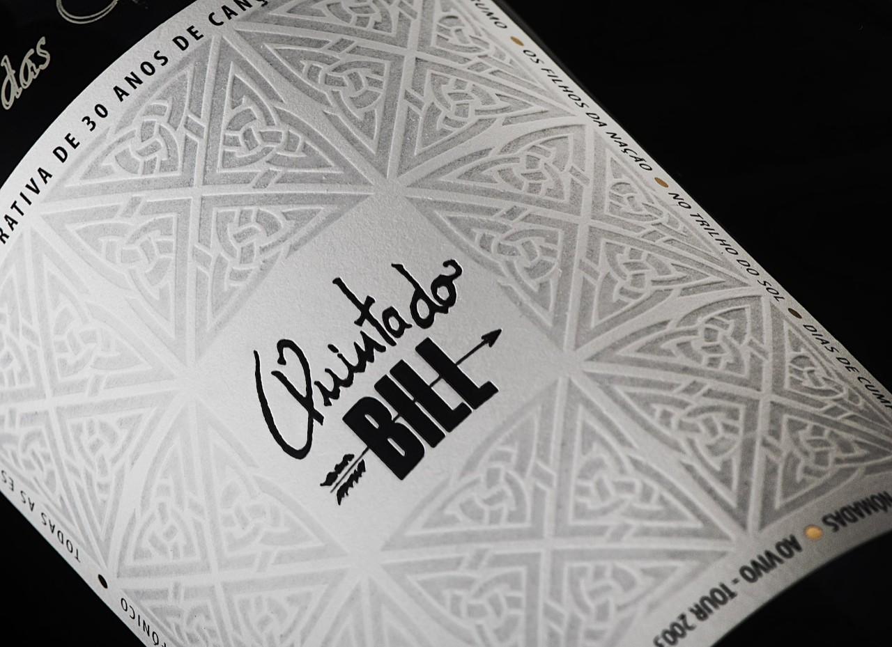
The label design for a wine celebrating the 30th anniversary of Portuguese folk rockers Quinta do Bill drew inspiration from Celtic culture, just like the band itself.
Designer Antonia Quintas explains:
“We used symbols and icons from Celtic civilization and its influence in the Iberian Peninsula. We sought inspiration from the Celtic knot, which represents the interconnectedness of life, eternity and the mysteries of birth, death and reincarnation. And we were inspired by the Celtic cross, which represents the junction of the four elements essential for life, as well as the intersection of masculine and feminine through sexual union.” As a finishing touch, names of the band’s albums were inscribed around the label’s edges.
Fasson Paper Watermark lent a feel that was both premium and seemingly handed down from antiquity.
Heating and embossing enhanced the paper’s already tactile texture, giving it a rougher feel reminiscent of wood, granite or fiber—something handmade and rooted in the elements. The material enabled preservation of the design’s finer details, suggesting they weren’t printed on, but integrated in the paper itself, as a watermark. The symbology, design and texture were just right for a band loved for its connection to Celtic mysticism and its authenticity.
Photography by Moema Quinta
Related Articles


Related Materials