Search
Design stripped back to its core
Revealing the new identity of Cantina Favaro
Designer: ArtevinoStudio
Printer: Ilma Etichette
Label materials: Fasson® Cotton White
Some wines don’t need to shout to make an impression. They don’t rely on trends or flashy packaging — just pure craftsmanship, a sense of place and the quiet confidence that quality speaks for itself..
That’s exactly the philosophy behind Benito Favaro, a small but dedicated winery in Canavese, near Ivrea. Their wines have always been about honesty, balance and staying true to their land. But how do you translate that into design? That was the challenge when it came time to rethink their labels. The goal wasn’t reinvention — it was refinement. A way to preserve the purity of the wines themselves, stripping away excess and letting their character stand on its own.
To bring this vision to life, Cantina Favaro collaborated with ArtevinoStudio, led by Art Director Antonella Frate. “The wines already had a strong identity,” Antonella explains. “Our job wasn’t to change that but to make it more visible — to create a design that reflects their values without overpowering them.”
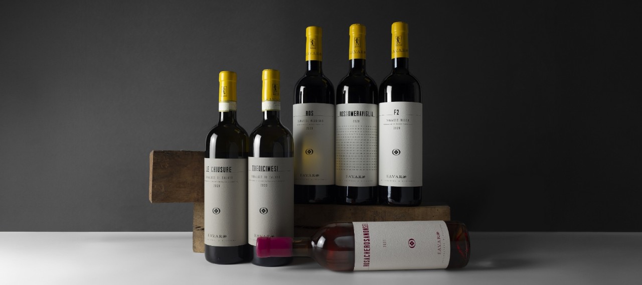
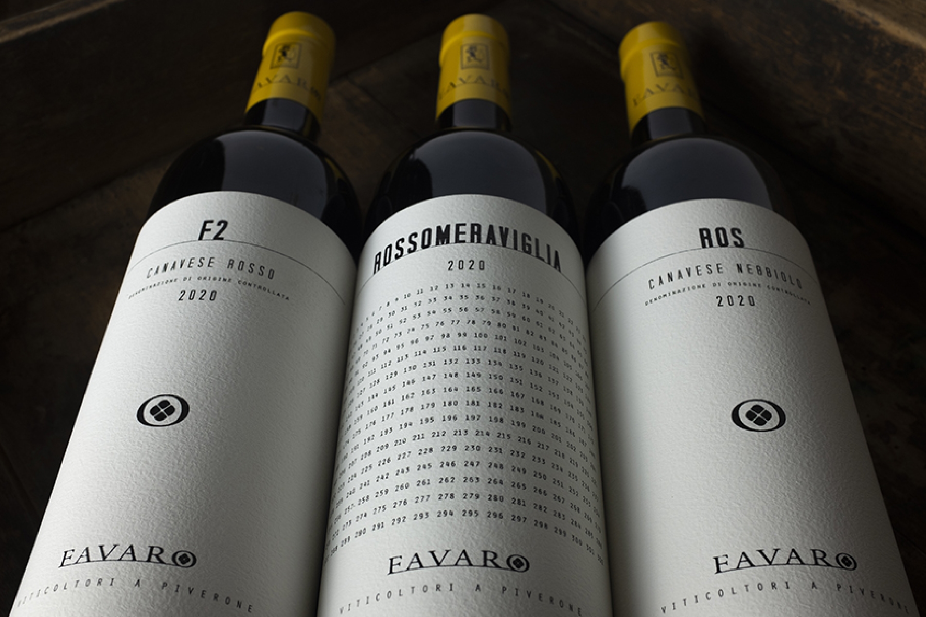
The result is a collection of six wines — two Erbaluce DOCG whites, a rosé and three reds made from Freisa, Syrah and Nebbiolo — all presented with a new, understated style. No distractions, no unnecessary embellishments—just a clean, intentional design that gives equal dignity to each bottle.
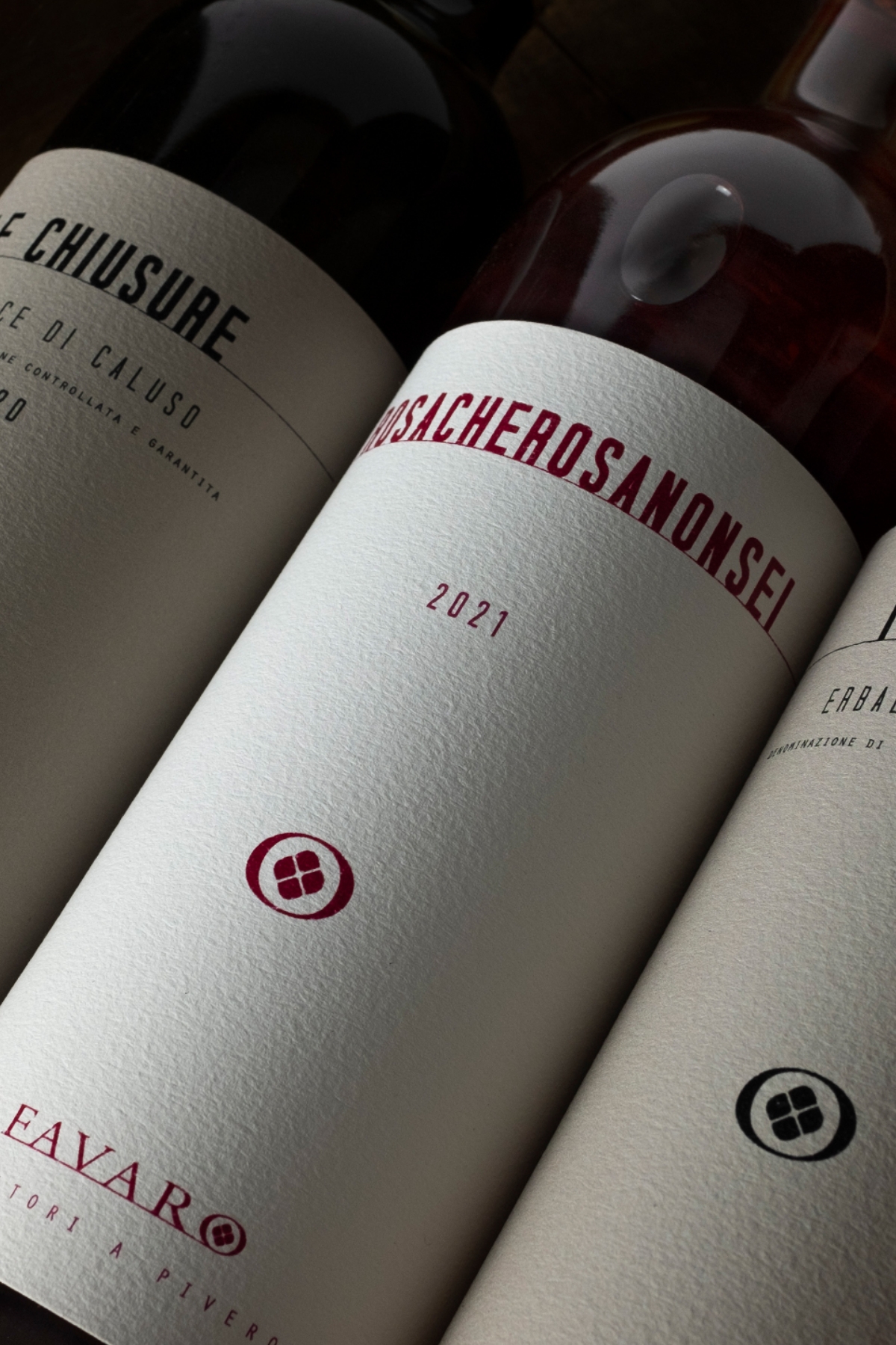
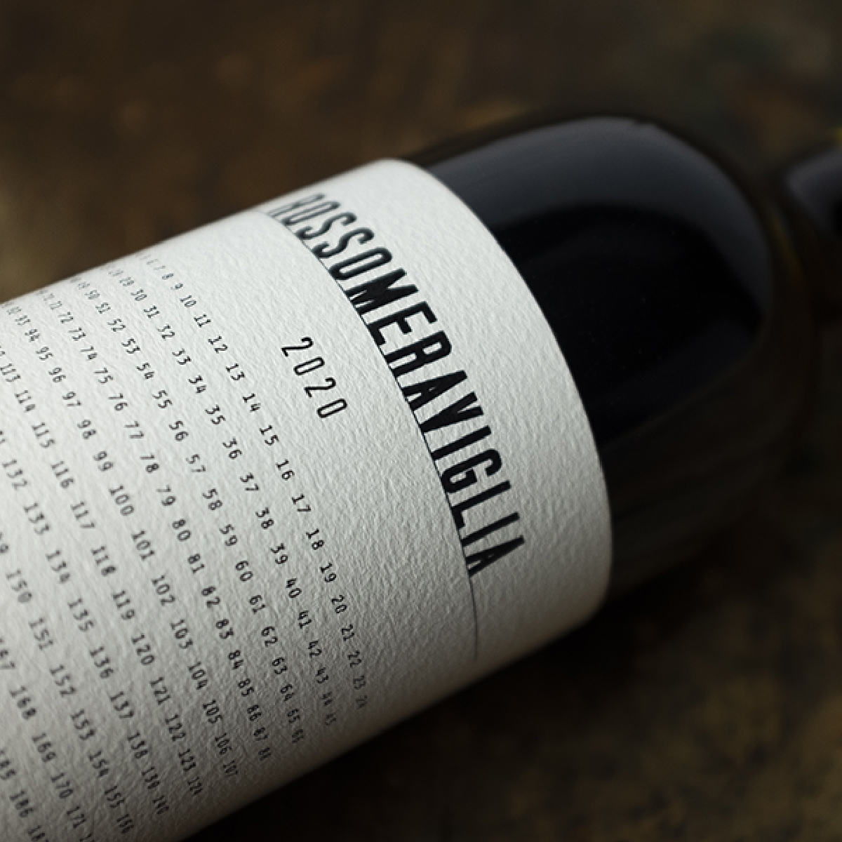
Every element of the new look echoes this philosophy of clarity and balance. The labels are large and expansive, creating a sense of presence without overkill. Each one follows the same structured layout, reinforcing the idea that every wine in the range deserves the same level of attention and respect — regardless of grape variety or price. The only exception is the Syrah ‘Rossomeraviglia,’ which subtly highlights the number of bottles produced and ‘Rosa che rosa non sei,’ a tribute to the musician Francesco De Gregori, given a soft, monochromatic pink treatment. Quite fitting considering De Gregori is often referred to as "Il Principe dei cantautori", a nickname he earned for his “elegant” songwriting.
The choice of materials plays a key role in bringing this vision to life. Our Fasson® Cotton White paper was selected for its tactile warmth and natural texture, which enhances the minimalist design while adding a quiet sense of luxury. “The materiality of the label was just as important as the design itself,” explains Antonella. “Cotton White gave us the perfect balance — it’s sleek, but there’s an authenticity to it that really aligns with the philosophy of these wines.”
Beyond the aesthetic, sustainability was also an important factor. Benito Favaro has long embraced environmentally responsible practices, from organic conversion in the vineyard to mindful packaging choices. Using a label material made from cotton linters — a byproduct of the textile industry — was a natural fit. It reflects the winery’s broader commitment to quality without compromise, extending beyond what’s in the bottle to how it’s presented.
Even the smallest details were considered. The finishing touches — glossy screen printing and braille embossing — were executed by Ilma Etichette, bringing depth and precision to the minimalist design. Meanwhile, Enoplastic provided the yellow capsules with a subtle pop of brightness that added a final touch of distinction. Diam's corks and Sincera Sistemi’s shellac seals round out the experience, ensuring that every aspect of the bottle aligns with the winery’s philosophy.
At its core, this redesign is about honoring the identity of Cantina Favaro in a way that feels both conventional and modern. A visual language that doesn’t overshadow the wine but instead acts as a quiet reflection of everything that goes into it. Because great design, like great wine, speaks for itself.