Search
GinTellMan
Agency
PG Branding
Client
Naroch
Material
Fasson® Fibers Look FSC®
Market
Europe, Minsk
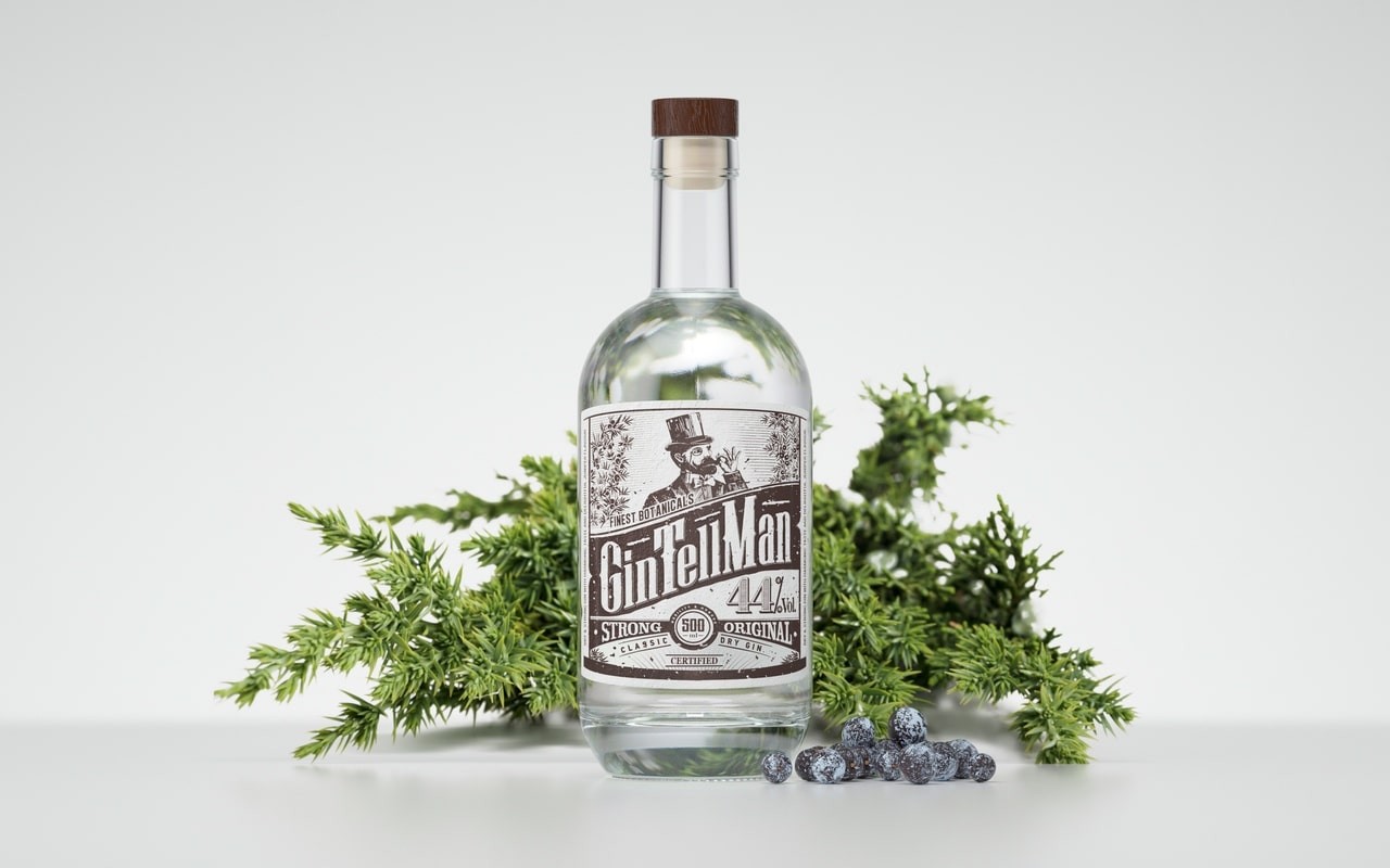
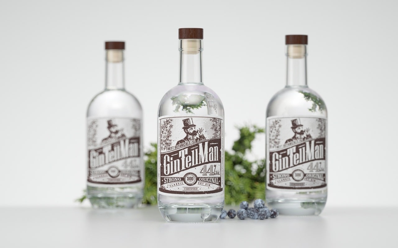
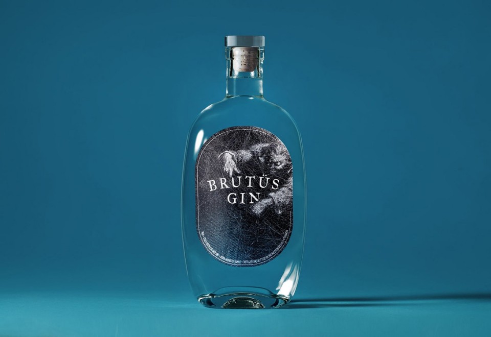
A top-shelf gin is all about sophistication. And when the gin is a new player in a crowded category, it needs a story. The label and illustration created for GinTellMan suggest both a man and a spirit with a thousand tales to tell.
Vitali Yatskevich and his team from PG Branding took their inspiration from juniper, the essence of gin:
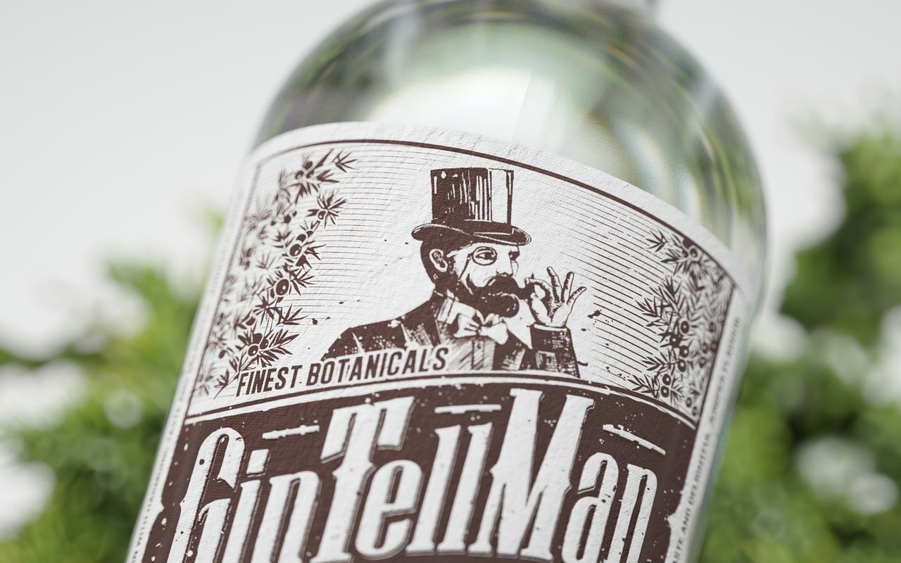
“Our idea was that the natural aroma of juniper recalls something natural and craft-like. That’s why for the name and design, we focused on craft. GinTellMan not only reflects its audience—a modern gentleman—but also implies that this gin has a story.”
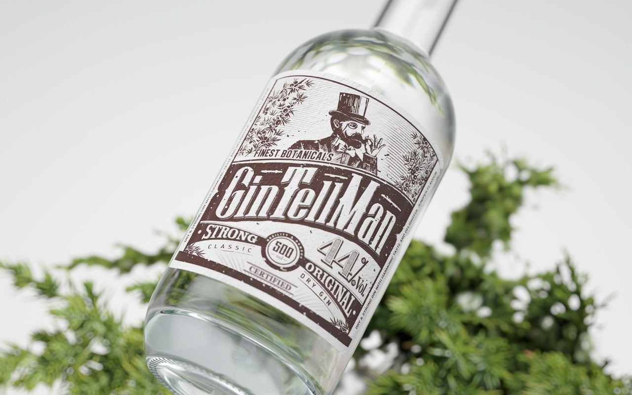
Fasson Fibers Look captured the right balance of artisan craft and premium-brand elegance.
A non-woven, uncoated paper with felt marks and visible fibers, Fibers Look offers a rougher-hewn counterweight to the monocle-wearing dandy in the label’s illustration. Its craftier look belies its water resistance, which ensures that the label holds up behind the bar or in a home liquor cabinet. Rendered simply in sepia and white, with the appearance of an antique etching, GinTellMan’s label bulls-eyed the sweet spot for its target audience: middle-aged men balancing quality and price.
Related Articles


Related Materials