Search
Purgatorio: A multisensory packaging experience
How Andrea Castelletti Studio, Eurolabel, Avery Dennison and Estal redefine packaging through inclusivity and innovation
Designer: Andrea Castelletti Studio
Printer: Eurolabel
Label materials: Fasson® Velvet Black, Fasson® rSiena Bianco, clear-on-clear Fasson®
There’s something compelling about the way we interact with everyday objects, often without even thinking about it. Take packaging, for example. A well-designed package can invite you to pick it up, examine it and feel the texture beneath your fingers. But what if that experience could be even richer? What if it could reach beyond just sight and touch, becoming something truly immersive? After all, isn’t this where design transforms from mere packaging to something far more meaningful? Imagine a bottle that doesn’t just sit on a shelf but entices you to engage with it in ways you might never have considered. It’s about more than just aesthetics—it’s about creating an experience that welcomes everyone.
And it’s from this ethos that the Purgatorio project was born.
Purgatorio, an exclusive design project between Andrea Castelletti Studio, Eurolabel, Avery Dennison and Estal, goes beyond traditional packaging design, pushing boundaries to create a multisensory experience that’s as inclusive as it is innovative. The concept is inspired by Dante’s Divine Comedy, using the journey through Hell, Purgatory and Paradise as a metaphor to tell a story through the bottle’s structure and materials. The mission was clear from the beginning: to create packaging that not only looks beautiful but can be experienced by everyone, including those with visual impairments.
“We wanted to ensure that every element was designed with accessibility in mind,” explains Andrea Castelletti, the Creative Director behind the project. “We're creating something that engages all the senses, making it accessible and meaningful for everyone who interacts with it.”
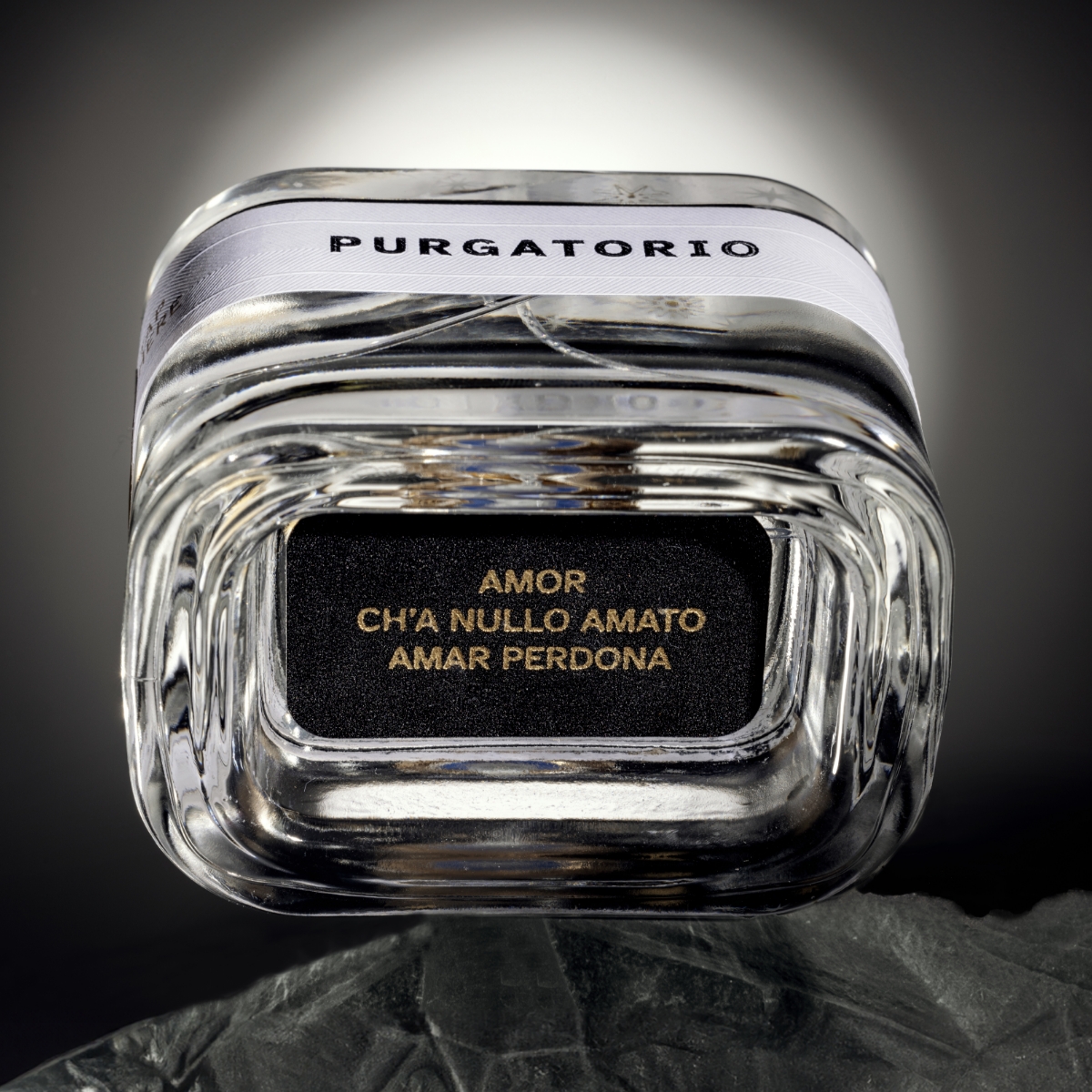
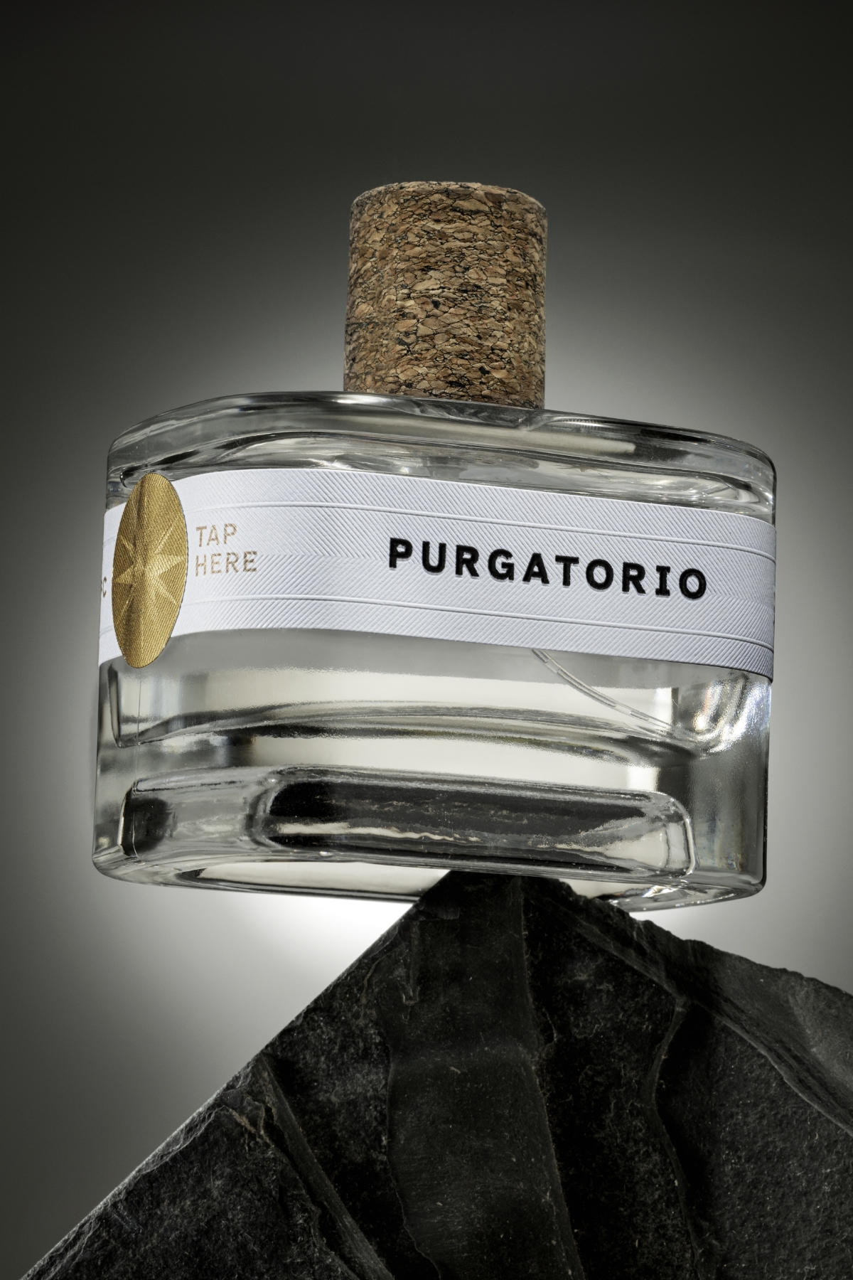
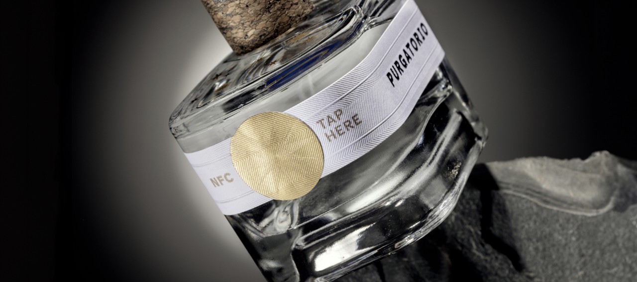
The bottle is divided into three distinct sections, each representing a different stage of Dante’s journey. The base of the bottle, symbolizing Hell, is wrapped in our Fasson® Velvet Black, a richly textured material that feels almost velvety to the touch. This section is adorned with gold foil stamping of a famous verse from Dante’s Inferno, providing a tactile and visual contrast that immediately draws you in.
Moving upward, the central section, representing Purgatory, features Fasson® rSiena Bianco, a paper composed of 50% post-consumer recycled fibers with a refined herringbone embossing. Here, the name "Purgatorio" is printed in glossy black foil, accompanied by high-relief Braille integrated directly into the design. This thoughtful touch allows people with visual impairments to identify the product and interact with it on their terms. “The Braille isn’t just functional; it’s an integral part of the design, adding another layer of interaction,” says Castelletti.
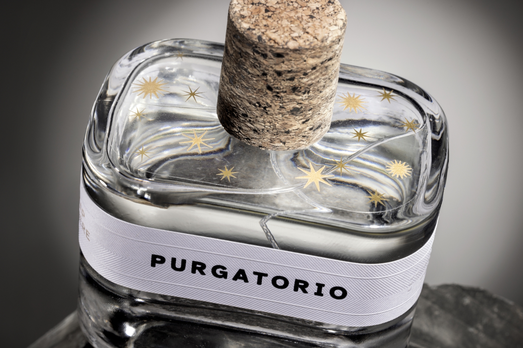
Finally, the upper part of the bottle, symbolizing Paradise, is covered with a clear-on-clear Fasson® label, decorated with delicate golden stars that evoke a starry sky. This transparent, ethereal finish creates a sense of lightness and completion, providing a sharp contrast to the darker base below. The three sections together form a unified journey, both visually and tactilely, inviting users to engage with the bottle in more ways than one.
But the innovation doesn’t end with the physical elements. Hidden beneath a golden seal is an NFC tag, allowing users to tap and access an audio experience directly from the bottle. This digital feature ensures that even those who cannot experience the packaging visually can engage with the product through sound. “The integration of NFC technology was key to making the design truly inclusive,” Castelletti explains. “It adds a layer of interaction that goes beyond the physical, making it an experience anyone can enjoy.”
The design process was closely supported by the Fondazione Istituto dei Ciechi di Milano, whose expertise in accessibility helped ensure the project met the highest standards for inclusivity. Every detail, from the Braille to the tactile finishes, was designed to create a packaging experience that is as engaging for those with visual impairments as it is for sighted individuals.
At its core, Purgatorio is a celebration of what packaging design can achieve when it embraces innovation. It challenges the traditional boundaries of what packaging should be, offering a multisensory journey that is not only luxurious but also convenient to everyone. This collaboration between Andrea Castelletti Studio, Eurolabel, Avery Dennison and Estal proves that beautiful design doesn’t have to come at the cost of accessibility — in fact, it’s all the richer when it includes everyone in the experience.