
Search
Rethinking shelf appeal: Designing a gin bottle that shines from every angle
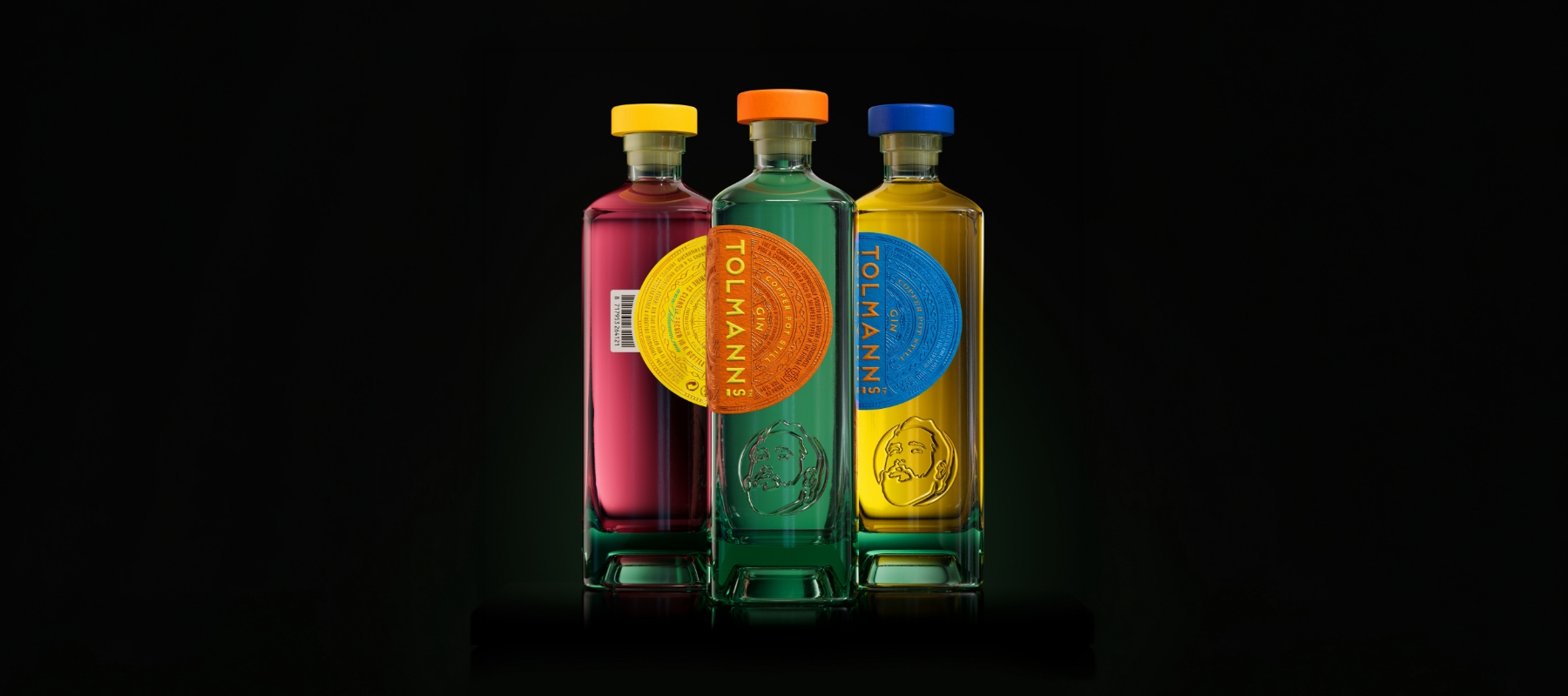
How Van Heertum Design reimagined Tolmanns as a bottle full of sunshine
Designer: Van Heertum Design
Label materials: Fasson Noble Extra White FSC”
Walk down a spirits aisle today and the gin section feels louder than ever. New brands, new flavours, new stories, all competing for a moment of attention. In a category that has grown fast and crowded, making your brand stand out no longer means adding more noise. These days, it's all about confidence and deliberate choices that cut through the chaos.
That was the reality facing Tolmanns Gin as it prepared for its relaunch at ProWein 2025. The ambition was unapologetic. This needed to be a redesign with a capital R. A bottle that would shine from the shelf, move away from familiar gin conventions and express the brand in a single, unmistakable gesture. As the team described it, this had to feel like "a bottle full of sunshine."
From there, Van Heertum Design (VHD) focused on presence above all else. In a segment dominated by sameness, the goal was to be immediately recognisable without relying on excess. “The gin category has been filling up over the last few years,” says Martin de Weijer, Co-owner and Creative Director at Van Heertum Design. “To stand out now, you really need to bring your A-game. Every decision has to count.”
From there, Van Heertum Design (VHD) focused on presence above all else. In a segment dominated by sameness, the goal was to be immediately recognisable without relying on excess. “The gin category has been filling up over the last few years,” says Martin de Weijer, Co-owner and Creative Director at Van Heertum Design. “To stand out now, you really need to bring your A-game. Every decision has to count.”
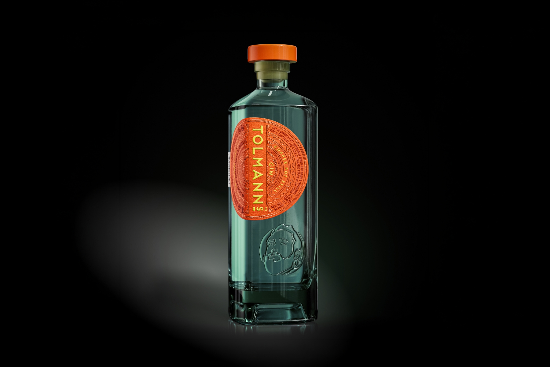
Sunshine became the organising idea, shaping form as much as graphics. The most visible change is the bottle itself. Tolmanns moved away from the familiar round silhouette and introduced a square-shaped bottle, more refined and architectural. The shift changes how the bottle reads on the shelf, giving it a sense of composure and authority.
That form is supported by material choice. The bottle is made from Wild Flint Glass by Estal, selected for its sustainability credentials and its subtle greenish glow. That tint interacts naturally with the spirit's colour, creating depth rather than neutrality. "The glass gave us a strong starting point," says Rob van Heertum, Co-owner and Strategy Director at VHD. "It brings a richness that works beautifully with color."
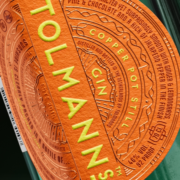
The label solution reinforces that. Everything is combined into one single label, eliminating the need for a back one. Even the barcode was designed as an attachment to the main label, supporting brand recognition instead of interrupting the design. It also communicates information about the gin’s 16 botanicals sourced from around the world, alongside flavour notes and production details. Illustration, typography and hot-foil stamping are layered at different heights, creating a surface that invites touch. “That moment when someone picks up the bottle really matters,” de Weijer explains. “It should immediately communicate craftsmanship and care.”
To support the intensity of colour and the richness of the finishes, the team selected our Fasson® Noble Extra White FSC®. The paper keeps inks bright and vivid, helping the sun-inspired palette stay alive without overwhelming the design. “This concept depends on colour staying strong,” says Rob van Heertum. “The paper lets the ink do exactly what it needs to do.”
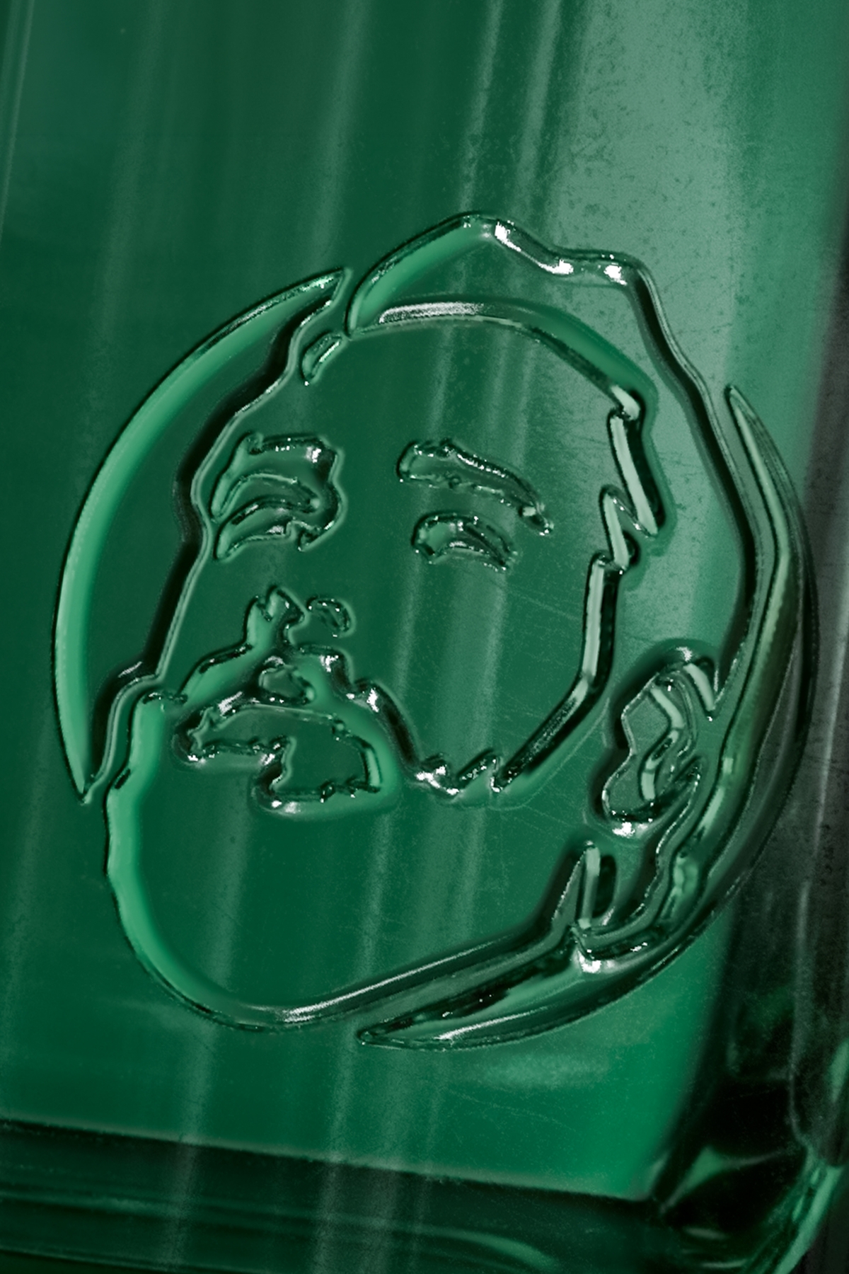
One of the most personal elements sits directly on the glass. An embossed portrait of the Master Distiller appears on the front of the bottle, created using advanced 3D printing techniques. The figure looks upward, toward the sun and toward the brand itself. “Honouring the Master Distiller was important to us,” says Ron van Tol, Owner of Tolmanns. “It reflects the pride and heritage behind the gin.”
Although the redesigned bottles are only just entering the market, the response has been immediate. Following the relaunch at ProWein 2025, it has already generated attention and conversation. On the design front, the project has received early recognition from the World Brand Design Society Awards, winning Gold for redesign and one of only four Black Agency Awards this year.
For Tolmanns, the redesign signals a clear point of view. In a crowded category, the new bottle stands composed, confident and unmistakably its own. A bottle full of sunshine, shaped by clarity, craft, and purpose.
