Sun, sand, and spritz: The story of Vero

Material
Fasson® Estate #8 FSC®
How Ben Galbraith brought Italy and Australia together on one label
Designer: Ben Galbraith design
Brand: Coles Liquor Group
Pinter: MCC
Label materials: Fasson® Estate #8 FSC®
Australia and Italy might be oceans apart, but they share a love for sun-soaked beaches, distinctive cultures, and delicious beverages. In Italy, the tradition of "aperitivo" is a popular ritual, a time to unwind with friends and family before dinner, savoring light drinks and snacks. Meanwhile, the laid-back beach culture in Australia promotes a similar vibe, where sunsets are often enjoyed with a drink. So, what would happen if we combined both of these passions to create one beverage? The answer is Coles Liquor Group's Vero — an Australian-made aperitivo inspired by la dolce vita.
To bring this vision to life, the brand collaborated with Ben Galbraith, an award-winning packaging designer specializing in the drinks industry. Ben was tasked with creating a visual story that would reflect both cultures' essence and stand out in a competitive market. "After researching both Italian and Australian beach cultures, I came up with a design idea that celebrates the similarities between the two," explains Ben.


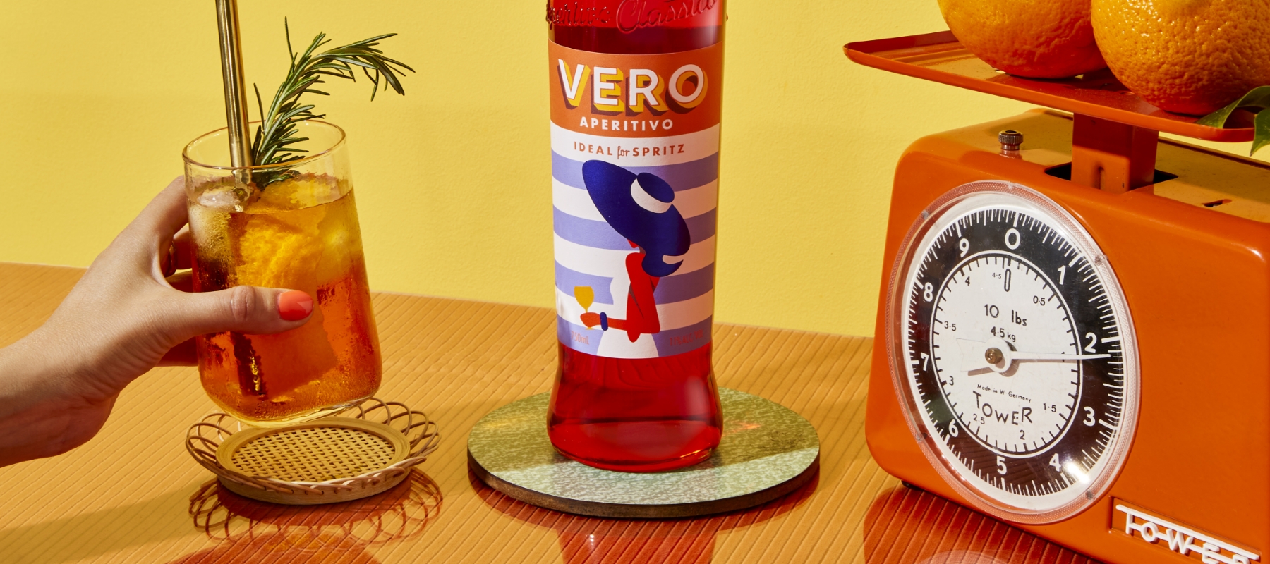
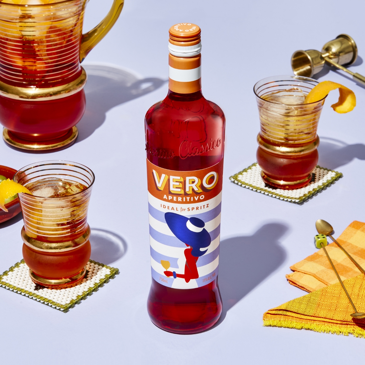
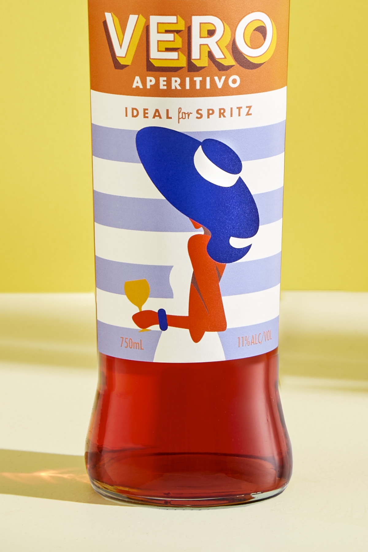
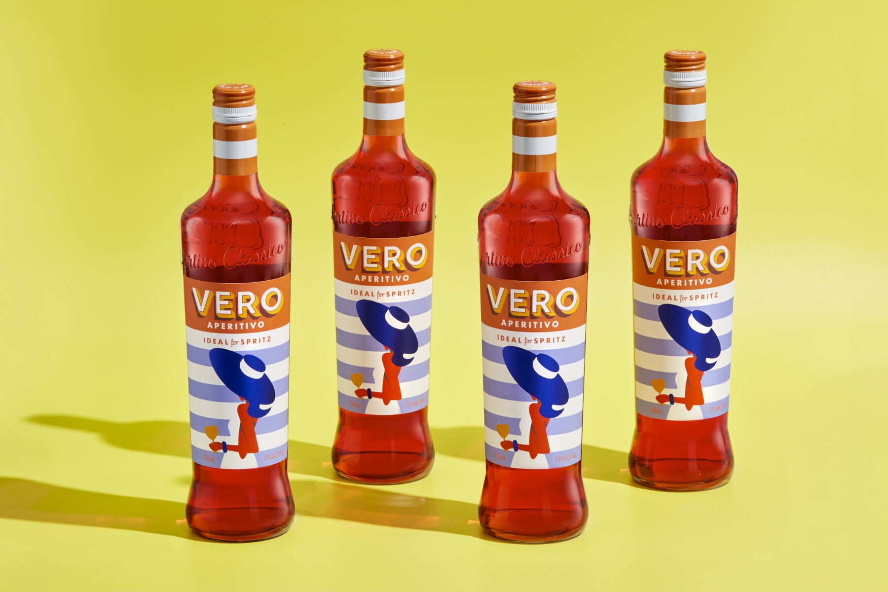
This character needed to be captured in the label design, so artist Alan Walsh was commissioned for his bold, graphic style, which was paired with a three-dimensional typeface inspired by Italian hand-painted lettering. "The combination aims to bring an authentic Mediterranean experience to Australian consumers that not only stands out on the shelf but also tells a story," Ben adds. Indeed, the outcome is an eye-catching label, to say the least. It depicts a stylish figure with a wide-brimmed hat, evoking a sense of effortless sophistication. The background of blue and white stripes mimics coastal scenes, while the bright orange infuses the design with energy and warmth. Ultimately, it expresses relaxation and refined taste, inviting consumers to indulge in a moment of bliss.
Materials played a crucial role in achieving this vision. Cold foil printing, gloss high-build screen, bespoke glass, and a bespoke printed capsule were all part of the process. For the label, Ben chose our Fasson® Estate #8 FSC® paper stock, which helped achieve a premium look and feel. "Avery Dennison's Estate 8 paper stock was perfect for giving Vero that touch of luxury without breaking the bank. The tactile quality and visual appeal complemented the brand, ensuring it stood out among its European competitors," explains Ben.

The impact of the project has been tremendous. Vero's packaging has been exceptionally well received, converting a new wave of Spritz connoisseurs to a more affordable Australian alternative. The bold, iconic style provides a real shelf standout, cutting through the more conservative designs of similar products. Richard Brandon Taylor, Founder of Brandon Consultants — a leading branding consultancy, praised Vero, saying, "I spotted this new alcoholic spritz challenger brand Vero in Australia, sitting amongst the established duopoly of Pimm's & Aperol. Just how do you cut through and get noticed, in this instance with a piece of art that sells an emotion. A moment in time that we can all relate to."
