The making of Øl’søn Gin

A gothic exploration of design, flavor and heritage
Designer: Van Heertum Design
Visuals developed by: Tricycle Studio
Brand: Øl’søn by Gothic Angels Distillery
Printer: Color Press
Label materials: Fasson® Artisan Extra White FSC®
If you've ever been lucky enough to walk through the streets of Toruń, Poland, you'll know the city is like stepping into a living storybook. Gothic architecture reaches toward the sky and centuries-old buildings tell stories of the past. It's the kind of place that makes you feel grounded in history while still brimming with life. And this is where Gothic Angels Distillery found its home and created Øl'søn—a gin that, much like Toruń itself, honors tradition while embracing creativity.
Michał Olszewski, the mind behind Gothic Angels Distillery, wanted to create something that reflects the spirit of his hometown and his passion for craftsmanship. And it shows—from the gin's taste to the bottle's bold design. "Øl'søn is born out of love for family, diversity and the nature surrounding us," says Michał. "Each bottle is like a chapter in our story, something deeply personal and connected to our roots in Toruń."
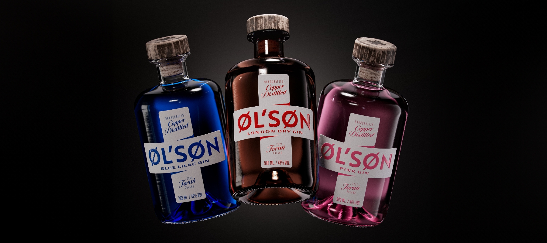
But it wasn’t just about the gin itself. The team knew the visual identity needed to be just as striking as the spirit inside. That’s where Rob van Heertum from Van Heertum Design came in. The brief? To create something bold and memorable, a bottle that would tell the story of Øl’søn at first glance. “We chose a cross as the main brand symbol because it’s inseparably linked with gothic and Toruń,” explains Rob. “From the very beginning, the idea was to make the front label strong enough to attract the eye and become ingrained in the customer’s memory.”


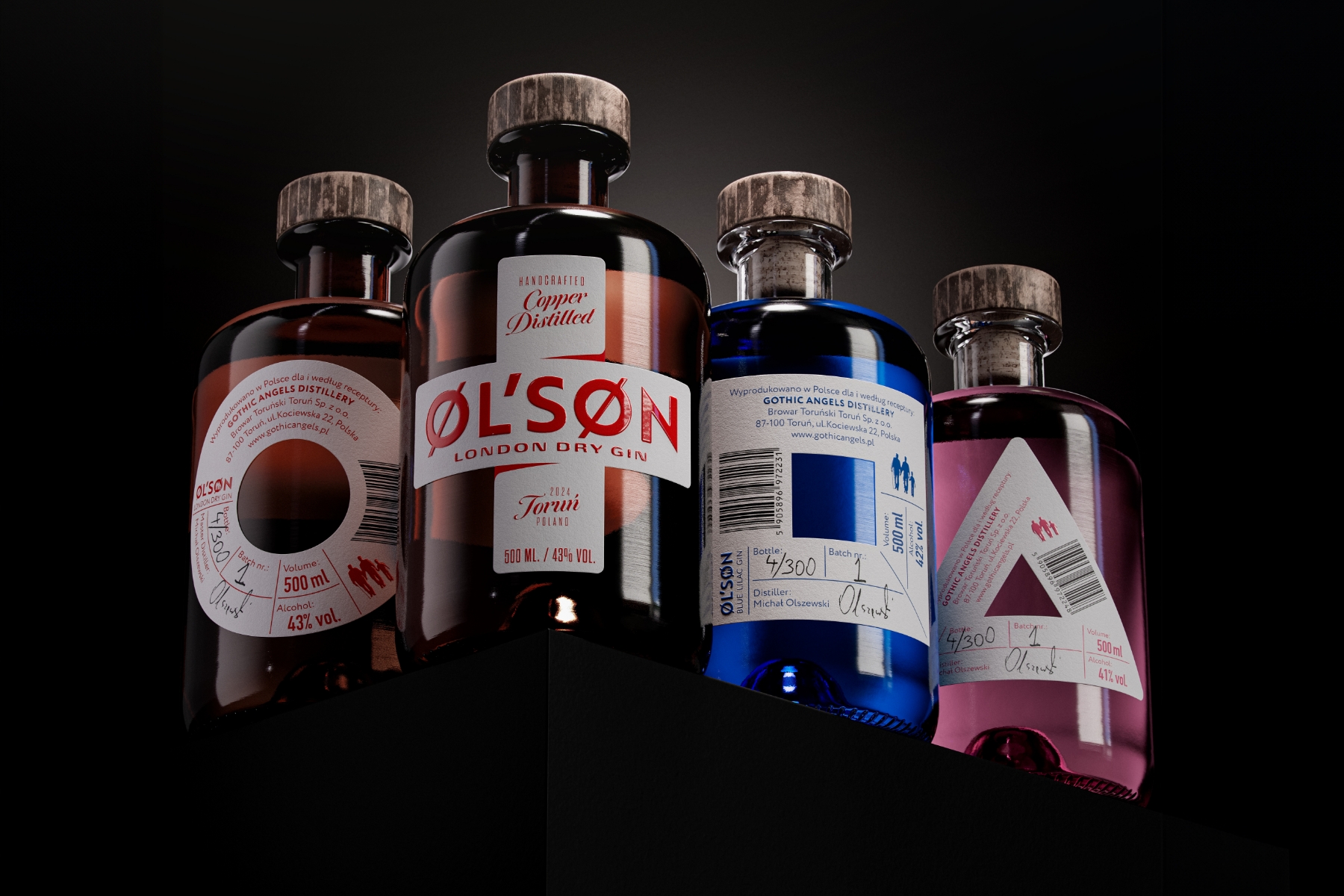
The design process didn’t stop with just a front label. Rob and the team wanted the back of the bottle to be just as engaging. They brainstormed ways to integrate it into the overall branding, and the idea of incorporating symbols from games that span generations emerged. The London Dry Gin features a tic-tac-toe motif — a nod to classic childhood games passed down through the years. Meanwhile, the Pink and Blue Lilac gins reference more modern games like the Playstation, tapping into the brand's playful side.
The choice of materials was crucial in bringing the packaging to life. The team used our Fasson® Artisan Extra White FSC® paper, giving the bottle a premium, handcrafted feel. Every detail was carefully considered, from the texture of the label to the tactile experience it offers when you hold the bottle. Color Press brought these designs to life with exceptional attention to detail, ensuring the visual elements pop and enhancing the overall experience of Øl'søn. Additionally, Tricycle Studio played an important role in developing the stunning visuals that made the brand come alive on the shelf.

Now, let’s talk about what the bottles contain. Øl’søn gin comes in three distinct varieties, each with its own unique flavor profile. The London Dry Gin bottle blends aromatic bergamot, American hops and tonka bean, creating a botanical mix that reflects the distillery’s passion for excellence. The Pink Gin, infused with cherry and grapefruit, offers a fresh, fruity twist. Then there’s the Blue Lilac Gin, a world-first featuring the beautiful and fragrant lilac flower. “This gin is all about diversity and nature,” Michał adds. “Each version is unique, but they all share the same DNA—a love for craft and the natural ingredients we use.”
Øl’søn is an experience. From the bold design to the carefully crafted flavors, it’s a brand that resonates with people on a deeper level. “This project was more than just about creating a label,” Rob says. “It was about making something that people connect with and tells a story.” And Øl’søn does just that—it’s a celebration of Toruń’s history and of the joy found in sharing a good drink with loved ones.
