Search
Wolf’s Head Wines
Agency
Jordan Jelev, The Labelmaker
Client
Wolf’s Head Wines
Material
Fasson® Bright White Felt
Market
Europe, Bulgaria
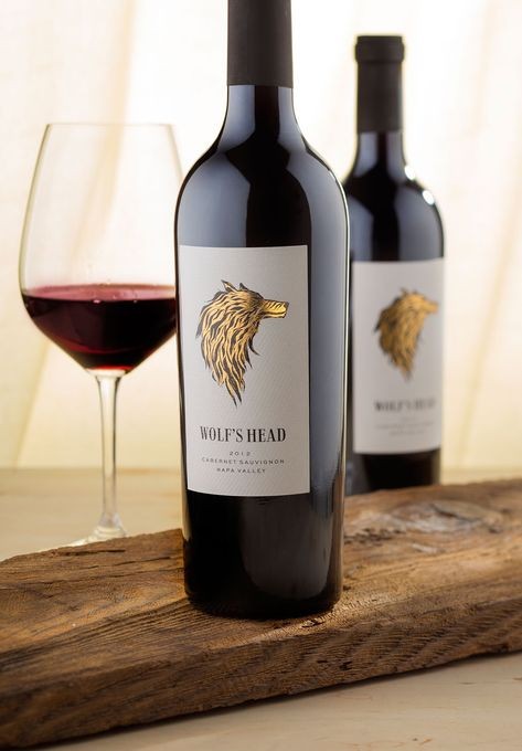
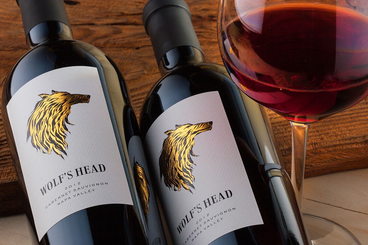
The brief of Wolf’s Head Wines was simple: “Give me a label with a wolf’s head on it.” But veteran designer Jordan Jelev knew it had to be a wolf that leapt over the rest of the wine aisle pack and seized shoppers’ imaginations.
He explains why his material was integral:
“The label is quite clean, so the visual impact from the wolf’s head and the paper were the two important effects I was looking for. Another great advantage of this paper was the texture—I don’t know exactly how it happened, because you see these things after the label is printed, but the paper texture somehow became part of my wolf, adding more tiny details that made the whole image look more organic. This is very visible in the areas where the gold foil is stamped.”
Jordan found the right blend of appearance, texture and performance in Fasson Bright White Felt.
The facestock’s nuanced tone lets the dramatic illustration pop in full alpha-wolf glory. Its texture adds dimension and the illusion of layers, giving the winery’s shaggy namesake fur you’d be tempted to run your fingers through if you weren’t slightly afraid that the illustration might snap at you. Deep, stern black alternating with gold foil suggests rich tradition and history—important for a new winery. All told, material and illustration add up to a beautifully arresting image, one that caught the attention of Packaging of the World, and wine drinkers, as soon as it landed on shelves.
Related Articles