Search
Interview with Coming Clean designer Rebecca Worth
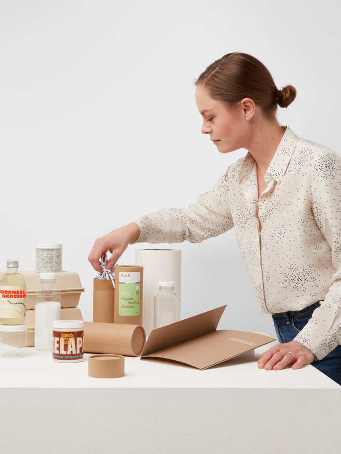
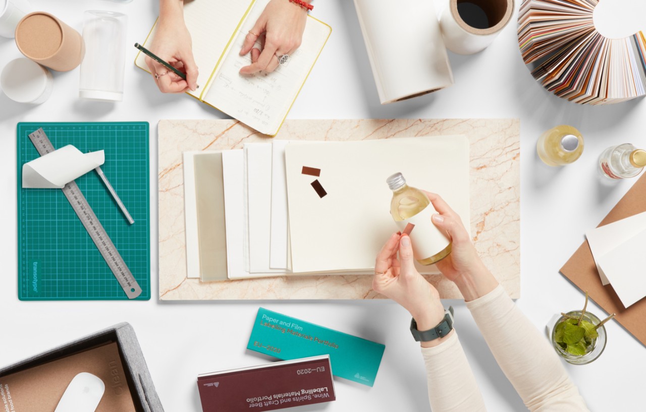
Each speculative brand in the Coming Clean design collection not only provides a unique, aesthetic take on a sustainably-forward product, but does so with a design that tells the story of each label’s relationship to the environment. To better learn about this holistic approach towards design, the M_use team chatted with Rebecca Worth, the lead designer that spearheaded the project.
Based in Utrecht, Netherlands, Rebecca has a background in brand design, but has embraced the potentials of the package, playing an integral part of the Avery Dennison creative team.
M_use: Tell us about your process in tackling this complex brief?
Rebecca: I started by looking at trend reports to identify what was happening in the food industry in relation to a growing concern from consumers about environmental and personal health. I came across all of these brands, big and little, doing super interesting things. From there, we wanted to ensure that the project was strategic in addressing these ideas. We wanted to push the stories of what’s actually happening with food solutions in relation to the health of the environment and our personal wellbeing. We landed with six possible solutions.
This holistic approach is also about authenticity. Strong brands are authentic brands, with no disconnect between their brand expression and business practices.
M: Did you find yourself balancing in-depth research with intuitive design decisions? If so, how did it play out throughout the process?
R: The research for each of these prototypes, which centered around a specific sustainable food solution, was very logical. A lot of consideration was taken to best match a food solution to a label material. Some of the connections are a bit more tenuous, and others more obvious. I wanted to emulate the way a brand designer works, which meant thinking about a label material’s ability to best communicate the values and/or positioning of the brand.
We developed personas for each prototype. With Batch, for example, you have something intended to feel family-run and made with care. Zebedees on the other hand was intended to be super playful and non-traditional. The intuition came in a little later, when the strategy and narratives were set in place.
M: Which of the labels in the collection was the easiest to design? Which was the most difficult?
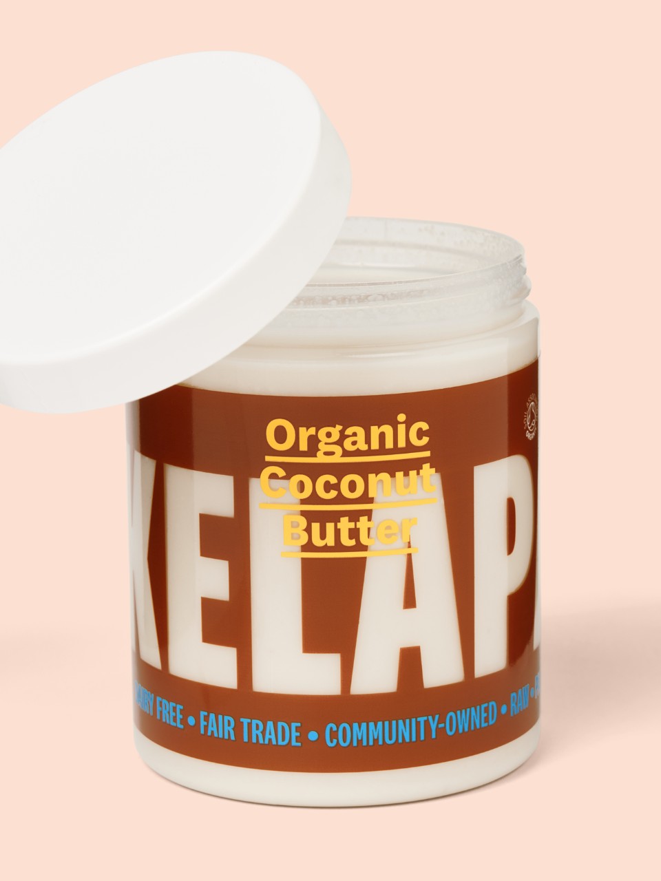
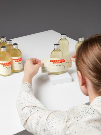
R: Goodness Gracious was the easiest, perhaps because the label material already has a super distinct character and materiality. It made sense to capitalize on the label’s partial composition of citrus waste by pairing it with a prebiotic geared towards intestinal health. The print finishing, where a white screen-printed background frames the material’s texture to make a playful weaving shape, was a risk to pull off. The effect is subtle but elegant.
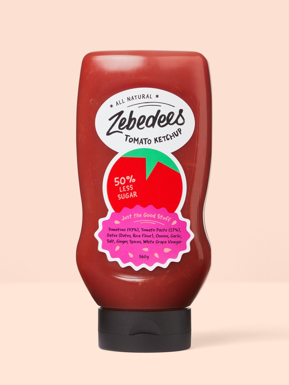
Surprisingly the most difficult, but one of my favorites, was Zebedees. In the beginning, I just could not crack it. I think it was due to wanting each design to have its own unique variation. Some being more typographic and others being more graphic or illustrative. That even meant thinking about the actual form, shape and treatment of the label. Some have a custom die cut shape, some leverage the transparency of the label material, and some use a foil treatment.
In the end I decided to differentiate Zebedees from the rest by focusing on a custom label shape. A few layered post-it notes above my desk, got me thinking about using multiple elements with varied shapes which lead to the tomato and the splat. After that, things started to move a bit easier.
M: How do you balance designing for the specific parameters of the package (size, material, application) and the more general brand identity? Does one inform the other, or do you tackle them simultaneously?
R: They interplay completely. But it also comes back to thinking holistically. ‘What is the most applicable element that can express this specific thing that we’re trying to communicate?’. It might be the material, the type, the finishing, a combination of those, or something else entirely.
M: Which design are you most proud of, and why?
R: I’m really proud of Batch because we used rMC, a very economic material. To be able to produce something with such a refined aesthetic was quite satisfying and the choice of the vessel was a wonderful way to offset the green and the white. I think this design shows that you can do beautiful things with economic materials.
M: The use of sustainable materials and processes have been driving trends in the food and beverage industry for some time. What advice do you have for brands, large or small, that are interested in taking the first steps to eco-design?
R: It’s obvious, but do your research. Form close connections with your packaging suppliers. This allows you to ask them important questions about what materials are made of, if they can be recycled, and how you can ensure that the consumer knows how to recycle it. We can all demand more of each other.
But, like anything else, when it comes to environmental health, any step is better than none. Incremental change is still change. Solving sustainability is an ongoing challenge, so it’s also not just about ticking one box and returning to the conversation in ten years.
M: In your research have you perceived any noticeable trends in sustainable product or packaging design?
R: You don’t have to have cardboard packaging anymore for people to understand that the product is sustainable. Language around recyclability is also something that’s now made incredibly clear on the label. This could mean instructions on how to recycle the product, or something that speaks to a larger narrative of sustainability.
It’s also helpful to question your assumptions about what is, and what isn’t, good for the environment. All plastics aren’t necessarily bad, though of course single use plastics have to go. It’s also important to take into account how different countries recycle. It’s quite a daunting task to try to keep on top of what’s going on as it’s progressing quickly. All the more reason to maintain close relationships with your packaging suppliers. They may miss something in new technology, or they may be able to keep you up to date with the new exciting thing!
M: Are you hopeful about tomorrow’s landscape of designers and brand owners directly addressing the environment? Are there other exciting examples out in the world that you’ve come across?
R: There’s a significant and noticeable ideological shift occurring with brands, driven by consumer demand. Our recent report titled The New Transparency, published with The Future Lab, states that 67% of European consumers feel that limiting the impacts of climate change has become more important, and 70% of people feel trust in a brand is more important than in the past.
An interesting brand directly addressing these concerns is Haeckels. I stumbled across their shop one weekend in Margate, and was struck by the authenticity of their story. The skincare brand began as an experimentation, in a family kitchen, with local seaweed and coastal botanicals. It lives and breathes sustainability – from the responsible ocean harvesting of its products’ ingredients, to its introduction of compostable Mycelium packaging and plantable seed paper, to its participation in marine conservation surveys and beach cleanups, to its discounts for refills and local residents. Haeckels could not be a better example of an inspiring, authentic brand.
About Rebecca Worth
Rebecca Worth worked for various branding agencies in London, including Saffron Consultants and Pentagram, before returning to postgraduate study at the London College of Communication. She moved to Utrecht in October 2020 and is Creative Manager at Avery Dennison LPM EU.
To learn more about the possibilities of sustainable labels, check out the full collection of Rebecca’s designs for Coming Clean: sustainable labels for bold food brands. You can explore the look and feel of these labels for yourself, with a complimentary samples envelope filled with the 6 showcase examples of eco-designed labels that elevate the brand story with innovatie, sustainable materials.
Related Articles