Search
Concubine
Client
Material
Market
Europe, Italy
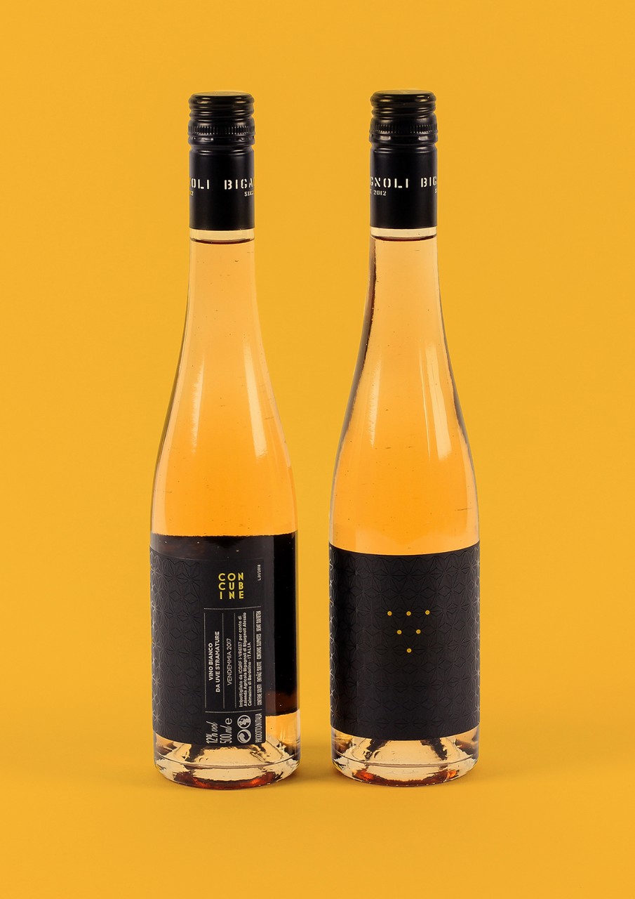
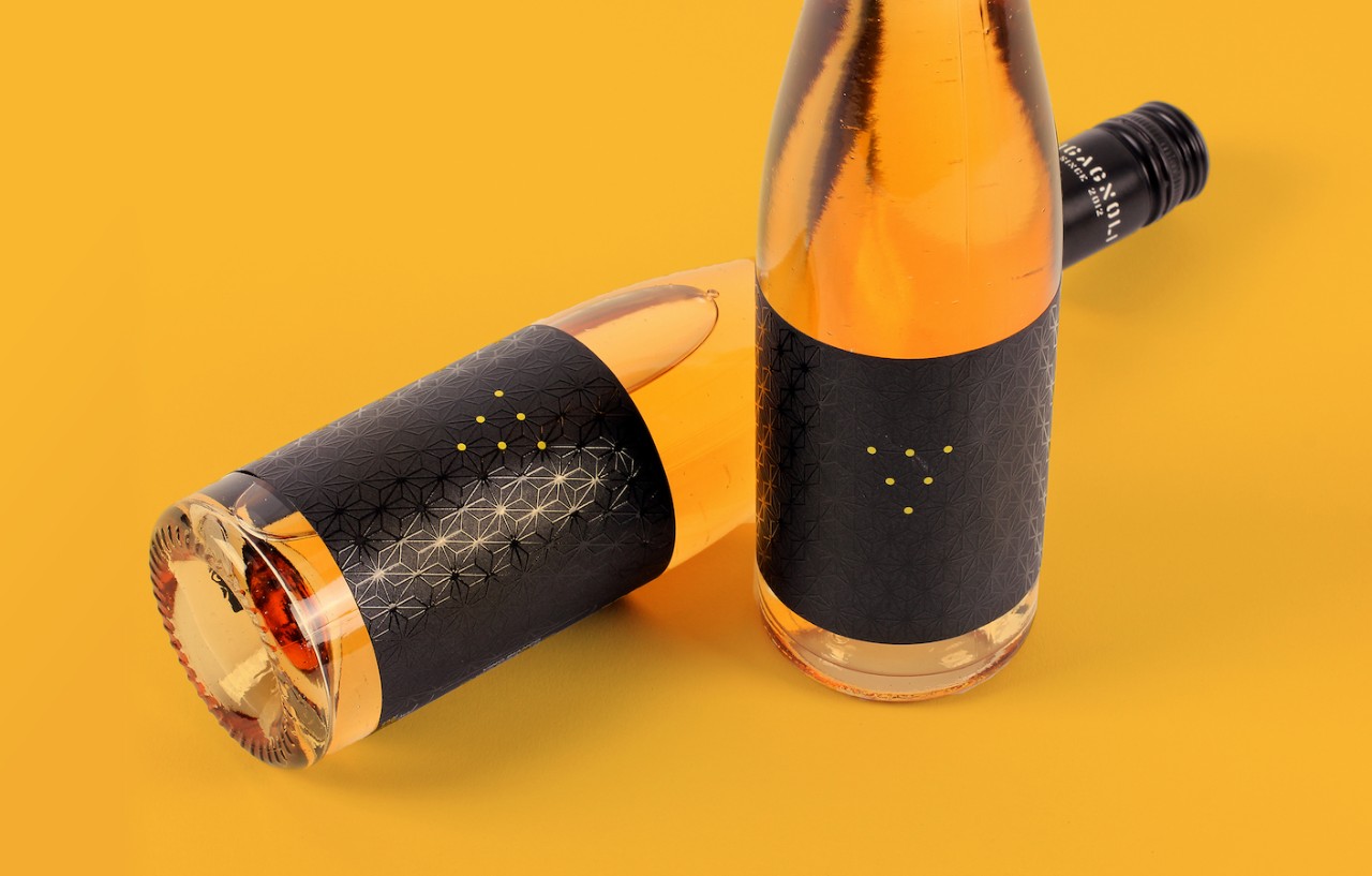
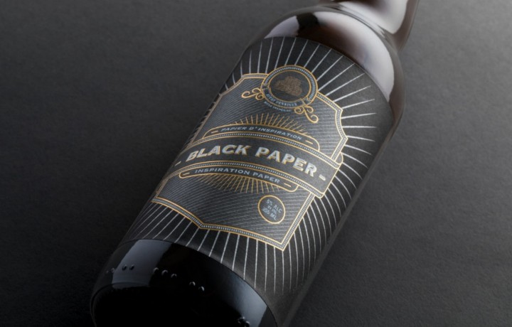
Bigagnoli, a winemaker known for challenging convention, does so again with a package as distinctive as the wine inside.
No words appear on the front label—just an inverted triangle composed of die-cut dots amid a textured, anise-shaped pattern. The soft black of the facestock makes the visible golden wine all the more vivid. On the back, the wine’s provocative name is set in a block above basic information about the rich, sweet white fermented from late-harvest grapes.
The message the screen-print, tactile-varnished label coneys is “premium,” “creative,” and perhaps most important, “I am different.”
To create a label for an iconoclast, designer Stefano Torregrossa chose Fasson® Paper New Black FSC® by Avery Dennison.
“No names, logo or data are visible in the front view,” Stefano said recently in Packaging of the World. “The product itself speaks, inspiring emotions and desires. The user is bound to touch, rotate, and look at the bottle closely to discover information...A luxury pack for a luxury wine.”
Printed by Grafical.
Related Articles


Related Materials