Search
Unbounded Affinity: A story of meaningful design
How 63 DE-SIGN and Eurolabel reimagined fragrance packaging with purpose
Designer: 63 DE-SIGN
Printer: Eurolabel
Label materials: Fasson® rPaper Black FSC
Every now and then, a design project comes along that really catches the eye and stirs something deeper. A curiosity, an idea or just a moment of silence. It’s the kind of project that invites you to look closer, to think not just about what it is but what it stands for.
Take a bottle of perfume, for instance. There can be more to it than just its scent. Like the smooth texture of the label and the thoughtful stories hidden in the packaging details – acknowledging its origin. It’s these small but meaningful nuances that define the difference between something you use and something you experience.
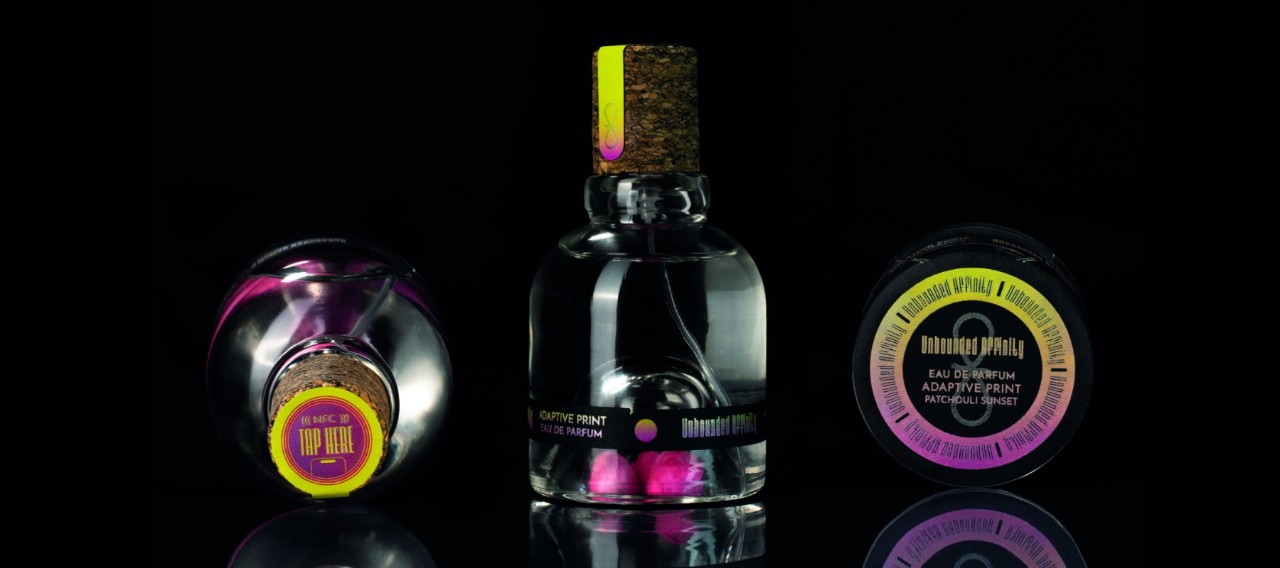
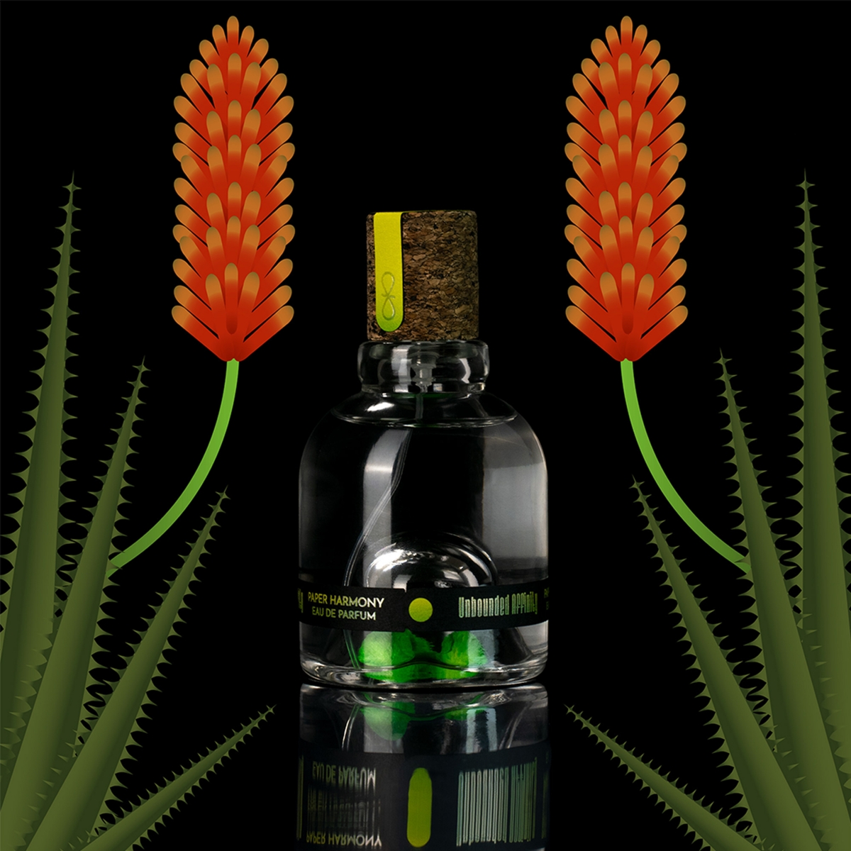
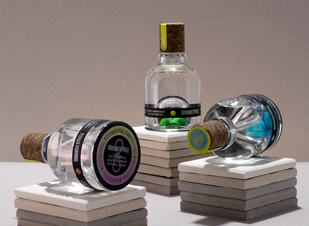
And it was from this philosophy that Unbounded Affinity was born. A collaboration between 63 DE-SIGN and Eurolabel, this concept debuted at the “WE HATE LABELS” stand during the Packaging Premiere Milano, where it caught the eyes of audiences with its combination of style, sustainability and accessibility. The project represents three fragrances, each inspired by a set of core values: “Print Adaptive” by Eurolabel, “Glass Clarity” by Estal, and “Paper Harmony” by Avery Dennison. Together, they form a collection that weaves these themes into every inch of the design.
What makes Unbounded Affinity truly special is its invitation to engage with nature. Each bottle contains flower seeds at its base, corresponding to the essence of the fragrance: aloe, patchouli or jasmin. These seeds alter the experience of perfume from something fleeting to something enduring. “We wanted to create a connection between the user and the fragrance that extends beyond the product itself,” explains Josie Ingoglia, Graphic Designer & Partner at 63 DE-SIGN. “By planting the seeds, you’re participating in a moment of renewal – a gift from the brand to the individual.”
This idea was a response from 63 DE-SIGN to go beyond the initial brief from Eurolabel, which focused on inclusivity and creating a stronger connection with consumers. By introducing the element of flower seeds, the studio brought an added layer of depth to the project, turning the concept of connection into a tangible and a memorable encounter.
Inclusivity was a key focus throughout the design process. The packaging was created to appeal to an audience that values variety and sustainability. To achieve this, the team opted for a unisex design and chose yellow as the key color. “Yellow is one of the most visible colors for people with monochromacy or achromatopsia, making it an accessible choice,” adds Josie. This is paired with our Fasson® rPaper Black FSC paper, which adds a rich, smooth texture and a deep black tone that enhances the contrast. The addition of holographic foil accents by Luxoro also injects a playful energy that resonates with younger, socially conscious consumers. Josie says, “We weren’t just thinking about how it looks – we were thinking about how it feels, how it involves people and how it connects with them.”
The innovation doesn’t stop at the aesthetics. Each bottle features a QR code and an RFID tag, turning the label into a digital gateway. Users can scan or tap to unlock multimedia content, diving deeper into the story of the fragrance and the values behind it. “Technology allowed us to make the experience more immersive and more participatory. For us, it was about not just showing a physical product but engaging with the story behind it,” Josie adds.
Sustainability was equally important in the design as inclusivity. The label was made intentionally thin to minimize waste while still looking and feeling luxurious. The carbon cork closure by Estal is another nod to green values. “Every choice we made, from the materials to the functionality, was about balancing sustainability with elegance,” Elisabetta Brambilla, President at Eurolabel says.
When Unbounded Affinity was presented at Packaging Premiere Milano, it was met with enthusiasm for its fresh take on packaging design. Created for a younger audience that’s socially aware, the project struck a chord with its core messages. Elisabetta reflects, “The concept of balance is central to this project and we wanted every detail to reflect that idea.”
By connecting design, nature and technology, this project creates a thoughtful, memorable experience that’s conscious of today’s consumers’ priorities. It’s a reminder that luxury can do more than delight the senses – it can spark a deeper connection and leave a positive impact.