069 Wines: Honoring the Identity of Frankfurt With Label Design
069 Wines: Honoring the Identity of Frankfurt With Label Design
AGENCY ArtevinoStudio - Fil Rouge
CREATIVE DIRECTOR Antonella Frate
CLIENT Cantine Lavorata
LABEL MATERIAL Fasson Cotton Extra White
PRINTER Rotocel Space
To most people, the digits 069 may seem insignificant and meaningless, but they carry great pride and identity in one corner of the world. Frankfurt, Germany, is not only the financial capital of the EU that offers a wide range of history and culture but its area code 069, is synonymous with the city's character. For those who live in this city, it is more than just a number.
It is this subtle yet powerful identity that Italian winery Cantine Lavorata wished to pay homage to. Some may wonder why a traditional family-run Italian winery dedicates its wine to a place that is approximately 1,800 km north of Calabria, where it produces its wines. The answer is quite simple. Respect and appreciation. Since the 1990s, Frankfurt has welcomed and seen the growth of Cantine Lavorata's wines as one of the first markets abroad to embrace the brand's premium and luxury products. Working in collaboration with creative agency ArteVinoStudio, the winery sought to create a new wine in honor of Frankfurt.
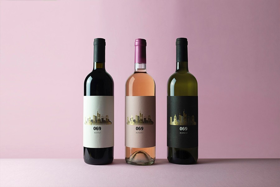
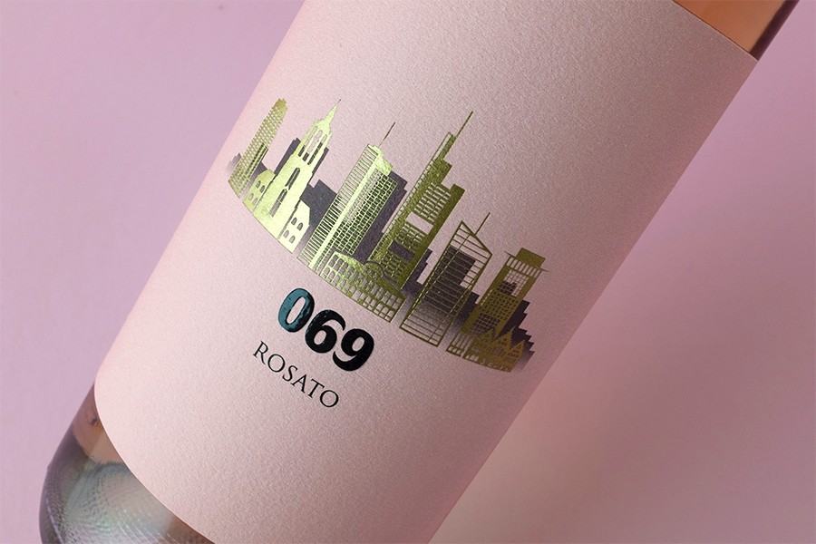
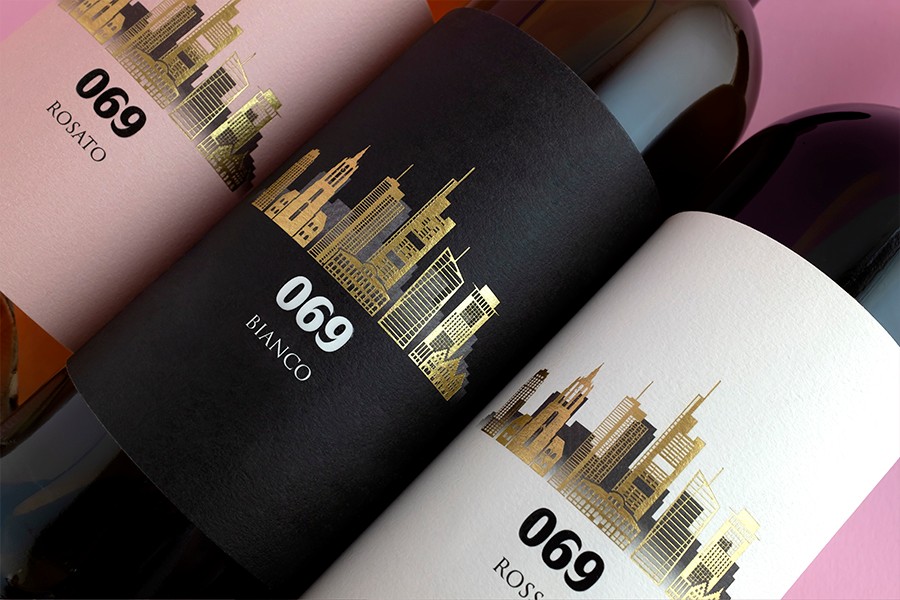
“The graphical approach and inspiration were tied to the very clear message that the labels had to put Frankfurt in the spotlight, with the name 069 evoking the city's image. Effective, yet clear and concise”, explains Antonella Frate, Graphic Designer & Art Director at ArteVinoStudio. Indeed, the label depicts the city's skyline on gold foil by Luxoro and LUXOR®/ALUFIN® MTS by Kurz. “The decision was deliberate to portray the idea of city lights and reflections of the Main river on the facades of the buildings”, adds Antonella.
For the label, the agency used Avery Dennison’s Fasson® Cotton Extra White paper which is made from 100% cotton and contributes significantly to the material impact. Printed by Rotocel, it enhances the label by providing a nice contrast between its modern and linear design, as well as the substrate's material surface. Using three different colors on the label differentiates between white, red, and rosé wines, adding another elegant layer of distinctiveness.
Many of us imagine vibrant vineyards far from the frantic pace of a city when picturing grape cultivation. The creation of this wine as a tribute to the city of Frankfurt creates a perfect juxtaposition between country and city, highlighting the fact that good quality wine knows no boundaries. Despite the underlying meaning and identity of the bottle being somewhat mysterious to non-Frankfurters, the bottle's simple and beautiful aesthetic transcends borders and speaks volumes on its own.
