Search
Behind the scenes with Mucho
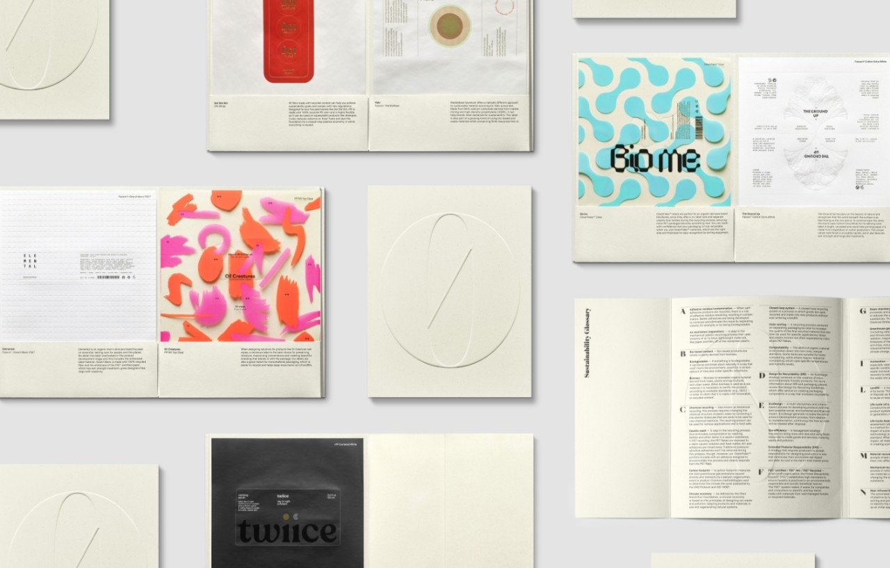
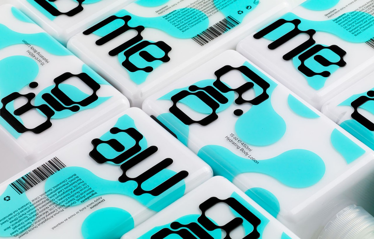
Steeped in imagination and guided by sustainable principles, the Zero Waste Beauty collection offers an assortment of speculative brands. Each one demonstrates how a label can make a big impact on consumers and a small impact on the planet.
Branding, packaging and graphic design agency Mucho relied on its diverse global team to create this collection. M_use spoke with them about sharing each brand’s story and their experience with taking an EcoDesign-centered approach.
Authors are signified with their initials.
LR: Luke Robertson, Associate Partner
HN: Hiuman Ng, Designer
DH: Dominic Hofstede, Partner
PJ: Pablo Juncadella, Partner
AT: Aura Torné, Designer
MO: Marga Oller, Associate Partner
LB: Lyam Bewry, Design Director
What was your process for developing the envelope format and content?
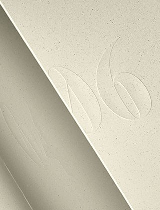
LR: The envelope design was our initial consideration for the project. First and foremost, it had to embody the concept of ‘zero-waste’, with nothing superfluous. We researched different methods of construction that would reduce unnecessary production processes and be easy to mail. We liked the idea of a concertina format, where simple folding is all that is required to bind the envelope and hold the labels in place. Finally, the concertina is then wrapped in a cover sheet, which doubles as a sustainability glossary and gives the envelope a shelf presence by creating a spine.
Sourcing the paper was another key element of this project, and we were thrilled when Favini agreed to provide their Crush Citrus paper. It is made through a process that incorporates agro-industrial waste, and the result is a beautifully textured and tactile material. The off-white colour creates a neutral background to showcase the diversity of label designs inside the envelope.
What were sources of inspiration for the label designs in the Zero Waste Beauty collection?
LR: We assigned each of the seven labels to a different global Mucho team, from Melbourne to Barcelona. This allowed responses to the brief to be interpreted uniquely by each one, resulting in a collection of prototypes that are wonderfully diverse. The inspiration came from the brief set by Avery Dennison, as well as by studying the unique qualities of the label materials themselves.
The designs in this collection strongly emphasize the sustainability story of each brand. What is your creative process for identifying and visualizing the key narrative of a brand?
LR: While the brands in the Zero Waste Beauty envelope were hypothetical, we approached them in the same way we do with the real brands we work with every day. Our objective is always the same: to align values with effective communication and design. We create narratives by generating value structures from a brand’s vision and objectives. Ultimately, the goal of the Zero Waste Beauty envelope and its brands is to set an example proving that EcoDesign doesn’t have to sacrifice quality, impact or beauty. In fact, it enhances these attributes.
Could you walk us through how you came up with the design elements for a specific label in this collection?
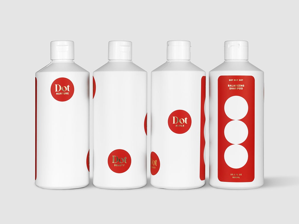
AT (Dot Dot Dot): It all started with the idea of making circular dots on the label to represent the Dot Dot Dot in the name. This made us realize that the dots could be distributed throughout the pack. We thought it could be cool because it gives the idea that the dots had ‘escaped’ from the main label. Finally, we combined a gold stamping touch with a contrasting coral red Pantone.
Which label was the most challenging to design? How did you work through those challenges to bring it to life?
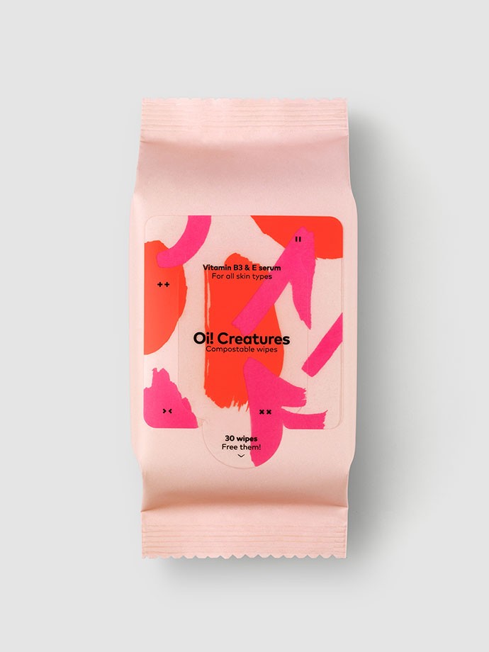
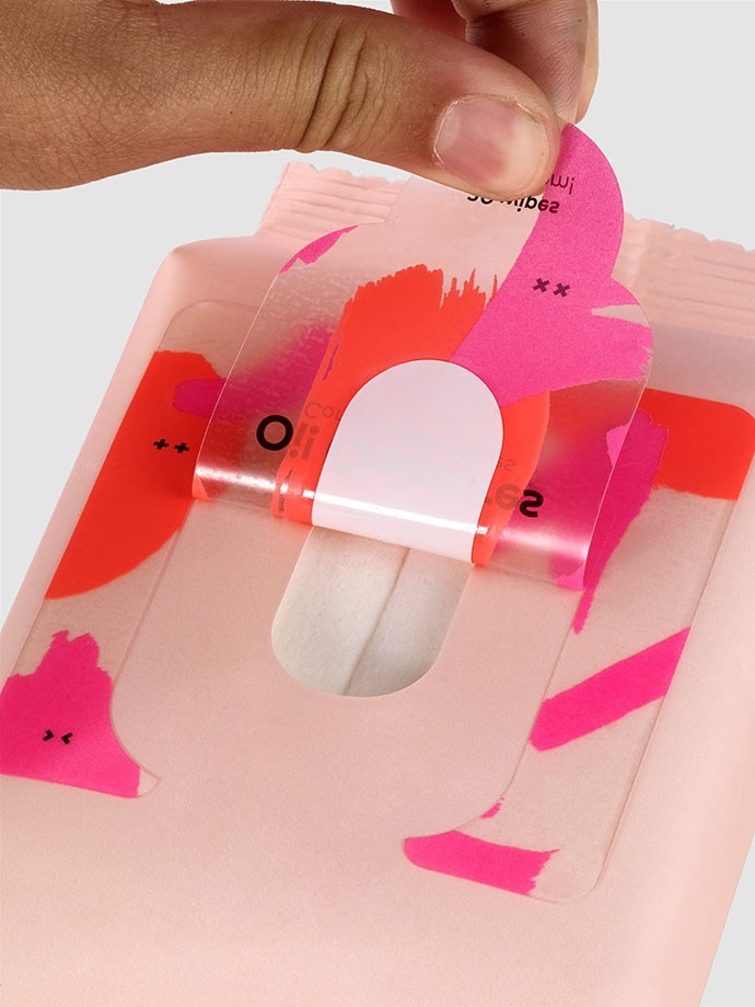
MO: Oi! Creatures was one of the most demanding labels for several reasons. The first challenge was to break with the aesthetic stereotypes of sustainability in order to reach a young, playful and bold audience while still talking about a compostable product.
Nowadays, new generations are more aware of recycling and sustainability, so old imagery feels outdated. In order to lessen our impact on the planet and reduce waste, we can create products that actually give back to the environment. Oi! Creatures wipes are 100% compostable. With this depiction of bright and fantastic creatures – makeup stains brought to life by a pair of eyes – we wanted to invite people to get creative with the remains of their makeup. The stains are a symbol of creation and regeneration as well as cheeky design.
The second challenge was the technical characteristics of the label itself. A lot needed to be communicated in a small space. In addition, one of this label’s characteristics is its transparency, so to reduce the amount of surface to be printed, we wanted to play with it. This made it necessary to think about the label design in a strategic way to cover the hole where the wipes come out, while avoiding slicing through relevant information with the die-cutting. Let's not forget that the main virtue of this label is the reclosure system that keeps wipes moist, while enabling smooth, repeated openings and closings.
How does material selection play a role in your creative process?
DH: Materials are as important to our design process as the selection of a typeface or a color. A textured wine label, for example, prompts both a visual and sensory response from a consumer, as there is a physical interaction between them and the bottle.
We will consider the label stock as an integrated component of the design, and that means requesting samples as early as possible in the conceptual process. Insights from our printers with regards to the performance of a paper stock are also critical and will inform the selection. We research existing examples to see what materials have been used, and, again, rely on our production partners for their input.
Maintaining a library of reference materials provides another important resource, and we have collected a broad range of samples that can be called upon to inform our design process.
Which featured material did you most like working with?
LR: It’s difficult to pick a favorite as they all have such unique functions and are suited to different purposes. The textural quality of the Fasson® Cotton Extra White that we used for The Ground Up is particularly effective at conveying the story of that label since it is made from a byproduct of cotton production.
This collection features a variety of finishes, embossings, foils and other tactile elements. In what ways did you use texture to communicate a brand’s story?
PJ: Certainly, we wanted every brand in the collection to have a relationship with the label material used, and that every brand idea was linked to a texture and a specific printing technique. Let's not forget that our purpose was always to learn about the possibilities of each material, and by doing that, share ideas that inspire other designers to embrace experimenting with interesting effects and taking advantage of the material’s characteristics.
A good example of this is the Halo label that combines lines with foil block to create the idea of a gradient or a shadow, or how we use a geometric structure debossed with ultra precise tinted UV varnish on the Fasson MarbleBase paper to express the idea of the mathematical beauty in nature.
What are the key lessons Mucho learned about designing for sustainability during this project?
LR: It’s no easy task. Designing for sustainability requires a deep understanding of materials, terminology, technology and production logistics, which are all constantly evolving. Practices around supply chains, waste management and recyclability differ from country to country, and even city to city. Luckily for us, the team at Avery Dennison was always available, offering knowledge and answering questions as we worked through the project. Seemingly small decisions can have big, unintended consequences down the line.
What EcoDesign innovations or trends are exciting you at the moment?
LB: As well as the increasing availability of new eco-friendly materials and processes, it’s exciting to see that more people are considering how their products and designs can serve multiple purposes and live beyond what is normally expected. This idea seems to have fueled a new wave of original ideas in packaging, as well as in other creative disciplines like product design and architecture, with a focus on reuse rather than disposal – inspiring stuff!
HN: In graphic design, the sustainable packaging trend has increased designer awareness of the responsibility of not making more environmental mistakes. Also, as designers, we’re elated to see all the innovative materials that provide more options and solutions in packaging design, including renewable and bio-based packaging that is compostable or biodegradable.
Also, in the fashion industry, many established brands are refocusing their commitments on eradicating plastic waste and pollution. We even see new sustainable brands that have been launching with the mission of creating an environmentally responsible supply chain.
As EcoDesign has evolved, people have become more aware of their responsibilities. Even though there are still issues and unsolved problems in innovations and trends, the positive impacts seen so far are important to the environment and planet.
LR: It’s positive to see EcoDesign being foregrounded by large, mainstream institutions such as the Design Museum in London with their current exhibition Waste Age: What can design do? Curated by Gemma Curtain, it explores the role design has played in creating the throwaway culture of today, and how we can imagine a more resourceful world in the future.
What advice do you have for brands starting to explore EcoDesign?
LR: Embrace it. It presents a valuable opportunity for brands to strengthen their commitment to material responsibility, and do better for people and the planet in the process. We imagine a future where EcoDesign can be so widely adopted the term itself becomes null and void, and its principles simply become the required baseline.
Related Articles