M63: A tribute to Michelangelo's artistry in modern label design
A story of individuality and heritage by Tonutti Tecniche Grafiche Spa member of Alliance Etiquettes
Designer: Barbara Passon
Brand: Badagoni
Printer: Tonutti Tecniche Grafiche
Photographer: Barbara Passon
Label materials: Fasson® MarbleBase, Fasson® Fibers Look FSC®
Michelangelo found hidden depths and stories in raw marble blocks, just as a label can reveal hidden layers and stories with the right touch of creativity. His iconic works like ‘Bacchus’ and the ‘Sistine Chapel’ ceiling, embody the combination of technical skill and artistic vision. This same sense of transformation is captured in the recent M63 vodka label project. Led by the designer Barbara Passon from Tonutti Tecniche Grafiche Spa, M63 redefines the concept of labeling, combining the best of Michelangelo's artistry with modern innovation to create something truly special.
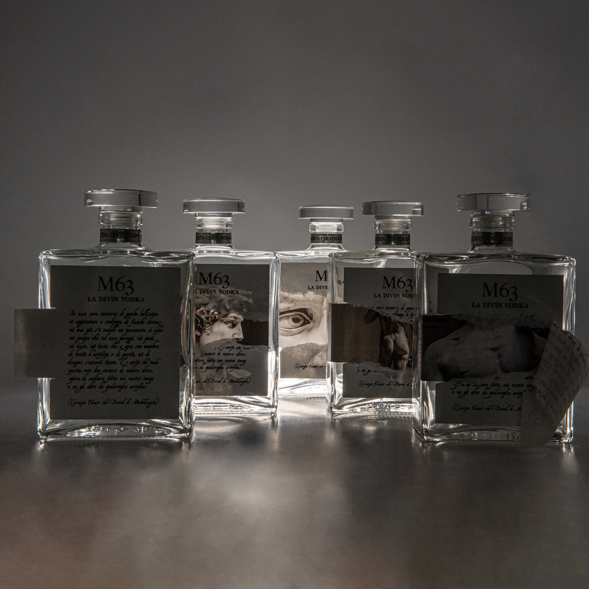
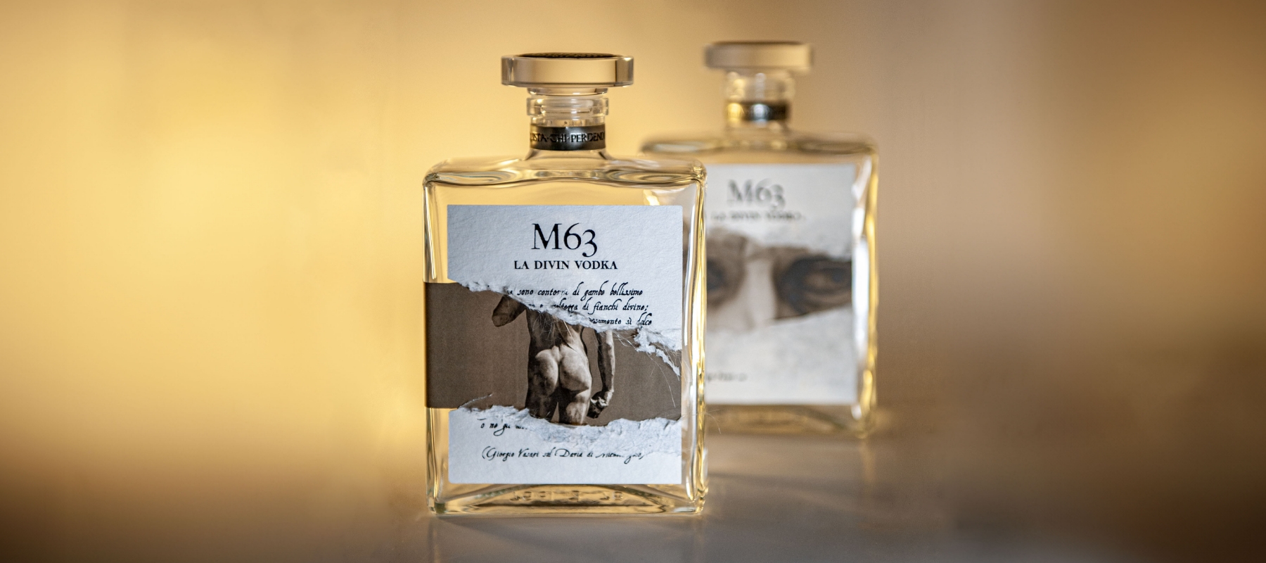
In an industry where uniformity is the norm, M63 celebrates individuality by embracing the uniqueness of each piece. Every label is crafted to be original, reflecting Michelangelo's philosophy of uncovering beauty from within. Passon drew inspiration from the artist’s ‘David’, one of the most notable works of the Italian renaissance. The label's design features two overlapping layers, including a tear-off technique that reveals eight hidden details beneath—reproductions of different parts of David's body. This interaction turns each label into a unique piece of art, much like Michelangelo's process of carving marble to reveal his masterpieces. "M63 is designed for the instinctive, a target group characterized by creativity and expertise," explains Passon. "The act of removing a layer of paper to reveal the work is exactly what Michelangelo did with marble."
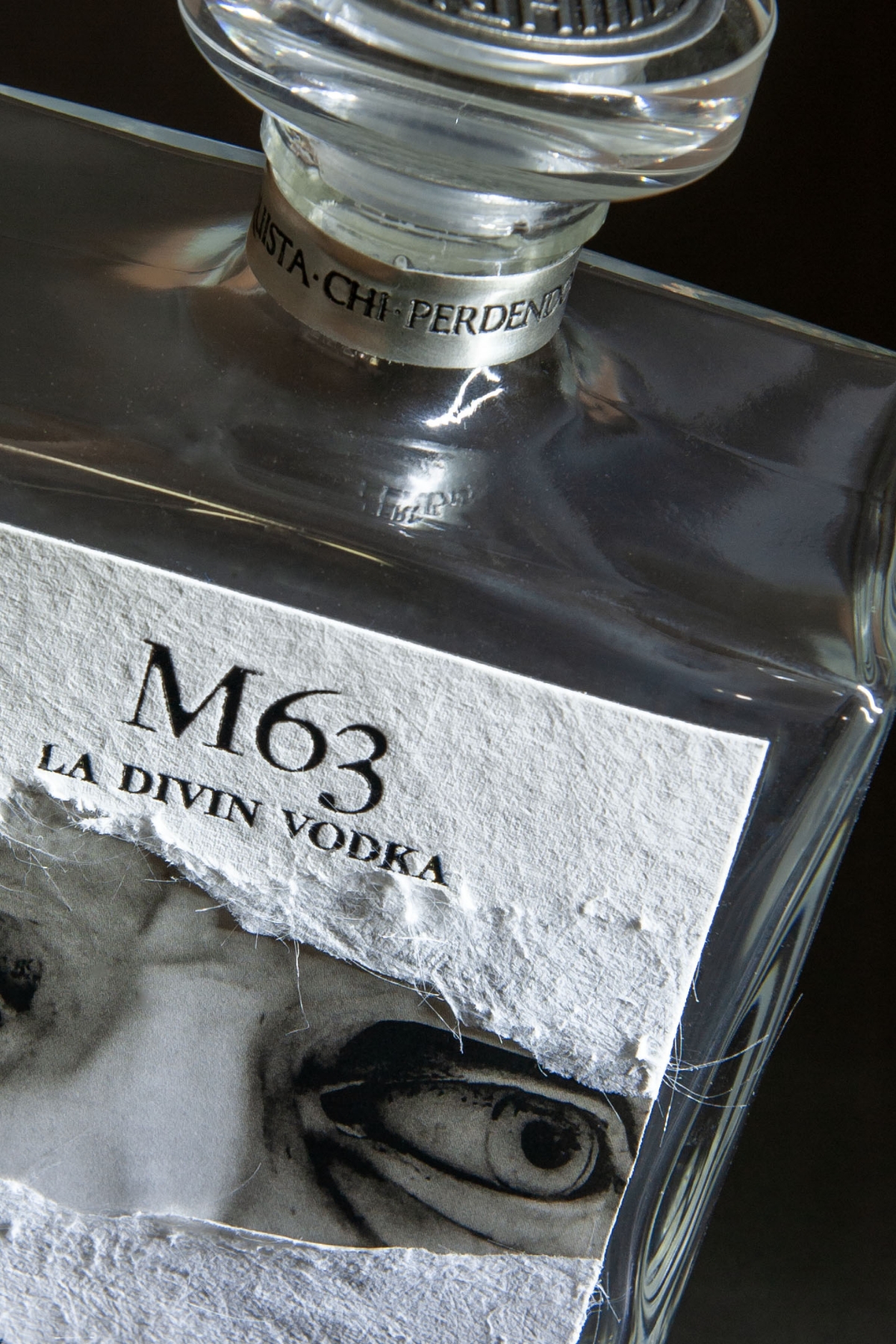
The name M63 itself is a tribute to the artist. The 'M' stands for Michelangelo, and "63" represents his birth date, March 6. The inscription 'la divin vodka' on the neck of the bottle pays homage to the sculptor, who was nicknamed to by his contemporaries as 'the divine artist'. But it doesn’t end there. The neck of the bottle also features the phrase 'He who learns by losing,' highlighting Michelangelo’s belief in the value of failures in achieving greatness. The pull tab bears his personal mark—three circles and an 'M'. The mark is not fictitious; it was Michelangelo's actual personal emblem, symbolically printed with two levels of debossing. One circle contains his only recognized signature (used on the sash of Mary's robe in ‘Pietà’, which reads 'Michael.Agelus.Bonarotus.Florant.Faciebat’), another holds Barbara Passon's name, and the third indicates that the product is Made in Italy.
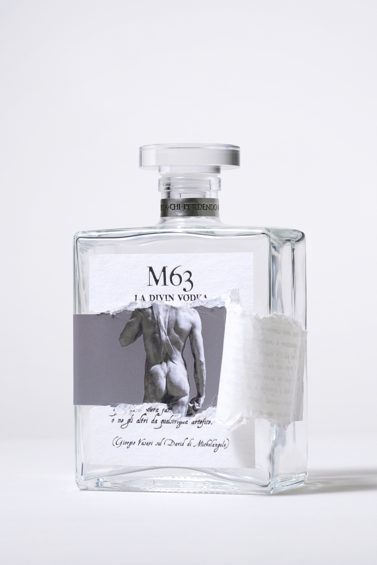
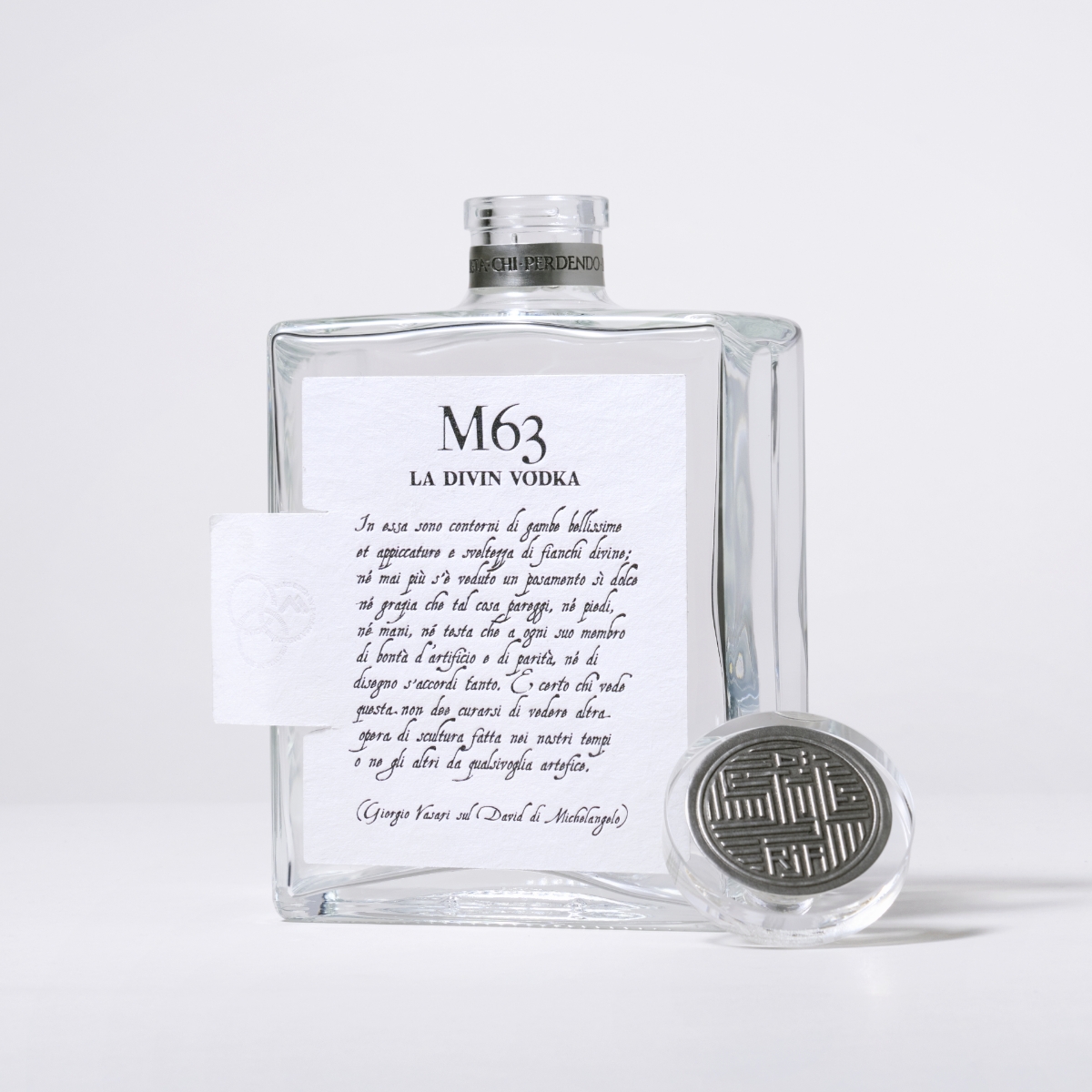
The choice of materials is key in bringing this vision to life. The upper layer of the label uses our Fasson® Fibers Look FSC®, a textured, fibrous paper with black hot stamping and debossing. This contrasts beautifully with the smooth lower layer, printed on our Fasson® MarbleBase which contains marble powder, giving it the tactile feel of marble. “Passon has created an interactive label with multi-level coupling and a surprise effect made possible by the tear-off technique,” says Barbara Pagnutti, Marketing Manager at Tonutti Tecniche Grafiche Spa. “The combination of Fibers Look and MarbleBase papers by Avery Dennison enabled us to achieve this sophisticated and tactile design.”
Talking about the packaging, Pagnutti added: "It is completed by an under-bag, a collar placed in the space under the neck of the bottle, and a decoration on the elegant glass jewel closure of Vinolok. The two pieces are made of magnificent pewter, 99.98% pure tin, in a patinated satin silver finish by Etincia."
The visual impact of the M63 label is undeniably powerful — even if it's for aesthetic reasons alone, it will make consumers want to own one. The black lettering on a white sheet, paired with the variability of the hidden images, ensures that each label is a one-of-a-kind creation. The upper part of the label features a pen stroke by Vasari on David, giving each label a handwritten appearance through hot foil printing on thick, long-fiber paper with debossing. This type of printing, influenced by various factors like the pressure of the beat, the heat of the plate, and the surface of the paper, creates a variability that emphasizes the character of each bottle. In fact, the bulging letters and uneven areas of print are synonymous with originality and remind us of the effect of the ink nib on hand-made paper — similar to ancient documents.
Ultimately, M63 goes beyond traditional label design, offering an engaging and interactive experience that reflects the brilliance of Michelangelo's work. Through this approach, Tonutti Tecniche Grafiche Spa have constructed a narrative that celebrates craftsmanship, heritage, and the timeless power of art, inviting you to be part of the creative process.

