From loss to hope: The story of Meyer-Näkel's ‘Lost Barrels’
How Ruska Martín designed a symbol of resilience
Design studio: Ruska Martín
Brand: Meyer-Näkel
Printer: Carini
Photographer: Sandra Fehr, Heroes of Riesling
Label materials: Fasson® Paper New Black FSC®
Just as Beethoven tapped into his deafness to create unforgettable symphonies, and Van Gogh channeled his grief into breathtaking art of sunflowers and starry nights, tragedy can often act as fuel for great creativity. This power is also clearly portrayed in the story of Meyer-Näkel winery and its 'Lost Barrels' collection.
The story begins in July 2021, when chaos struck the Ahr valley in Germany. Devastating floods swept through the region, leaving a trail of destruction, and Meyer-Näkel winery, one of Germany's top producers, was not spared. During the flood, the owners—Meike and Dörte—were able to escape their flooded wine cellar but were immediately carried away by the relentless waves. Their only hope was to hold on to a tree, where they remained for eight hours until they were rescued. Their entire 2020 vintage, the product of years of care and cultivation, was wiped away. Yet, amidst the wreckage, a glimmer of hope remained. Miraculously, nine barrels of Pinot Noir survived, carried away by floodwaters and eventually discovered miles away. These 'Lost Barrels,' a fraction of the original 380, became a symbol of resilience. As Meike and Dörte Näkel said, "We will remember the 2020 vintage forever. It is packed with emotion."
Determined to rebuild and share this extraordinary story, the owners approached the agency Ruska Martín to design the line of the last 2,520 bottles. Their vision was clear: a label design that captured not just the salvaged wine's preciousness but also their experience's emotional weight. "These wines are a relic from the past and also a starting signal from what may come in the future," they explained, perceiving their journey as one of loss and optimism.
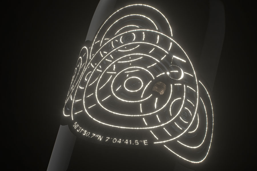
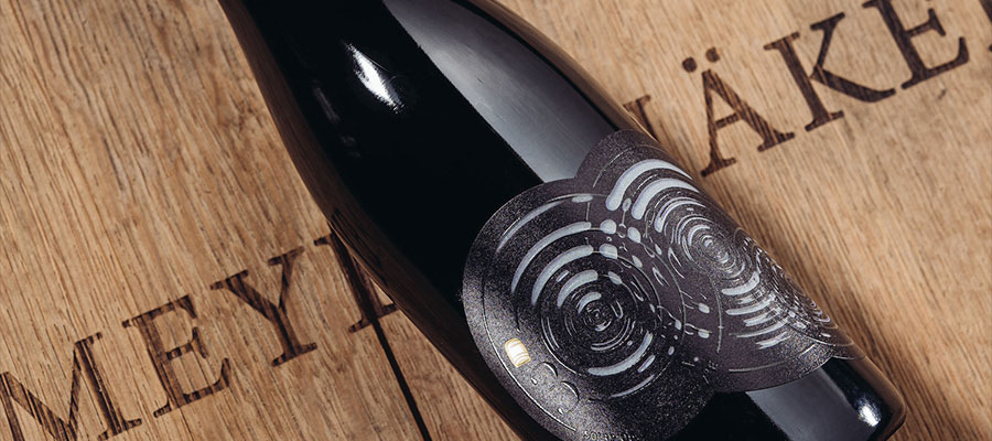
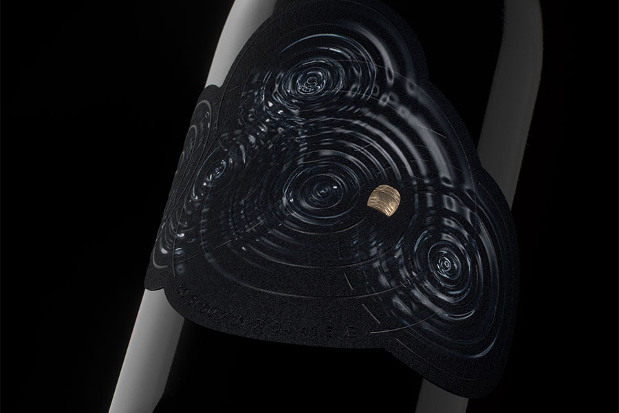
Roman Ruska, Creative Director at Ruska Martín, embraced the challenge with enthusiasm. "We were offered complete creative freedom," he explains, "and this allowed us to truly dig into the narrative and translate it into a visual experience." Inspired by the very event that birthed Lost Barrels, the agency began with a single drop. "The concept," he elaborates, "revolved around the flood itself. We envisioned a series of nine labels, each showcasing a growing number of water droplets, a subtle tribute to the nine recovered barrels." Among the dark waves, golden barrels stand out among the darkness, thoughtfully placed according to where they were found. The labels were crafted on our Fasson® Paper New Black FSC®, a choice that felt right for Ruska. "The dark tones," he explains, "were a stark reference to the flood's devastation, mirroring the event's gravity."
But the design also conceals a secret. "We wanted to introduce an element of surprise, a hidden message that spoke to the strength of the winery," says Ruska. This brilliant element came in the form of phosphorescent ink. Under dark light, the labels transform. "Details like the locations where the lost barrels were found, along with the bottle number and the water droplet motif, all came together," he describes. This clever use of materiality became a powerful metaphor. "The phosphorescent ink symbolized the hope beneath tragedy, a tribute to the human spirit's ability to persevere." The bottles are then placed in wooden boxes made from the remains of the lost barrels.
The Lost Barrels collection encompasses more than just wine. It symbolizes the winery's special journey. Each bottle tells a story through premium labels designed by Ruska Martín. The result is a collector's item with exceptional wine and an unforgettable narrative of loss, resilience, and hope.


