Search
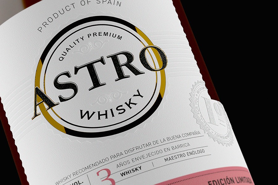
Astro Whiskey
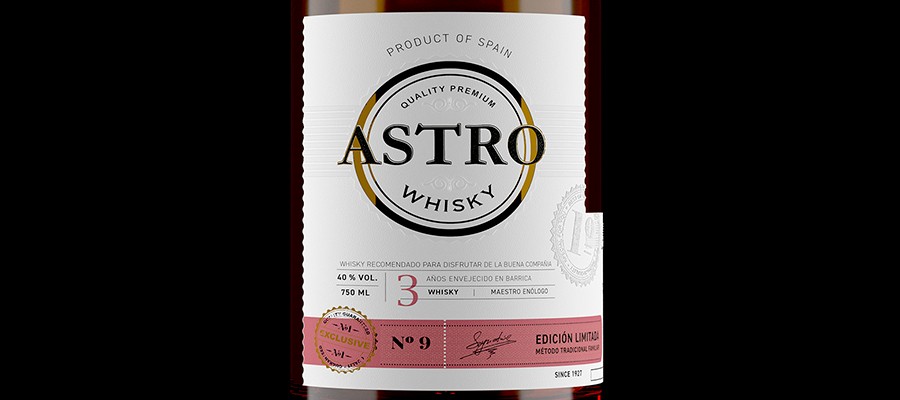
Astro Whiskey: Telling a brand story using label design
AGENCY Mompo Estudio
CLIENT Wine attraction
MATERIAL Fasson® Cotton White
MARKET Europe
PHOTOS Mompo Estudio
Throughout history, humans have always been fascinated by the bright beacons of light illuminating the night sky. Stars are said to depict chronologies of gods and mythical creatures, mark the passage of seasons, and guide our ancestors when there was darkness and nothing else. And it is this narrative of guidance and navigation that design agency Mompó Estudio and consultancy Wine Attraction wanted to capture with their ‘ASTRO Whiskey’ project.
“Our client wanted the product to be based on the definition of the word “star” (Astro in Spanish). In the same way that lights guided us in the past, the founders of the client's company always looked back to their family's successful past in order to determine which direction to go”, explains Jordi Montserrat, Founder of Wine Attraction. Therefore, the creative team was tasked with expressing this in a sophisticated and tasteful manner, in line with classical whiskey packaging.
Taking on ASTRO Whiskey offered renowned design agency Mompó Estudio an exciting opportunity since their impressive portfolio of product design is mainly focused on wine labels, presenting them a chance to try something new. With Wine Attraction, the team used space stars as inspiration for the design and the competitors' products to create a package that could be recognized as a traditional whiskey packaging and differentiated from the rest.
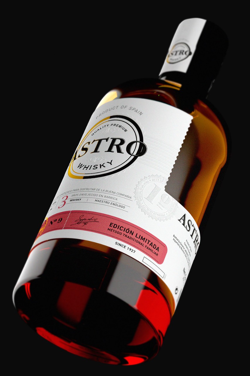
While exploring papers for the label, they decided that Avery Dennison's Fasson® Cotton White (which they discovered on the M_Useplatform) best expressed this product's elegance, luxury, and quality. "Fasson® Cotton White's texture immediately evokes a sense of luxury and quality. We also found that the feeling of this material reminded us of the pearly, irregular yet harmonious surfaces we see on celestial bodies such as the moon - making it perfectly appropriate for the project at hand", says Pablo Bellver, Packaging Designer at Mompó Estudio. The paper was also used on the capsule tin to give the product an even more significant presence.
One of the most prominent elements on the label is the circle representing the star, highlighted by gold foil surrounding its outline, mimicking its glow. Moreover, the sphere is given depth by the embossment around it. "We wanted to include a No9 on the red band at the bottom, which was the number given to this new, sweeter recipe, according to the client. The front and back labels are also joined using the same die-cut, creating a unique design element”, explains Pablo Bellver.
Combined with the simple elegance of the product design, the label finishes and die cuts reflect the remarkable concept and the vast family history the client wanted to capture. Indeed, the piece was well received by both the brand and the general public for capturing the idea altogether, telling a tale of stars and a brand story simultaneously.

Related Articles