Search
Dragon Rouge
A Dragon Rouge: Sustainable Labels for Wine & Spirits
PROJECT NAME Nothing is lost, everything is create, everything is transformed
AGENCY Dragon Rouge Creative
CREATIVE DIRECTOR: Matthieu Bourlon Creative Director, Consumer Business, Dragon Rouge Paris
CLIENT: Avery Dennison
LABEL MATERIAL: Avery Dennison Fasson® rNaturel Blanc FSC, Fasson® rGranit Blanc FSC, Fasson® MarbleBase, Fasson® rFleury Chene FSC®, Fasson® rCrush Barley FSC, Fasson® rCrush Citrus FSC, Fasson® rFrozen Pearl FSC, Fasson® rCrush Grape FSC paper
“Alone we can do so little. Together we can do so much” - a poignant and inspirational phrase from the late Helen Keller, emphasizing the importance of coming together and collaborating. As well as encapsulating the worldwide effort being made towards creating a more sustainable world, it also reflects the recent partnership between Avery Dennison and Dragon Rouge.
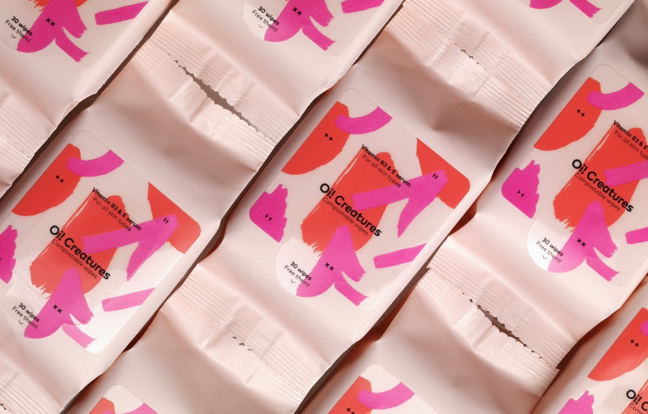
To illustrate how the perfect blend of materials and design can elevate a brand's story and its products, we asked Dragon Rouge to design an inspirational envelope of eight concepts. These were dressed with our recycled fiber facestocks, as well as residual materials from the wine, rum, beer, and citrus industries. With these creations, brands can not only communicate their environmental values, but also enrich brand storytelling through high-quality and aesthetically pleasing labeling. As the wine and spirits industry embarks on a journey towards sustainable packaging, the collaboration invites brands to participate in a creative journey and learn how innovation, circularity, and excellence can be combined to create compelling packaging.
Now let's explore the underlying inspiration behind all eight concepts and learn more about their stories.
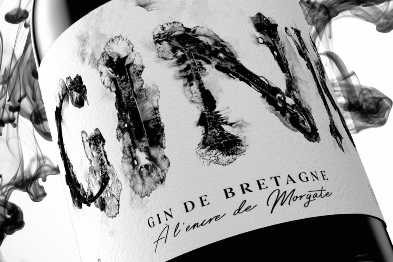
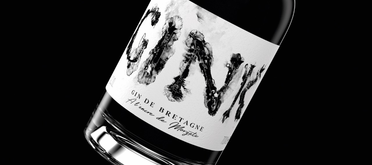
The first concept is GINK, a striking black Gin with a bottle that would stand out on any shelf. The fact that black remains one of the most popular colors due to its timeless nature means anything described as the 'new black' is often a sign that something is becoming fashionable and popular. As far as GINK is concerned, upcycling is the new black. Our Fasson® rNoble Blanc FSC® was used for this concept, a 100% recycled paper with a fine felt marked finish, that captures the essence of the aesthetic in the most elegant and sophisticated way. The design of this spirit was inspired by the French local cuttlefish "La Morgate", which is native to the Brittany region. Its ink gives this premium artisanal Gin a vivid sense of the Atlantic Ocean. Thus, Gin + Ink inspired the name of the concept.
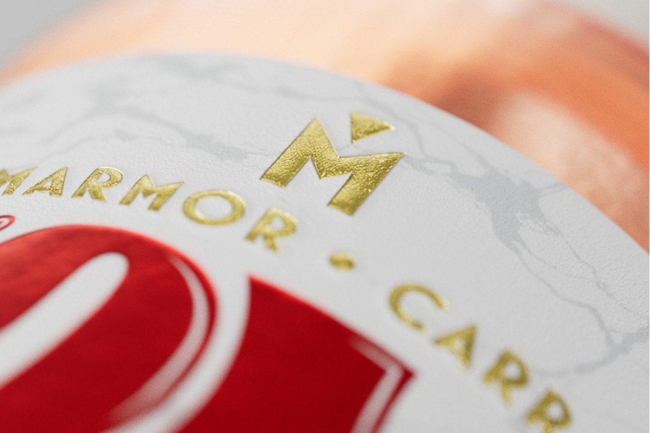
Next, we have a concept that fully embodies the traditions of one specific country and region - Tuscany in Italy. An organic tomato liquor, Pomodoro pays homage to the region renowned for its world-class cuisine and Carrara marble quarries. It is beautifully portrayed in two ways. Firstly, the triangular label resembles a slice of pizza - an unmistakable and tasteful nod to the region's cuisine. Secondly, the use of our Fasson® MarbleBase facestock refers to the marble quarries. Composed of 80% marble mining waste, it features touches of gold ink and a signature on the neck label, which plays with the marble's effect of the paper.
It is impossible to picture a quintessentially British occasion without tea. 5 O'CLOCK embodies this concept with its original whiskey infused with black tea and mixes rock and poetry simultaneously. Although this may slightly distort the image of a traditional setting, rock and poetry are undeniably a significant part of British culture. A different kind of tea time - the embodiment of true Britishness. Made from the recycled Fasson® rFleury Chene FSC® paper, the subtle brown label boasts a flowery texture indicative of a woody taste, while the design evokes a romantic, decadent feel. A wonderful representation of classic and modern Britain, with a touch of creativity.
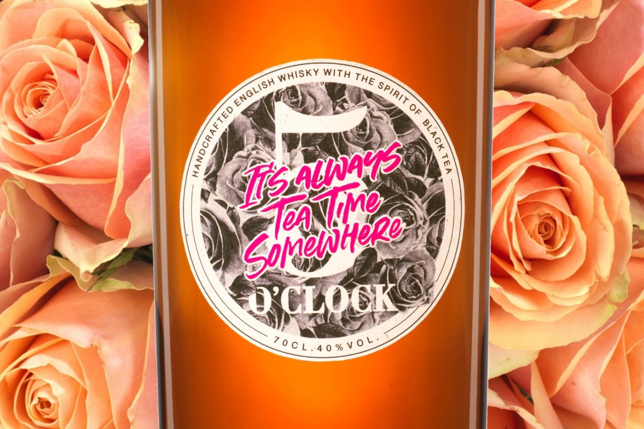
It is impossible to picture a quintessentially British occasion without tea. 5 O'CLOCK embodies this concept with its original whiskey infused with black tea and mixes rock and poetry simultaneously. Although this may slightly distort the image of a traditional setting, rock and poetry are undeniably a significant part of British culture. A different kind of tea time - the embodiment of true Britishness. Made from the recycled Fasson® rFleury Chene FSC® paper, the subtle brown label boasts a flowery texture indicative of a woody taste, while the design evokes a romantic, decadent feel. A wonderful representation of classic and modern Britain, with a touch of creativity.
“Be realistic, ask the impossible” was a slogan displayed on streets and houses throughout Paris during the French unrest of May 1968 - a period defined by protests and general strikes. The L’IMPOSSIBLE beer concept takes this slogan and turns it into a promise: a punchy craft beer full of taste but without all the alcohol. This distinctive bottle bears a monochrome label inspired by the spirit of the Parisian uprising, displayed on Fasson® rCrush Barley FSC paper, which is made from barley scraps and recycled posters.
Next, we have Orange Fuel, a triple sec that is inspired by the cult movie poster for 'A Clockwork Orange' by Stanley Kubrick. As if evoking the movie's mood, Orange Fuel is distilled in a grunge-style distillery to capture the raw essence of oranges. The machinery illustrated on the label gives the feeling of constant rotation, while the orange peels discarded during the alcohol manufacturing process are reused for the recycled paper on this label, which is our Fasson® rCrush Citrus FSC. It is yet another example of how brands are becoming more circular by embracing sustainable packaging without compromising quality or storytelling efforts.
RINASCIMENTO DI VENERE is a prosecco from a young vineyard located on the Adriatic coast of Italy, near Venice. With the name ‘Il vigneto di Venere’ translated as ‘The vines of Venus’, the label is designed to represent Venus' rebirth. At its core, the concept seeks to convey a timeless story. From Botticelli's ‘The Birth of Venus’ painting to modern street art - the goddess of love is once again brought to life through this label. Printed on Fasson® rFrozen Pearl FSC (made from 40% post-consumer waste fibers), this paper reflects the inside of the seashell that gave birth to Venus in Botticelli's painting.
Completing this remarkable envelope of inspiring concepts is Revelaçao, a Portuguese wine. The goal of this design was to acknowledge nature and the environment once again. A fascinating organic image and sensation were created for the wine label by playing with hot gold embossing - similar to what would be created by fungus growing on a vine. In its heart, Revelaçao is a story of alchemy underpinned by chance: the label design and the wine itself result from an unforeseen natural process. This is also expressed with the deliberate and fitting use of the Fasson® rCrush Grape FSC paper, which is made from grape waste generated by the production of this wine.
Using powerful graphic storytelling in this envelope proves that delivering novelty and excitement to consumers is possible, as well as adding value to a global circular economy. People seek sustainable and meaningful products that allow them to connect with brands on a more personal level, so it is the perfect time to reimagine product packaging to fulfill these demands and embark on a journey towards authentic creativity.
Related Articles