Search
Quinta Vale Santa Luzia
Quinta Vale Santa Luzia: The making of Quinta Vale Santa Luzia’s visual identity
Design Agency: Calcco
Director:Sergio Aja Iglesias
Designer: Javier Triviño Murillo
Illustration: Marmonk
Brand: Vicente Faria Vinhos
Label materials: Fasson® Cotton Touch Craft FSC®
Print: Etiquel
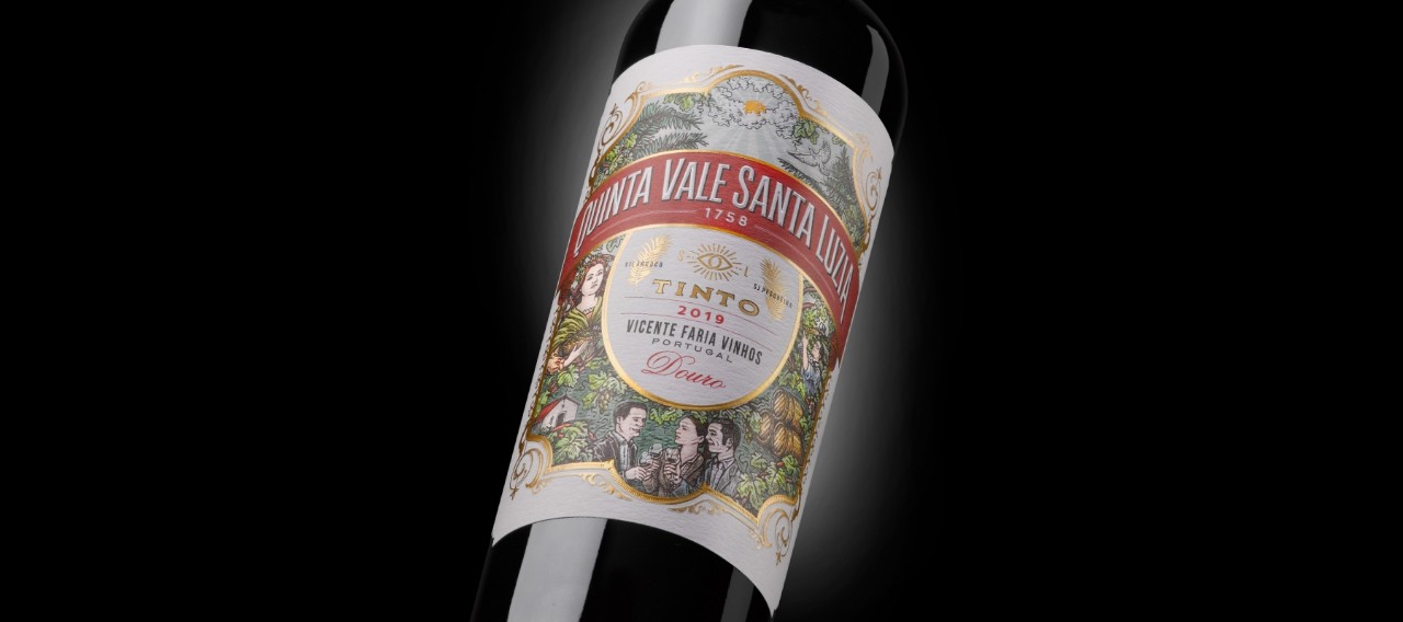
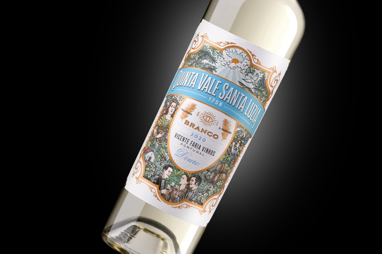
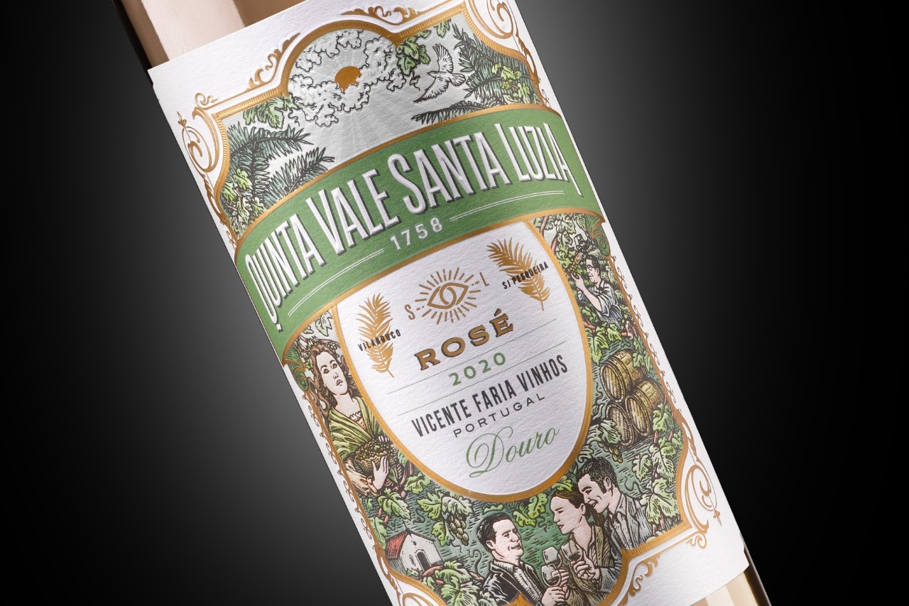
A great brand story's DNA often encompasses symbolism, heritage, and authenticity. The absence of these three key ingredients can reduce the chances of consumers noticing products on shelves, much less remembering them and becoming loyal customers. Portuguese winery Vicente Faria certainly understands this challenge and launched its Quinta Vale Santa Luzia range in collaboration with industry-leading brand experts and creatives. Named after the estate in the Douro Valley (a renowned wine region) where it resides, the range has a much broader identity than is evident at first glance. In fact, Saint Luzia, the patron of light and vision in the 4th century, inspired the estate's name. Thus, a new realm of symbolism and association was opened to the brand—especially one aligned with its core values of honesty, vitality, and perseverance.
Behind the brand is Vicente Leite de Faria, a seventh-generation winemaker recognized internationally as one of Portugal's leading producers. Wine runs through his veins. As a child growing up in the Douro Valley—the oldest demarcated wine region in the world—he learned the craft of winemaking from his grandfather and has pursued it as a profession ever since. And this passion and devotion are clearly evident in the brand's wine. Vicente Faria's commitment to sustainable farming without pesticides and chemicals sets a perfect example of how quality can still be achieved without compromising product integrity and sustainability.
With this history in mind, Quinta Vale Santa Luzia's branding and labels were created. In collaboration with Henri Sizaret from Brand Reveal, Vicente Faria devised the brand concept and contacted wine packaging specialist, Calcco for the design. "As Spaniards, we find an easy cultural approximation in Portugal that enables us to fit in seamlessly. Nevertheless, it was important for our team to spend some time in Portugal to accurately convey the diversity, generosity, solidity, and origin of the brand into its visual identity while also conveying the quality and excellence of these wines," explains Sergio Aja Iglesias, Director at Calcco.
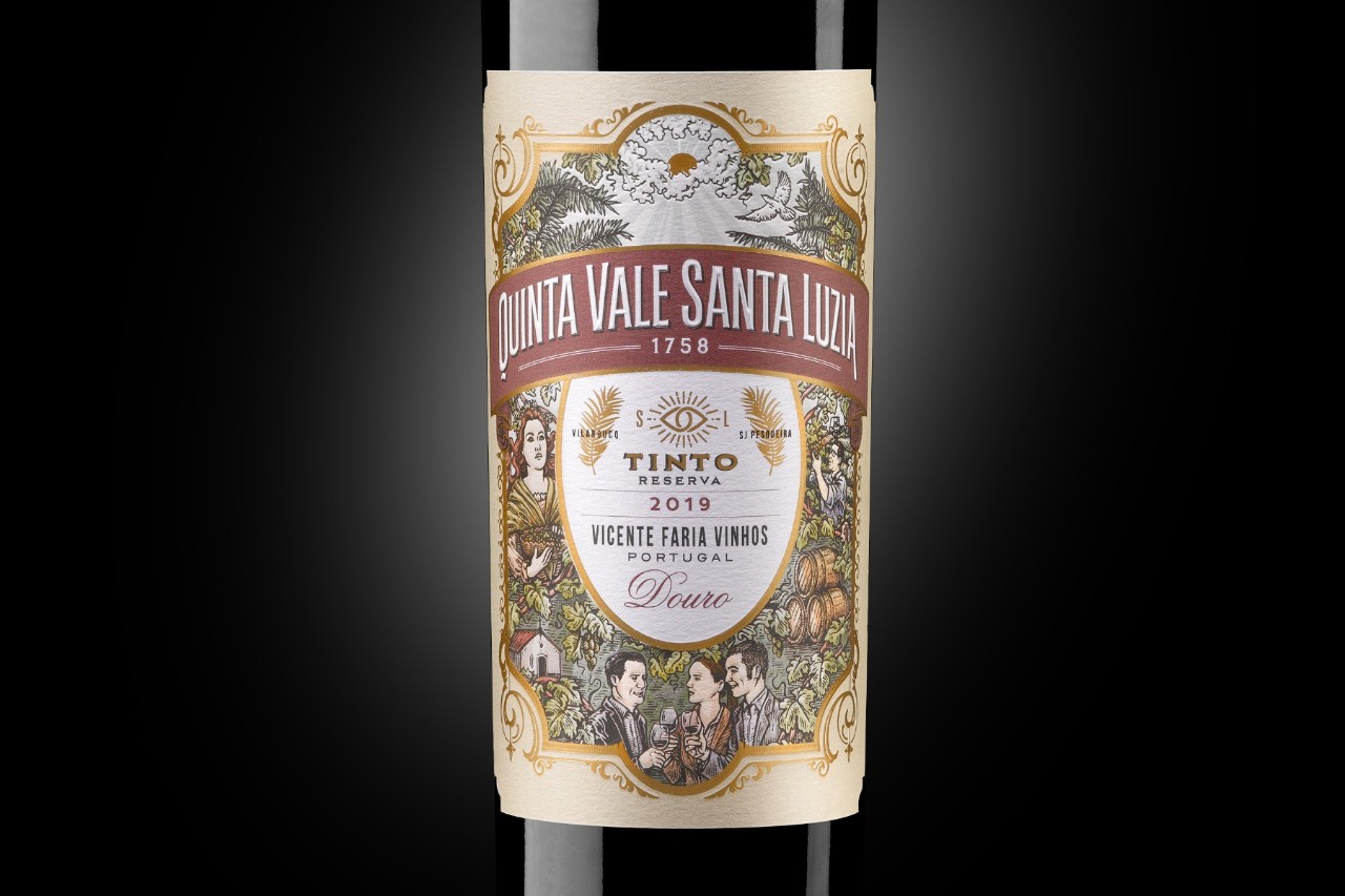
Printed on our Fasson® Cotton Touch Craft FSC® paper, these labels feature everyday Portuguese wine characteristics, following many of the guidelines of traditional iconography reminiscent of illustrations from the nineteenth century. It is a tribute to the past of Vicente Faria's history, which spans almost four centuries. "Since some of these wines are white and rosé, we were searching for a paper that could be used for immersion in ice buckets. Additionally, to achieve the desired result, we needed a paper that had a pleasant texture, worked well with color, and could be finished in various ways," adds Sergio. Indeed, the chosen paper is treated with wet strength and fungicidal technologies to ensure the label remains intact and beautiful in challenging environments like cellars, fridges, and ice buckets. Its high texture level offers the perfect canvas for all labeling projects in the premium wines industry. "Avery Dennison's team is always on hand to help us interpret each paper's qualities and express our objectives in every project," continues Sergio.
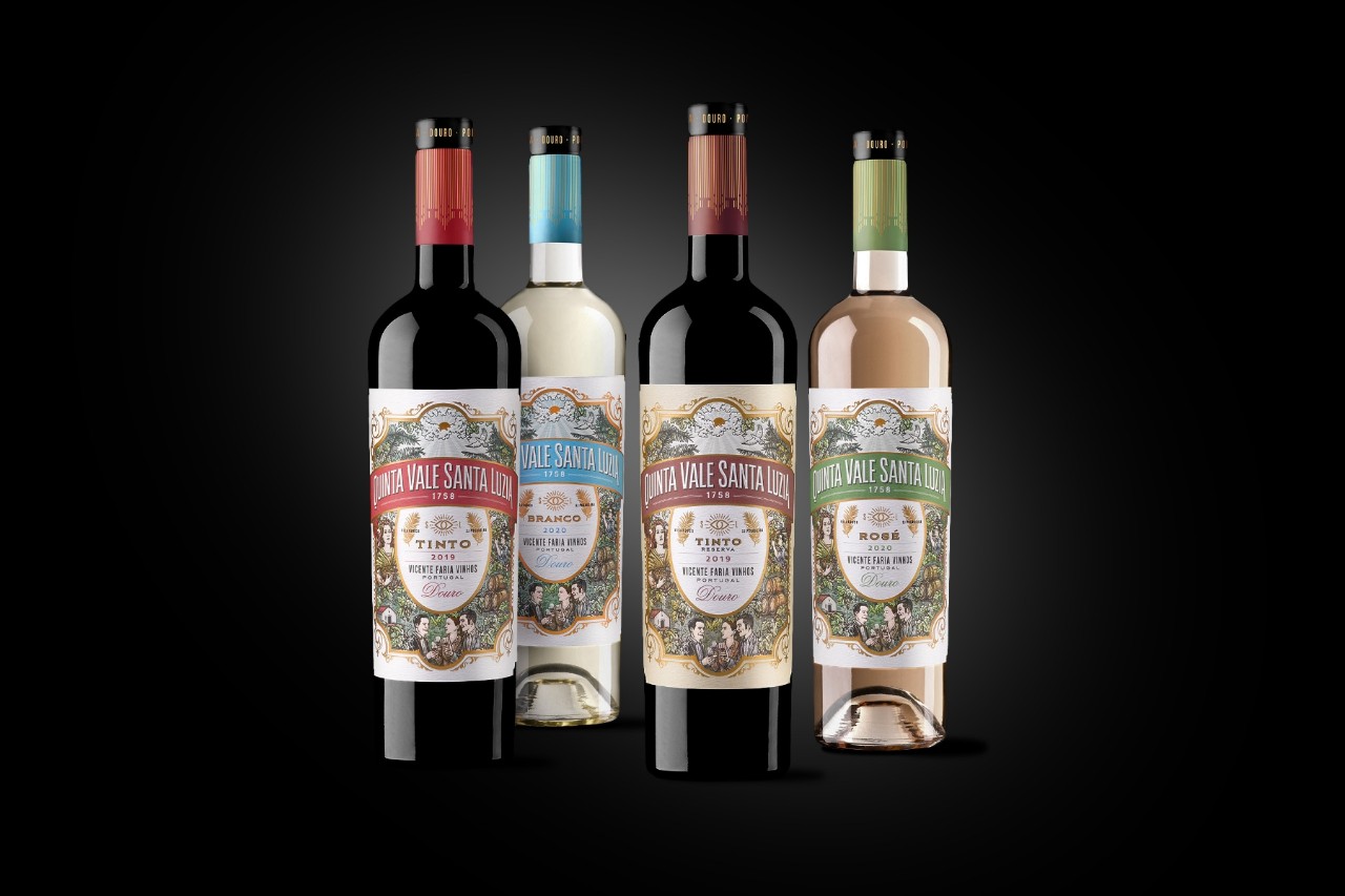
By combining all these elements, the labels express vitality, respect for vineyards, freedom, and optimism—traits that link all the way back to Saint Luzia. Most importantly, these designs encompass symbolism, heritage, and authenticity while staying true to its core values in a way that resonates with consumers seeking great quality wines for moments of celebration. Recently, a Vivino user survey found that 85% of respondents said that they had purchased a bottle of wine in the past primarily based on the appearance of the label, and there is no doubt that this vibrant label range will catch the eye of wine connoisseurs.
"With this project, we have communicated the brand values and created an easily recognizable and solid identity, which is well communicated at the point of sale. In contrast to many Douro wines that adopt a very discreet, monochromatic, and typographic language, the illustration made by Markmonk brings color and life to the bright side of the brand. Something we all seek for our moments of celebrations." concludes Sergio.

Related Articles