Search
The story behind Bien Nacido Estate's Black Label redesign
A deep-dive interview with the brand and designer
Design agency: The Labelmaker
Brand owner: Bien Nacido Estate
Printer: Dagaprint
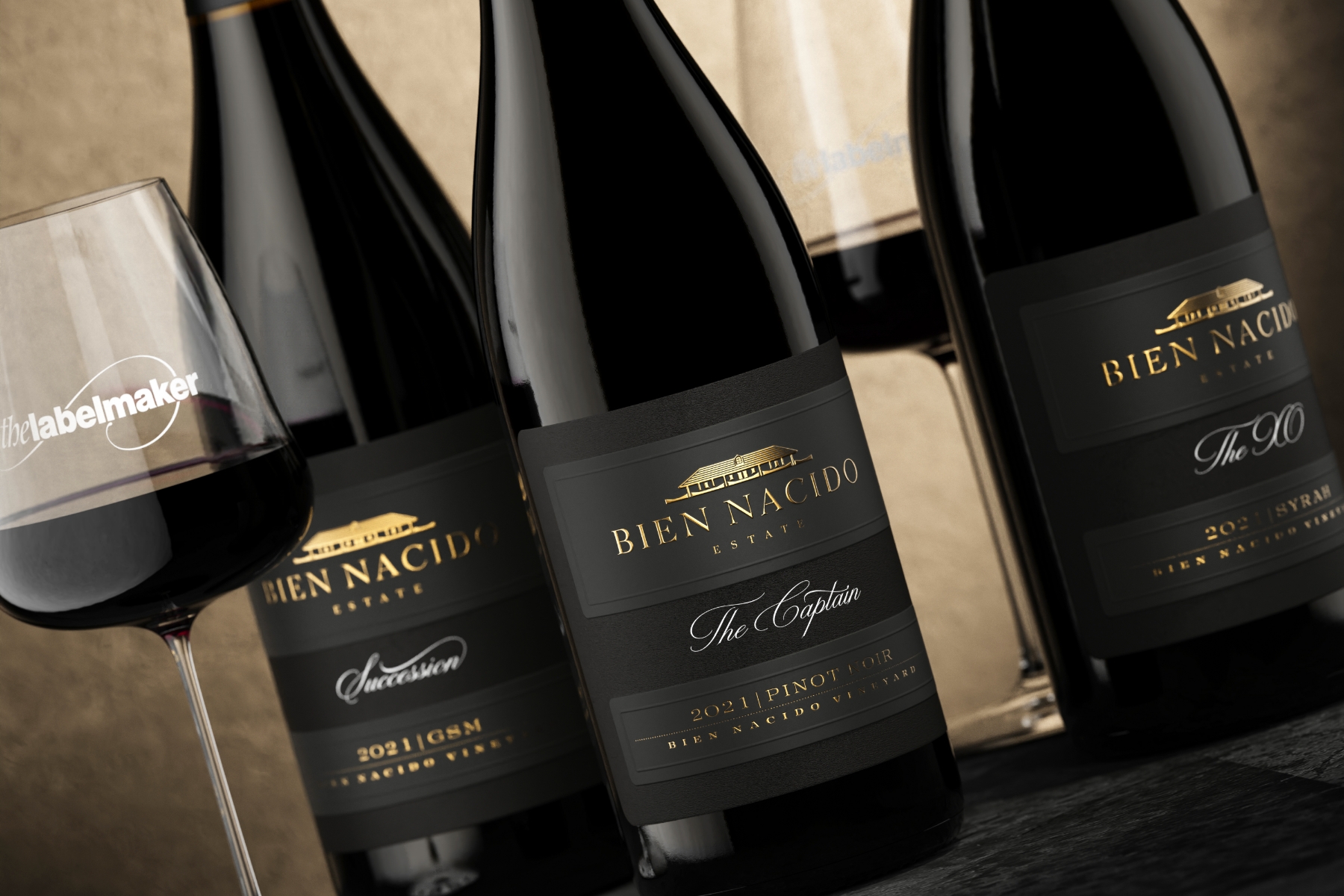
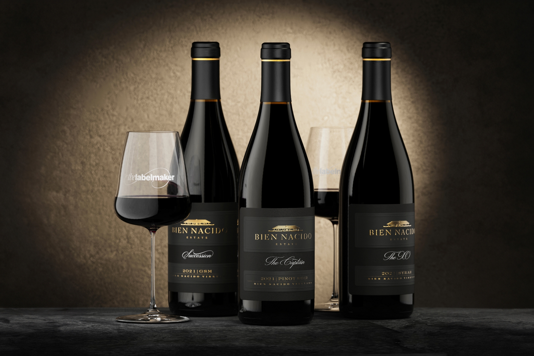
Label material: Fasson® Cotton Black & Fasson® Soft Touch Black FSC®
Amidst the sprawling vineyards of Santa Maria Valley, a time-honored tradition meets contemporary vision. Bien Nacido Estate, an iconic name in California winemaking, has embarked on a transformative journey to redesign its esteemed Black Tier wines' labels. In collaboration with the masterful touch of Jordan Jelev, The Labelmaker, this venture interweaves legacy with innovation, heritage with modernity. We recently sat down with The Labelmaker and Elisabeth Rodrigo, Brand Manager at Bien Nacido Estate, to peel back the layers of this fascinating collaboration, delving deep into the art, history, and passion that goes into every bottle.
To kick things off, could both of you share with us how this creative collaboration between Bien Nacido Estate and the Labelmaker initially came about? What motivated you to embark on this journey together to redesign the labels for the Bien Nacido Estate Black Tier wines?
Elisabeth: For 50 years, Bien Nacido Estate has thrived as a vineyard, and our estate brand has remained consistent with variations of the same label throughout the years. We believed it was the right moment to infuse a contemporary touch into our design while still paying homage to the vineyard's rich history and what our estate program stands for. Our aim wasn't triggered by a specific event, but more of a realization that it was time to rejuvenate our packaging. We wanted it to not only look modern but also mirror the luxury of the wine within.
The Labelmaker: My journey with Bien Nacido Estate started with an unexpected email from them. To be honest, I wasn't initially aware of their legacy. But once I delved into the brief, it became clear that Bien Nacido Estate is a renowned name in the Santa Maria Valley and the broader US wine sector. Being approached by such a prestigious winery, especially from afar, like the US, is always a humbling experience for me. It's not just about the project; it's an affirmation of my skills and a reminder of the trust wineries place in me. Amidst a sea of talented designers globally, being chosen for this project was a true honor.
Elisabeth, could you elaborate on the role a professional brand strategist and designer, like The Labelmaker, plays in distinguishing a brand and potentially improving business results?
Elisabeth: In projects of this magnitude, it's crucial to bring on board someone with expertise beyond our in-house capabilities and, more importantly, someone who offers a fresh and innovative perspective. Jordan didn't just bring design skills; he brought a strategic vision that aimed to elevate our brand's packaging, making it stand out in a competitive market, especially within our price bracket. All this while beautifully intertwining our rich history and the vineyard's heritage in the design. What he delivered was a unique, distinctive look that not only gives our brand a competitive edge on the shelf but does so in a manner that's both elevated and genuinely representative of what we stand for.
And given the rich history of your vineyard, how important was it to maintain a connection with the past while creating a new label that would position your Black Tier wines as contemporary and premium products?
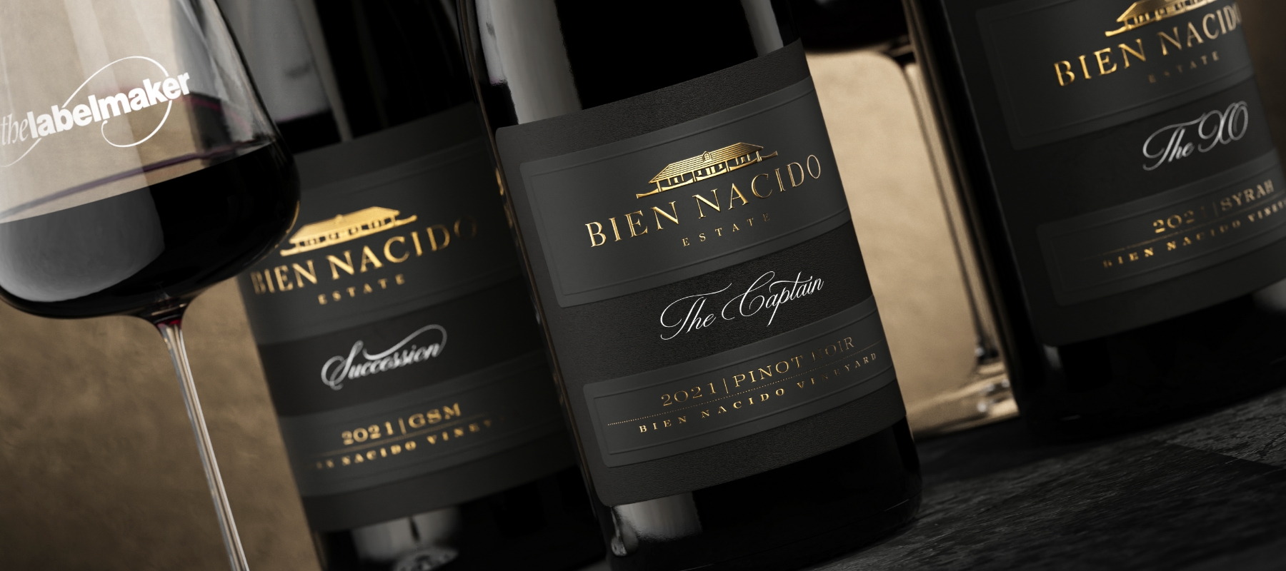
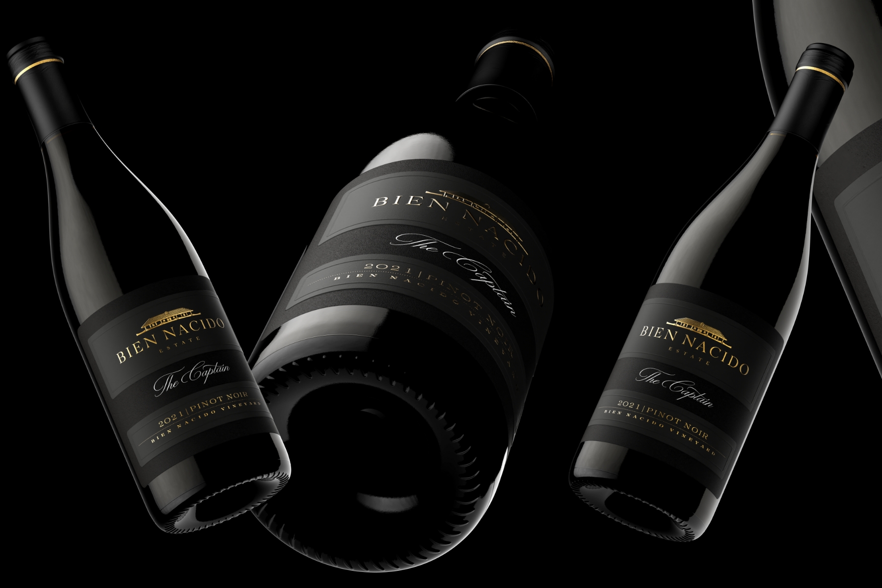
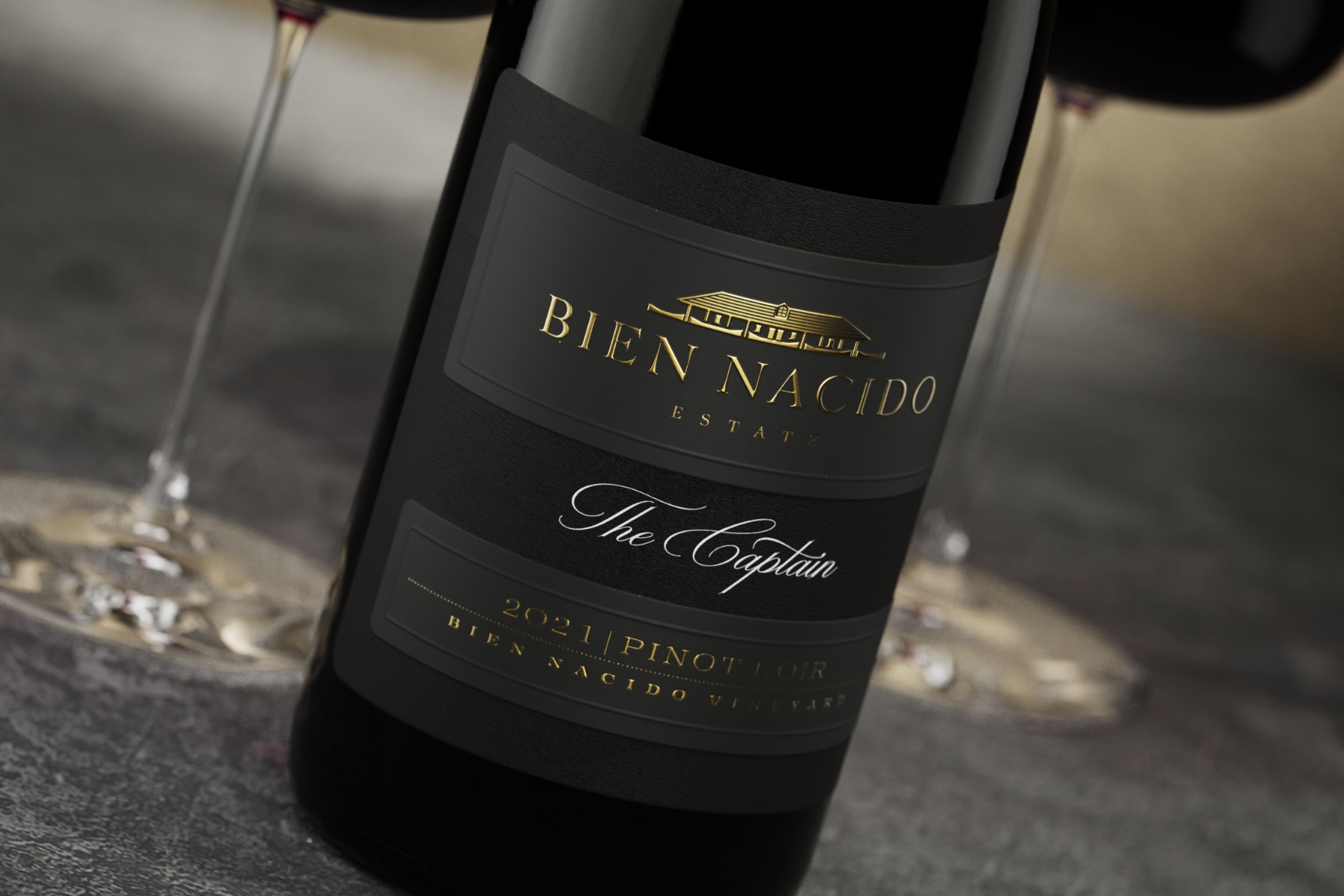
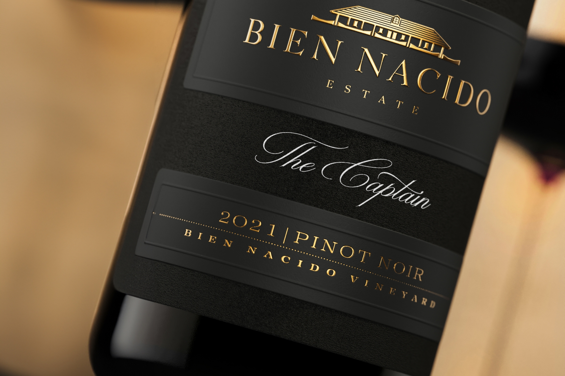
Elisabeth: Preserving our connection with the past while crafting a contemporary identity was absolutely paramount. The essence of this project was finding a balance—how to infuse modern aesthetics without losing touch with our roots and the deep history embedded in our land. This delicate balance can be seen in the adobe logo we incorporated into the design. The logo represents an authentic adobe building on our property from the 1850s, a relic from the original land grant given to the early settlers. This inclusion isn't just a nod to the past but a tribute. It stands as our testament to the respect and honor we hold for the rich history of our property and its significance on the central coast of California.
Jordan, can you tell us about the creative process that led to fusing two types of black pulp paper into a single label for the Bien Nacido Estate Black Tier wines? What inspired this innovative approach?
The Labelmaker: I am perpetually drawn to innovation, be it in design, typography, or printing techniques. The art of merging two different papers is something I'm passionate about, as it elevates the perception of the label to an unparalleled dimension. While this technique remains relatively uncharted in the wine domain, teaming up with Dagaprint added an electrifying layer to the experimental process. The end product surpassed even my high expectations, and this was after conducting meticulous at-home tests to ensure the perfect harmony between the materials. This intricate design is tailored for those with an astute eye for detail, mirroring the refined audience that cherishes Bien Nacido Estate's premium wines. It's my sincere wish that this label mirrors the exquisite quality of the wine, resonating with the palates and preferences of passionate wine enthusiasts.
You've spoken about the importance of typography and calligraphy in your work. How did these elements play a part in the redesign of the labels for Bien Nacido Estate Black Tier wines?
The Labelmaker: While many of my creations distinctly showcase a passion for typography and, at times, calligraphy, the Black Tier labels took a divergent path. For this particular project, the spotlight was firmly on the lavish paper materials, complemented by intricate effects such as foil stamping and embossing. Contrary to other designs where typography stands out boldly, I adopted a more restrained approach in this venture. Typography assumed a backdrop role, ensuring it didn't overshadow the overall aesthetics of the packaging. The intent was to sculpt a design where the paper and its accompanying effects become the main protagonists, culminating in a subtly alluring yet profoundly impactful design.
Elisabeth, how did you work with the Labelmaker to ensure that the new design accurately reflects the essence of the Bien Nacido Estate Black Tier wines? What were the key elements you wanted to emphasize?
Elisabeth: From the outset, we conveyed our vision clearly to Jordan. Our primary objective was to weave our heritage into a refreshed, contemporary aesthetic that echoes the present day. While we gave him broad creative leeway, our interactions were structured around refining a range of his initial concepts. One element we emphasized was our connection to the adobe building, which I mentioned before. Many brands use landmarks or property features to craft a unique identity, and the adobe held that potential for us. While it was illustrated on our original label, we appreciated Jordan's ingenious approach to transitioning it into a logo, maintaining that vital link yet updating its presentation.
And Jordan, when working with Dagaprint.com, you mentioned the precision and attention to detail that went into producing these labels. Could you elaborate more on the production process and the challenges you encountered?
The Labelmaker: Choosing the right materials was a cornerstone of this label's design. While I had an overarching vision, tapping into Dagaprint's profound knowledge of papers was key. The decision to use Avery Dennison's Fasson® Cotton Black as the foundational layer was straightforward, yet the ideal top layer eluded me. That's when Chiara Thomasi, an exceptional artist and expert from Avery Dennison, stepped in and recommended Fasson® Soft Touch Black FSC®. This recommendation was a game-changer, harmoniously uniting the two paper types.
Further elevating the design, Dagaprint impeccably carried out the detailed foil stamping and profound embossing. The journey from conceptualization to realization was seamless, culminating in a product we were all immensely proud of. The synergy with Dagaprint.com was pivotal, meshing precision and meticulousness to craft a label that truly stands out.
How does the redesign of the labels fit into the larger branding strategy and vision for the future of Bien Nacido Estate?
Elisabeth: The redesign is indeed pivotal, especially as this year marks a significant juncture for us. We're not only commemorating the 50th anniversary of our vineyard's inception by our current CEO, Steve Miller, and his brother, Bob Miller, back in 1973, but we're also heralding the inauguration of our on-site tasting room.
This May, we introduced The Gatehouse at Bien Nacido Estate, a monumental step as it's the first invitation to the public to immerse themselves in our legacy right on our estate. They can now savor our wines against the backdrop of the sprawling vineyards, truly engaging with the terroir.
This transformation in our branding, with the label at its heart, is part of a broader renaissance for Bien Nacido Estate. The aim is to accentuate our presence and uplift our standing amidst our peers in the winery landscape. The initial appraisal of a wine often hinges on its label. So our label redesign endeavors to mirror the quality and prestige of our wines— wines that have been consistently praised by critics and publications and cherished by consumers. The revamped packaging is geared to resonate with the acclaim the wines receive, ensuring a harmonious brand image when presented to consumers.
In retrospect, was there anything that surprised you or that you learned during this project that you will take forward into future label design projects, Jordan?
The Labelmaker: Every project brings its own set of learnings, and with Bien Nacido Estate, it was no different. The fusion technique was a meticulous endeavor, almost akin to treading through uncharted territory. We meticulously progressed through each phase, from determining the label size to selecting the perfect paper and ensuring its bonding efficacy. The journey went beyond merely fusing labels; it encompassed the art of integrating intricate embellishments. Though the project bore an element of risk due to its innovative nature, the learnings it presented were invaluable. I truly hope that Bien Nacido Estate appreciates the outcome as much as I cherished the journey.
How has the response been among the Bien Nacido Estate team regarding the redesigned labels for the restyled wines?
Elisabeth: The response has been overwhelmingly positive within our team and among industry insiders who've had a sneak peek. They've expressed admiration not only for the aesthetic appeal but also for the tactile experience of the label. Jordan approached this project with a keen attention to detail, focusing not just on the visual but also the physical feel of the label—something that's especially significant when holding a bottle of wine priced at such a premium. His choice of paper stock, treatments, and other technicalities resonated with our team's vision. The feedback we've received highlights how the label brings a fresh and elevated touch to a timeless classic. The design isn't overtly minimalist or modern but strikes the right chord with its classic elegance. It mirrors the very essence of our wine: classic, elegant, and timeless.
And finally, how important is the story behind a label in fostering an emotional connection with your consumers, especially in the wine and spirits industry where longevity and memories are closely tied?
Elisabeth: The story behind a label significantly enhances consumers' emotional connection to a brand. It invites them into a shared experience, making them more invested in the narrative. When someone pours a glass from our bottle and shares with others that the building depicted is an actual adobe structure on our estate, it gives them a sense of sophistication and joy in sharing that knowledge.
This connection is further deepened when one gets to taste the wine directly on our property, understanding and feeling firsthand the nuances of the terroir, like the ocean breeze's impact on the vines. And there's undeniable longevity in the world of wines and spirits. Many choose to keep the bottles even after emptying them, perhaps as decor or a souvenir. Such consistent reminders around them naturally foster a profound sense of loyalty and resonance. The narrative, intricately woven into our labels, ensures that every bottle of Bien Nacido Estate doesn't just offer a drink but an experience and a cherished memory.
Related Articles