Search
The story behind Frutto del Garda's bitters branding
Crafting a sensory experience through labeling design
Design studio: Killeridea
Brand: Frutto del Garda
Printer: Rotas
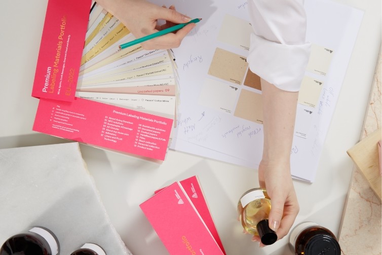
Label materials: Fasson® PP 50 Top Clear, Fasson® Cotton Touch FSC®
Foil: Kurz 386 gold foil, 306 light blue foil
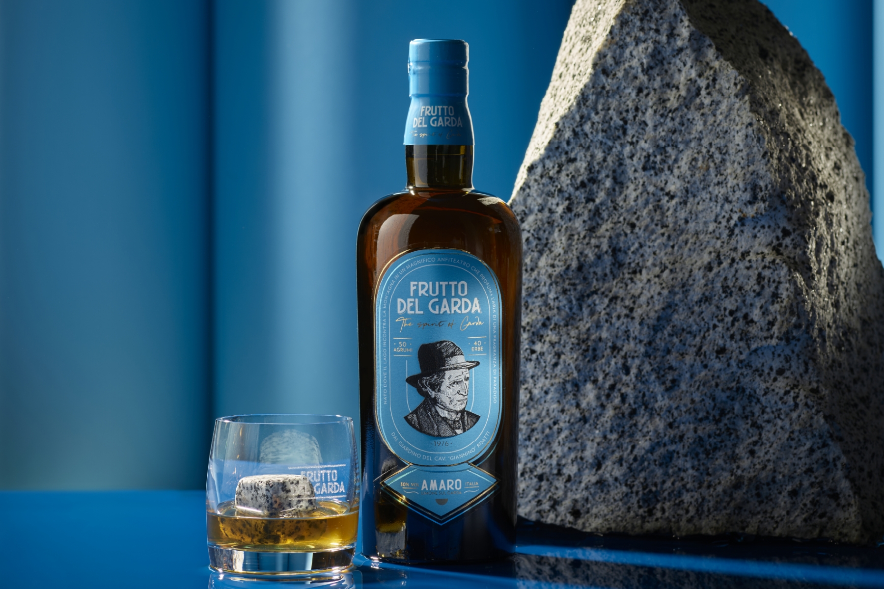
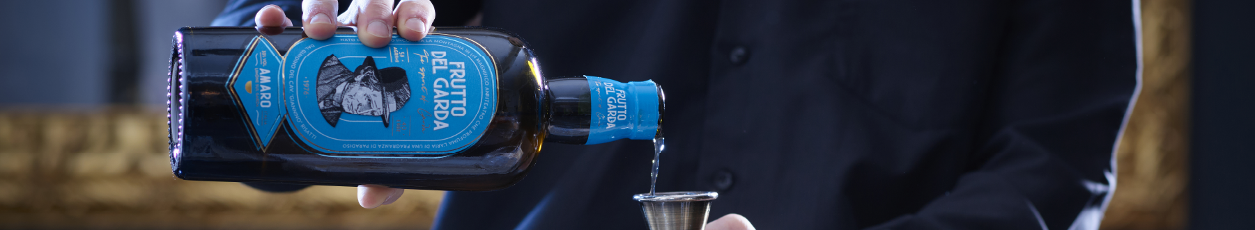
Imagine a world where tradition and contemporary design intertwine to create a product that goes beyond the norm. This is the core of the recently introduced Frutto del Garda bitters bottle—a project that breathes new life into the classic Italian beverage. Orchestrated by the talented Lorenzo Cattoni, Art Director at Killeridea agency, this design is the perfect example of a brand taking a bold step forward in a world of Italian bitters, where the old ways often reign supreme.
The initiative to create Frutto del Garda's bitters identity was not just about aesthetic refinement but also about embedding the brand's legacy and forward-thinking ethos directly into its products. "Our goal was to bring together the history and energy of the brand’s home into a label that speaks volumes," shares Cattoni. This vision led to the exploration of novel packaging solutions, resulting in a label design as intricate as stylish.
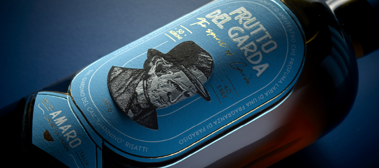
What truly sets this project apart is its distinctive multi-layered construction. Three different elements come together to create a sensory experience. The foundation is laid with our Fasson® PP 50 Top Clear, a transparent polypropylene paper, offering a clear window into the product itself. This base is topped with our Fasson® Cotton Touch FSC® paper, adding a touch of softness and a vibrant blue tone. Finally, the pièce de résistance: an embroidered portrait of the brand's owner. As a guarantee of quality, bitters were historically characterized by the founder's signature on the label, and in this concept, the founder's portrait is added to the label to add a modern twist. This detail elevates the label and transforms it into a miniature work of art. The label is masterfully printed by Rotas, a manufacturer with advanced technological expertise specializing in premium labeling.
"The overlapping layers were crucial in achieving the desired effect," explains Cattoni. "We wanted the blue lines to appear as if they were printed directly on the bottle, creating a sense of depth and dimension." To achieve this, the team used a combination of Kurz's 386 gold and 306 light blue foil alongside liquid gold, each chosen for its specific properties. The result is a visually dynamic interplay of textures and colors, guaranteed to capture consumers' attention on the shelf.
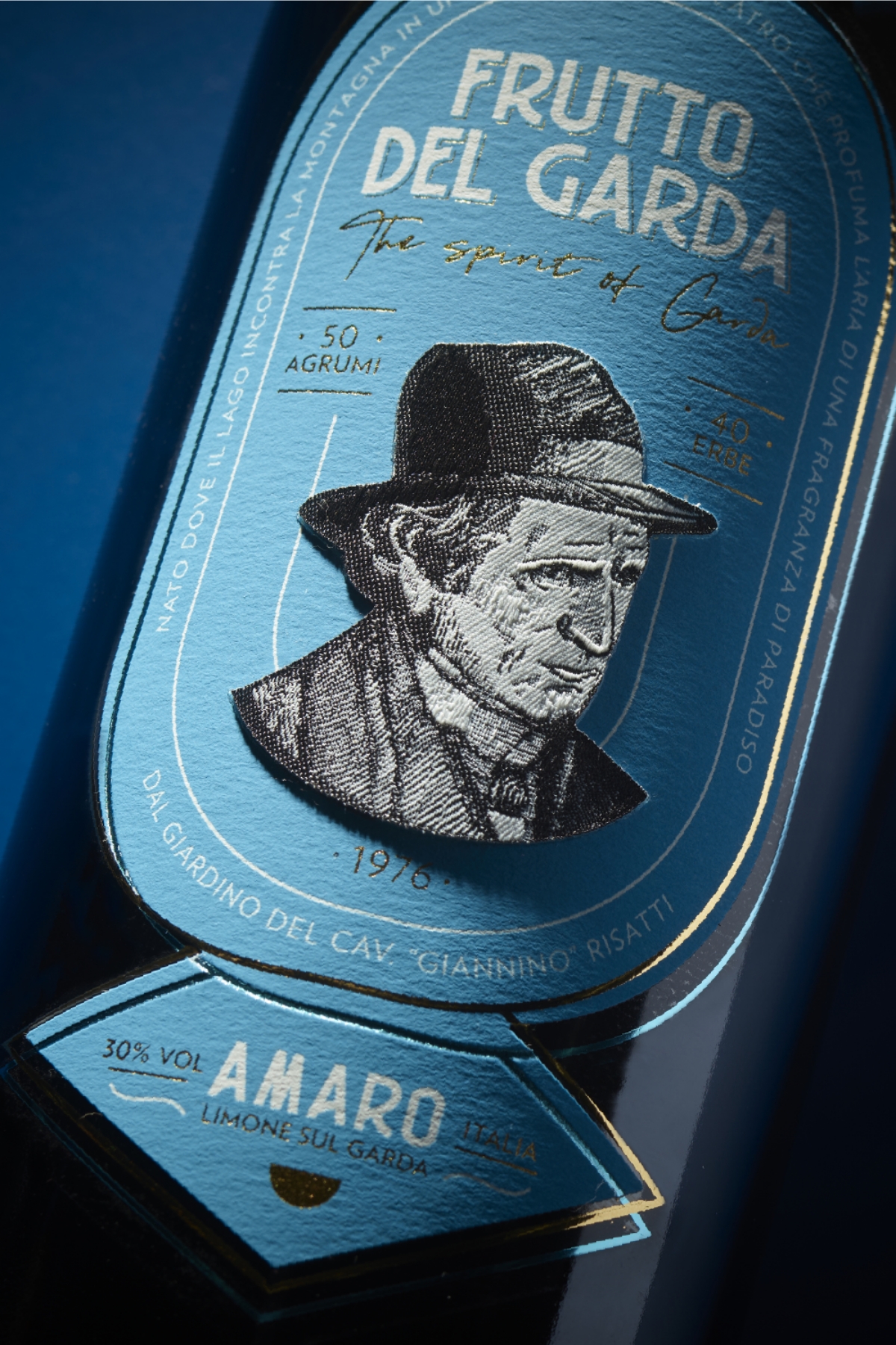
But the design choices extend far beyond mere aesthetics, serving as a tribute to the brand's heritage and connection to Lake Garda, given that it is produced in Limone sul Garda. The blue color, for instance, is a deliberate nod to the lake's nickname, "the blue lake," often referenced by poets and artists throughout history. "The idea of embroidering the label was inspired by historical photos of the lemon groves, which almost look like ancient embroidery patterns on the coast of Limone," adds Cattoni.
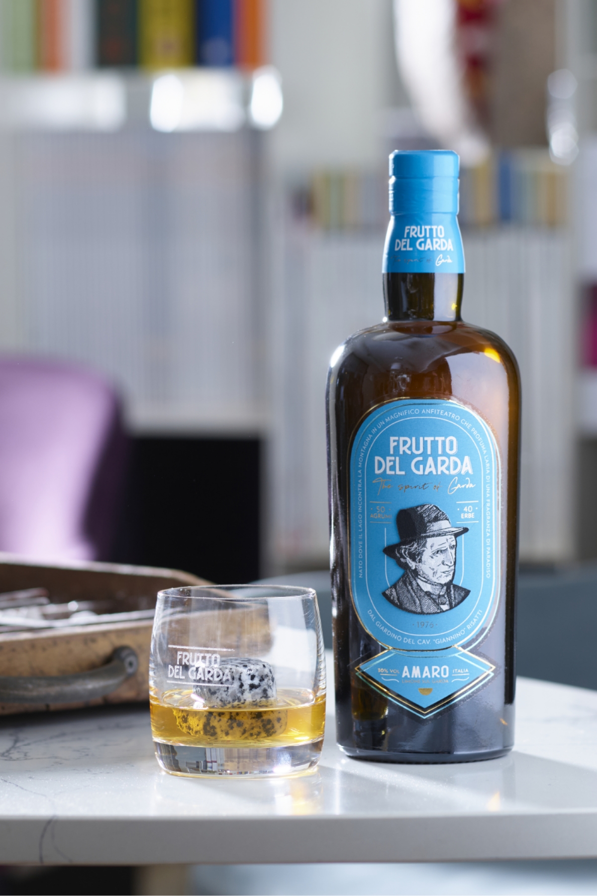
Frutto del Garda stands out in a crowded sector by venturing beyond the expected. The combination of the best materials, precise craftsmanship, and thoughtful design elements creates a multi-sensory experience that is both visually captivating and emotionally resonant. In a market saturated with similar products, Frutto del Garda has not only differentiated itself but also established a deeper connection with its consumers through packaging that tells a story of quality, history, and place.
Related Articles
The evolution of gin and the 2024 market landscape