Search
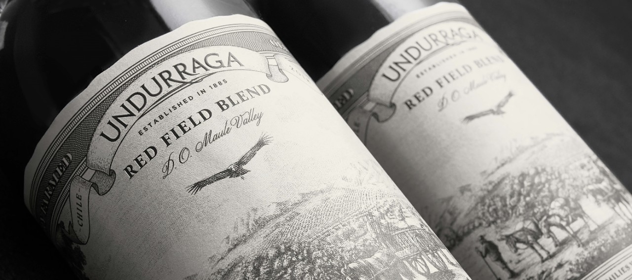
Undurraga’s Red Field Blend
DESIGN Nano Alfonsín
BRAND Viña Undurraga
MATERIAL Fasson® Cuvée White Cotton
The Story of Undurraga Red Field Blend Told Through Label Design
Maule, Chile's largest wine region and a treasure trove of old vines and vintage varieties, is nestled in the southern-central part of the country, around 300km south of the capital, Santiago. With its roughly 54,000 hectares of land, Maule's history dates back to the 16th century and the arrival of the first vintners, who worked hard to adapt the valley and cultivate vineyards in areas that were not considered ideal for such endeavors.
As a tribute to this rich history, Viña Undurraga, a Chilean winery, released a special limited version of its flagship wine, Undurraga Red Field Blend, which embodies the essence of the Maule valley inside and out. The purpose and objective were clear ‒ to pay ‘homage to the pioneering farming families who planted the first vines on these lands’, and it is this story that Nano Alfonsín (a renowned design agency specializing in design and packaging for alcoholic beverages) has been able to seamlessly articulate with the wine's packaging and label design.
“Our goal was to create a label that tells a story," explains Mariano 'Nano' Alfonsin, Founder of Nano Alfonsín Studio. "The label design and the general aesthetic of the package reflect the challenges faced by the pioneer winemakers of the region. From left to right, the design depicts how the valley was transformed into a place suitable for harvesting grapes through hard work and vision”. Indeed, the illustrations, differentiated dies, and special finishes reveal a series of details that pay homage to those individuals responsible for taming the wild area and transforming it into a vineyard. By meticulously bringing all of these fragments together, the agency has created a distinctive label that truly fulfills its purpose.
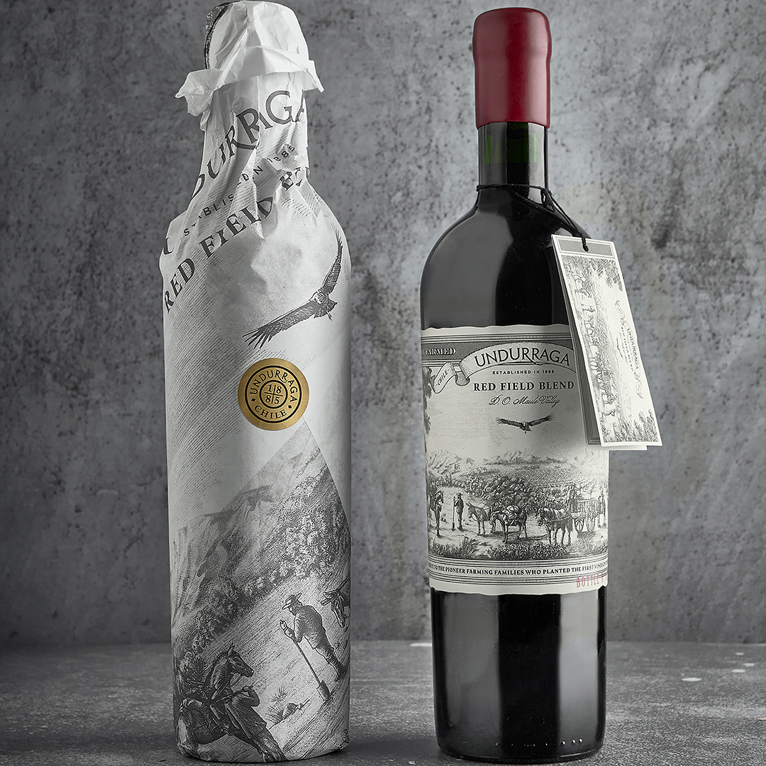
The paper chosen for this project was Avery Dennison's Fasson® Cuvée White Cotton, made from 100% cotton and offering a unique velvet finish appearance for a very authentic look and feel, highlighting all the details of the artwork. In addition to this, the paper contains wet strength and fungicidal treatments, which allow it to remain intact under humid conditions and prevent processes such as edge-lifting and bubble formation. With these characteristics added to the period design, the sealing wax in the capsule, and the embellishments on the label, an ideal result was achieved that represents this iconic product of the winery from a visual standpoint. “We chose this paper because it has a special grammage and subtle texture that allowed us to give the label an even stronger visual and tactile presence. This solution also offers excellent performance in humidity, which helps maintain a striking aesthetic throughout its lifespan", adds Alfonsin.
In today's world, consumers seek meaning and purpose behind their purchases. Understanding the origin of their products and appreciating the effort and detail that has gone into their creation will allow them to build more meaningful and lasting relationships with brands. This limited edition of the Undurraga Red Field Blend recognizes the significance of this and has been able to produce a wine that embodies both quality and tradition.
In reflecting on the project, Alfonsin concludes: “Creating a design that represents the people's pioneering work in these lands while also preserving the brand's premium feel was challenging in many ways. Each label detail has a profound meaning that depicts different aspects of this history, and we're proud to have been able to assist Viña Undurraga in telling this story”.
Related Articles