Search
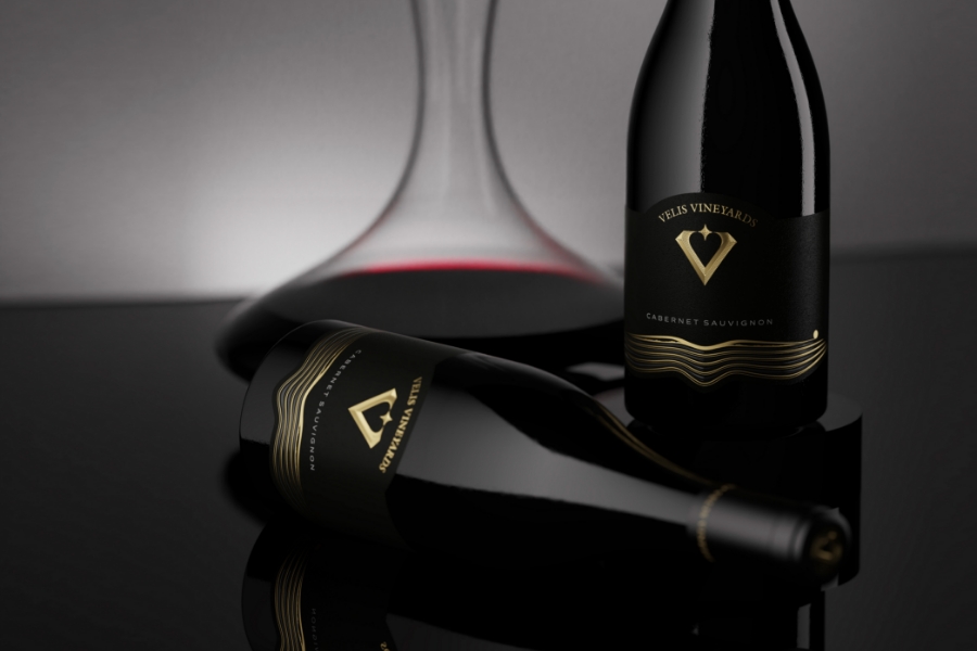
The Velis Vineyards Label Gets A Classy Makeover
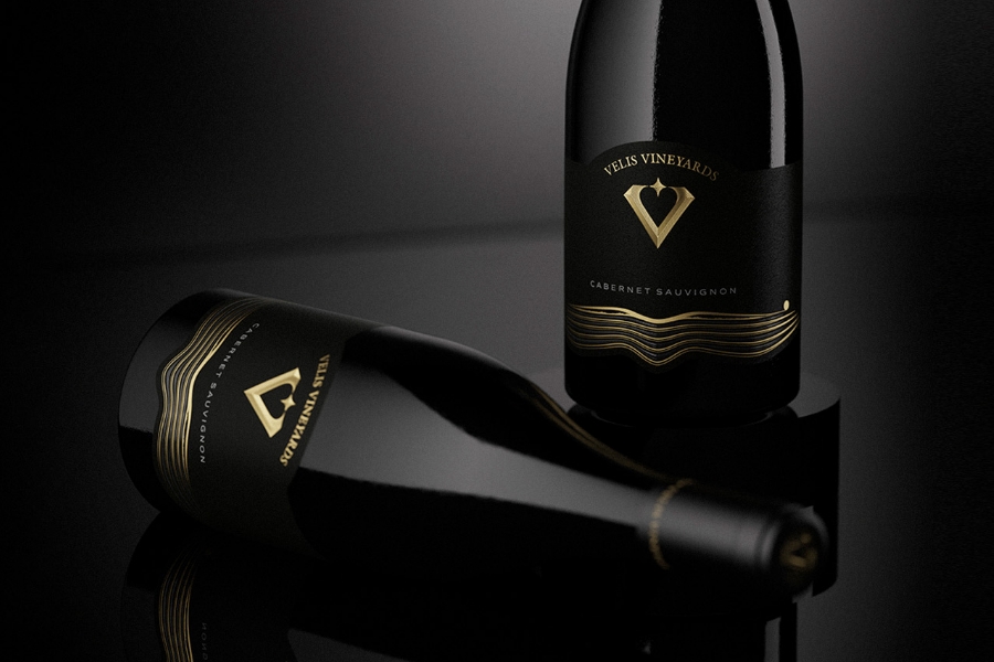
The Velis Vineyards Label Gets A Classy Makeover
CLIENT Velis Vineyards
PRINTER Dagaprint.com
DESIGN the Labelmaker
PHOTO Jordan Jelev
There is something incredibly powerful and compelling about partnerships forged out of shared passions combined with creativity and appreciation of the product. The makeover of Velis Vineyards’ red wine label, developed by Jordan Jelev, The Labelmaker, is no exception. To fully comprehend why this collaboration was so wonderful, one must first understand the history of the brand and the creative.
The winemaking process is most often associated with beautiful vineyards in France, Italy, and Argentina. Unless you’re a true connoisseur, you’re unlikely to recognize Bulgaria in this image despite its centuries-long tradition of winemaking. In fact, archaeology proves that grape vines were first cultivated and produced in Bulgaria by the Thracians, tracing back to 1300 BC. This is where Velis Vineyards comes in.
Velis Vineyards is a winemaking project that “transcends borders and unites cultures”. A small parcel of old vines was discovered and re-cultivated in Bulgaria's upper Thracian Valley, growing into over 36 hectares of vineyards today. Bulgaria's warm continental climate and soils are perfect for growing red French grape varieties and making wines with character and long aging potential. But ultimately, Velis Vineyards is a unique project that combines Bulgaria's ancient wine heritage with modern German craftsmanship.
There is no surprise that the Velis Vineyards team has developed an excellent working relationship with Jordan Jelev–The Labelmaker, who they completely trust with their creative vision. Jelev is an award-winning label designer with over 20 years of experience specializing 100% in the wine, spirits, and beer sectors, unlike many other agencies.
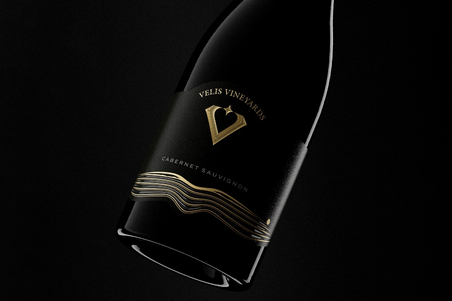
With a long history of working with the brand before the redesign of its red wine label, Jelev explains: “Velis Vineyards had an existing label design, which we decided not to use for some reason. However, after working together, we decided to transform this design using the new logo of the winery. As the old design had both good and bad sides, my task was to extract the good parts and repurpose them in the new design”. To reflect its heritage, the stylized image of fields and mountains found a place in the new project. Besides elevating it and making it look more refined and detailed, Jelev had made almost no significant changes to it. “Using gold foil, I stamped it the same way as the old design and the image's overall sensitivity was improved by adding transparent raised varnish to the gaps between the lines”, he explains.
The new logo is placed at the top of the label, and Jelev decided to use embossing, emphasizing the sign's shape and volume. Additionally, Dagaprint expertly handled the print and all embellishments. For the paper, The Labelmaker chose Avery Dennison’s Fasson® Cotton Black, which has a solid texture and contrasts nicely with the bottle. With its textured finish and high cotton tactility, this paper gives the wine a stylish and elevated appearance. “We also changed the bottle”, adds Jelev. The previous design used a stunning burgundy bottle, but I was concerned that its diameter would not be large enough to show off the new label. To complete the full makeover, we used a burgundy bottle with a wider diameter, which made the label itself more visible”.
Overall, the makeover design is very similar to the original. By taking what they liked and changing everything else, the team didn't just do a simple redesign but reinvented the old label completely. There is no doubt that the outcome of this successful partnership is a sleek and aesthetically pleasing product that simultaneously honors its roots.

Related Articles