Search
Winning Designs at the 2022 Vinitaly Packaging Awards
Winning Designs at the 2022 Vinitaly Packaging Awards
The storytelling of products begins with the packaging. With consumers offered endless choices and alternatives in today's competitive market, packaging can act as a fundamental feature that can help set products apart from the rest by building deeper connections with buyers. We no longer only purchase products based on their sensory characteristics (such as taste and smell) but also based on what we see at first glance. It takes imagination, innovation, and foresight to make this happen.
The Vinitaly Design International Packaging Competition, a prestigious event recognizing those who do this successfully, once again served as a source of inspiration this year and provided an opportunity for brands and designers to gain global and creative recognition. An international jury of designers, art directors, and journalists picked the best finished bottles of wine, olive oil, beer, and spirits out of 287 bottles that took part in the competition. Overall, 13 categories and 6 special prizes were up for grabs.
We are pleased to announce that 11 award winners used Avery Dennison's label materials. All the competitors deserve our congratulations, and we are delighted to have collaborated with various brands and designers on these fantastic pieces. Each project was innovative and distinctive in its own way, communicating individual stories, and has been recognized for its commitment to investing in creativity.
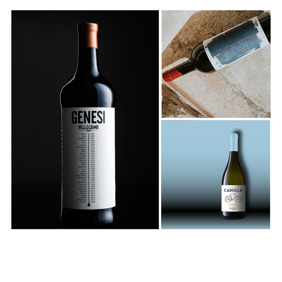
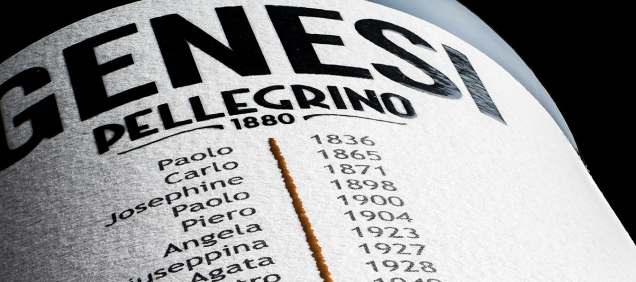
The Special Label of The Year 2022 award went to GENESI, a project developed by Gianclaudia Marino Creative Studio for Cantina Carlo Pellegrino. The eye-catching label was created to celebrate the 140th anniversary of the Pellegrino cellars' founding, retracing the history from its origin to the present. It embodies the winery's history, the Pellegrino family, and the famous Marsala wine. The label, printed on Fasson® Cotton White paper, illustrates a timeline beginning in 1836, with the birth of the founder, and continuing through all the descendants up to 2020. By combining history and contemporaneity, a vintage and essential style emerged which pays homage to the winery's rich history.
However, Cantina Carlo Pellegrino's success continued as Terre Siciliane IGT Zibibbo CARDILLA collected two awards with its simple and retro design. The first was the Special GDO Award, and the second was the Bronze label in the category ‘packaging for still wines with designation of origin and geographical indication’. Through their collaboration, Cantina Carlo Pellegrino and creative agency Alias focused on enhancing the name of the winery and the lands surrounding the vineyards. To represent genuineness and capture the consumer's attention, the label depicts a bike as a symbol of something iconic and familiar that immediately transports them to a traditional rural experience reminiscent of their childhood. Considering its tactility, the label was printed on Fasson® Rustique Blanc FSC® (PLUS version) paper, which reinforces the notion of authenticity.
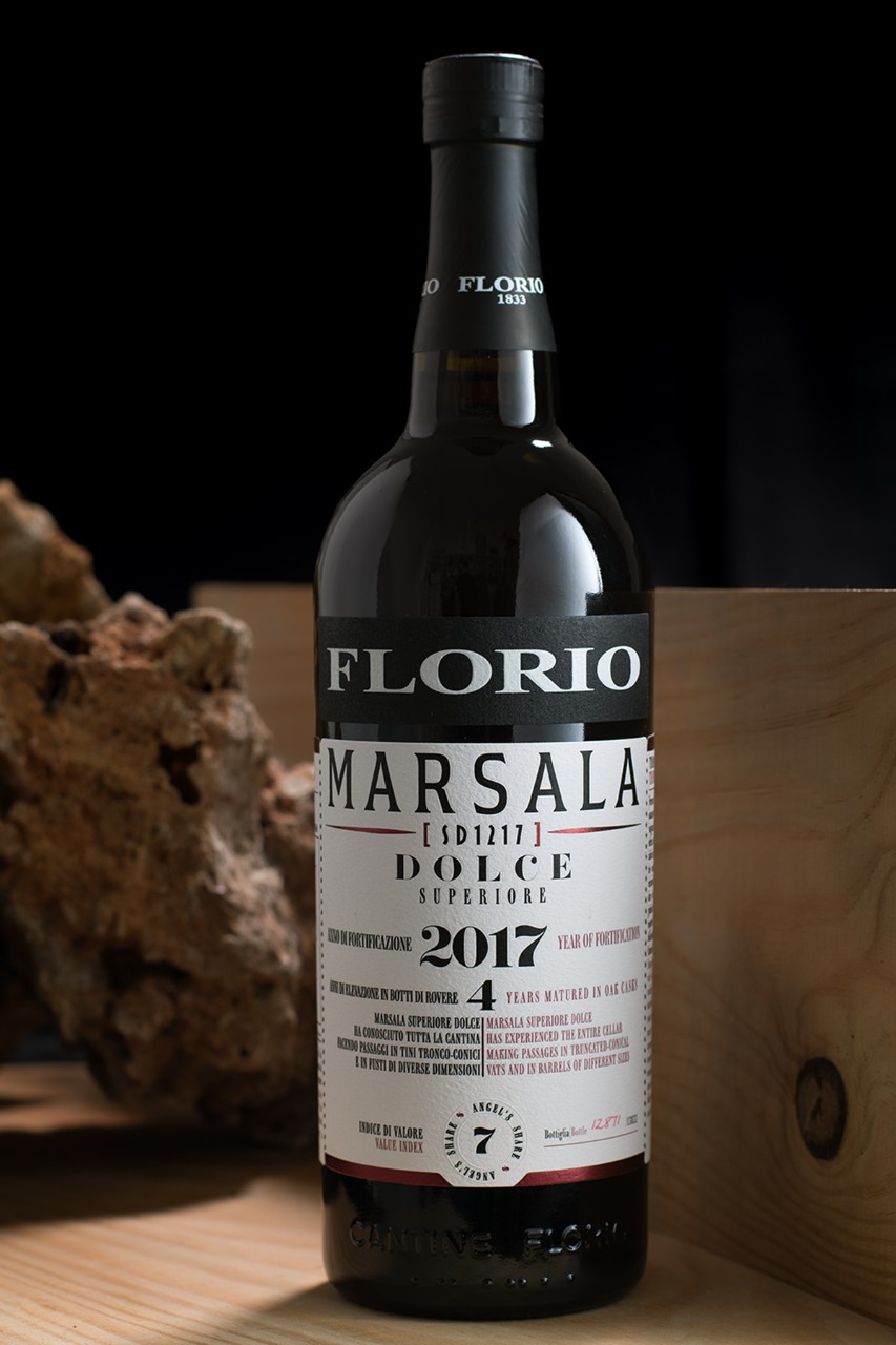
Cantine Florio (part of Group Duca di Salaparuta) in collaboration with creative agency 63DE-SIGN on the FLORIO MARSALA range won the Gold label in the category 'packaging of naturally sweet wines and still liqueur wines with designation of origin and geographical indication'. As part of the process of creating a new brand of Marsala that would restore the prestigious Florio title and highlight the unique characteristics of the product, the team wanted to revisit the history of the wine with its proximity to the Mediterranean sea and the fact that it's a Marsala born in Marsala. The label, printed on Fasson® Cotton White and Fasson® Cotton Black papers, was the result of a discovery process that included researching various historical printing techniques, selecting a font that was inspired by vintage Italian magazines, and creating a balanced design from complex information.
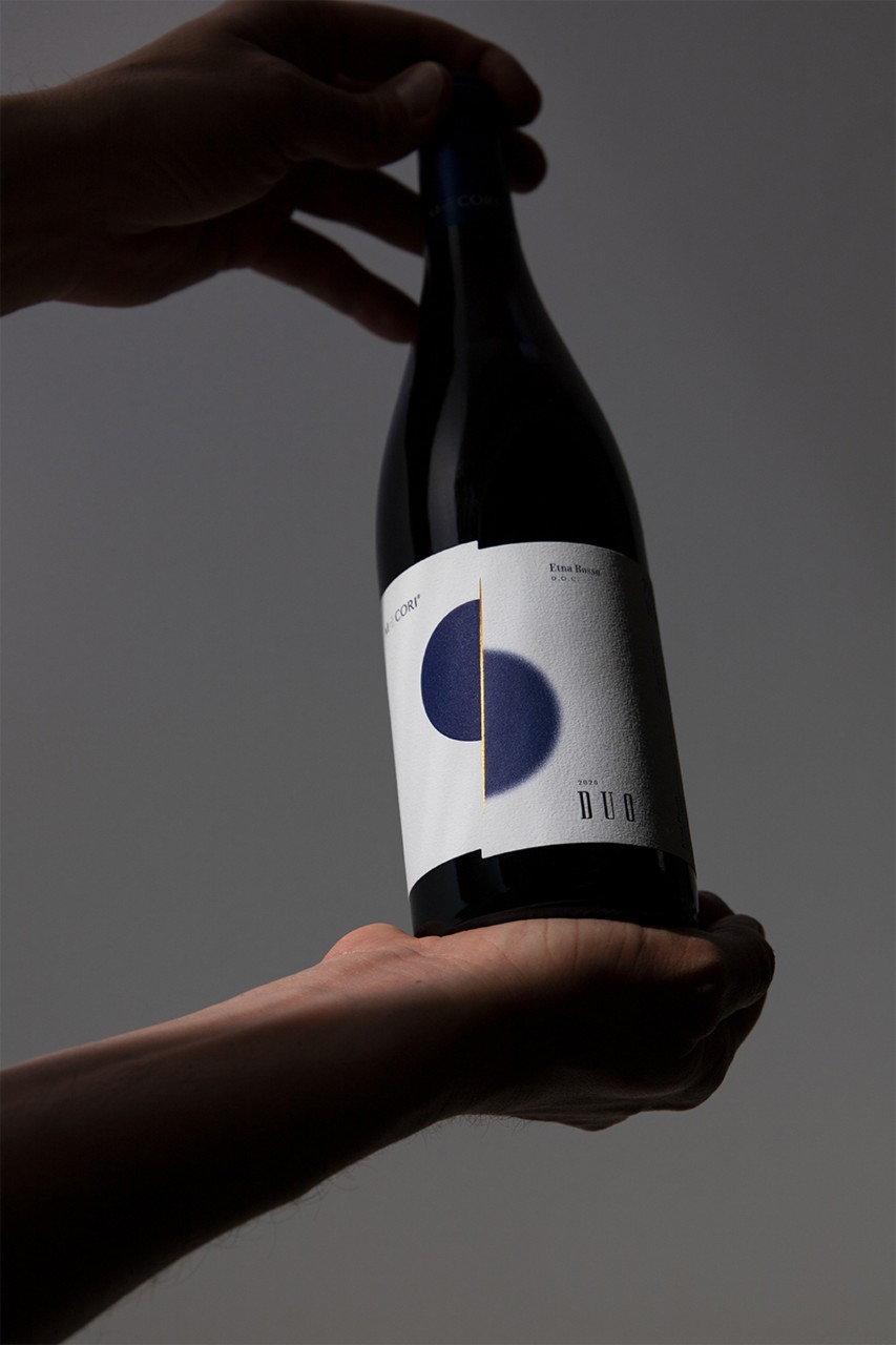
What happens when an agronomist and an oenologist come together? They created a non-traditional winery known as Mecori (which in Sicilian dialect means 'my heart'), and hired hellobario design studio, to develop the packaging design of DUO to communicate the unique characteristics of the Etna region. This novel product won them the Gold label award in the category 'packaging of still red wines with denomination of origin and geographical indication - 2021 and 2020 vintages’. With a cut of light and a slight rotation, the design is divided into two parts and inspired by the Nerello grape. Printed on Fasson® Cotton Extra White paper, it depicts two cultivars, two professionals, and two souls - one with roots firmly planted in the earth, the other more of a dreamer, who have found the perfect balance in this union. The materiality of the paper successfully evokes the roughness of lava stones and the tactile qualities of artisanal production, thus supporting the team in achieving their creative vision.
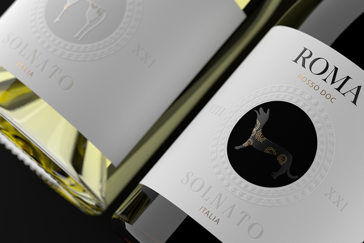
Brand Breeder and Spazio di Paolo are another brand and agency partnership that received two awards for two different projects. First and foremost, SOLNATO won the Silver label award in the category 'packaging for still wines with designation of origin and geographic indication'. Imperial Rome is resurrected in the bottle's design and symbolizes the adoration of beauty, power, and greatness of the Eternal City, dating back to the 8th Century BC. The label's classical style borrows elements from numerous symbols to convey the idea of luxury and an aesthetic value, such as those in frescoes and sculpted scenes that decorated noble residences of the time. Printed on Fasson® Paper Watermark 120 FSC®, this paper lends itself well to this vision in an exceptionally minimal and symbolic way. The second win of Brand Breeder and Spazio di Paolo will be covered later in this article.
For our last winner within the wine categories, we have TORRE TESTA, a partnership between Tenute Rubino winery and Atelier790 design agency, which received the Silver label award in the category ‘packaging of still red wines with designation of origin and geographical indication - 2019 and previous vintages’. The main objective of this label design was to enhance the printing process and materials by using very few graphic and typographic elements. Due to the materiality of Fasson Fibers Look FSC®, the bold design conveys the uniqueness of the product, the craftsmanship of the process, and the rich colors of the grape variety.
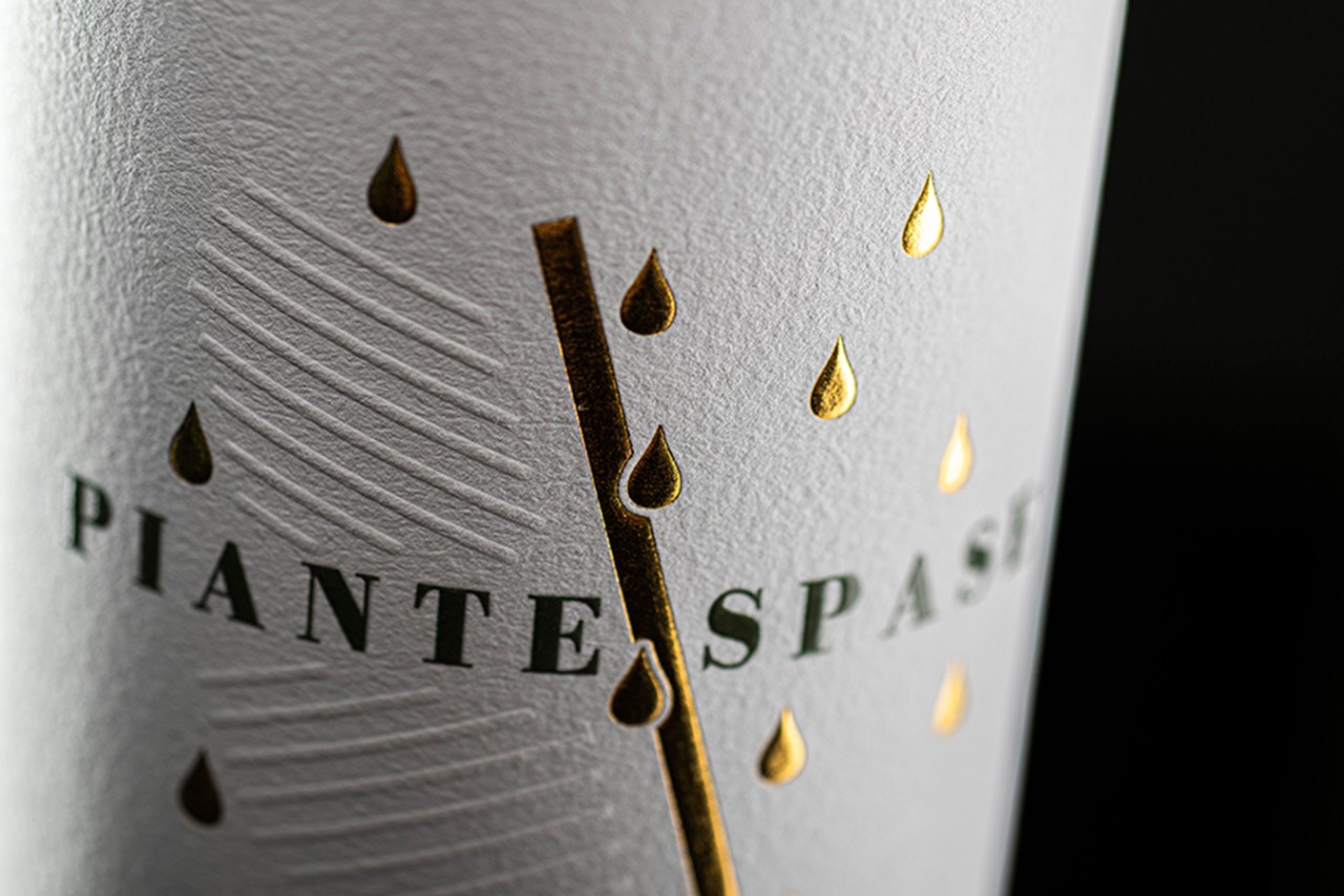
As we move into the olive oil realm, we are first met by PIANTE SPASE, a project by Vini Centanni and agency Rossomura. To demonstrate the brand's methods of growing olive trees, the label shows how these trees are placed arbitrarily near the borders of the land or among vineyards to share space with other crops. Ultimately, the objective was to create a modern and captivating design that would withstand time, and it won them the Gold label for ‘packaging of extra virgin olive oil’ award. The label was printed on Fasson® Cotton White (Plus version) instead of a classic oil-resistant plasticized paper to support the natural look and quality of the finished product.
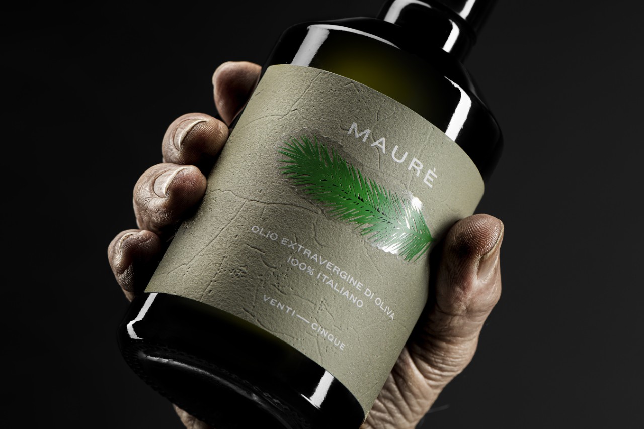
Luxury brands in various industries are known to honor traditions and pay tribute to families through their label designs. This is also true for MAURÈ, which won the Bronze label award in the category 'packaging of extra virgin olive oil'. The main goal of the product, designed by Agricola Venticinque and Stefano Bracci Studio, was to commemorate Roberto di Maurè, the maternal grandfather of the brand owners. The label reminds people of Roberto’s action on the land, which was to remove the "cudelle" (also known as horsetail in Italian) that grew abundantly under the olive trees. Thus, consumers can symbolically do the same thing with the label. The cudelle, which is a separate, can be easily peeled off to reveal the main bottle label printed on Fasson® Cotton White paper with an artisanal look and feel.
Moving into the liquor category, we are greeted by Silvio Carta, a brand that has remarkably won multiple awards this year. One of them is Amaro BOMBA CARTA!, where the conceptual genesis of the design came from the product name, which in turn strongly influenced the graphic style of the label, printed on Fasson® Verge Blanc FSC® (Plus version). The bottle's vintage newspaper style and "deformed" glass neck, which won the Bronze label award in the ‘packaging of liquor' category, give the bottle a distinctive and individual character.
Silvio Carta’s victories didn't end there, as their project BITTEROMA ASSOLUTO won two consecutive awards. Firstly, the Silver label was awarded for the ‘packaging box’, and subsequently, the Gold label award for ‘packaging of liquor’. A design that emphasizes the dynamism of the avant-garde, this one-of-a-kind bottle features a faceted surface of "a thousand" lines, except for the label (which is printed on Fasson® Silver Foil Embossed FSC® paper) that runs along the circumference of the glass. Each bottle of Bitteroma Assoluto comes packaged in a jar of spiral paper, making it truly premium.
Last but not least, we come back to Brand Breeder and Spazio di Paolo, whose second project, BESIDE GIN, was awarded a Silver label for ‘packaging of spirits with a different origin than grapes’. The project beautifully combines creativity and typographic techniques with the executioner's precision. Each of the three squares of paper has an orange back to create an interactive three-dimensional game, as every one of the squares is partially raised off the base. Even though it was technically challenging to print the words 'Beside Gin' on two different paper levels without misregistration, the ambitious idea was realized successfully and printed on the versatile Fasson® Cotton Touch FSC® paper.
These award-winning designs are proof that using the right materials and a creative mindset can enhance product labeling and packaging and change consumer perceptions to influence their purchasing decisions. Standing out on shelves, using labels to tell stories, and having a product of high quality is essential in today's competitive market. A label is more than just a means of communicating a brand's identity or product details - it is the first impression and often a deciding factor in whether a consumer makes a purchase.

Related Articles